Color Management - Intro

Why?

Almost 5 years ago I have published some articles about the Theme Colors. From what I hear on social media, and read in most books and manuals (and in a recent webinar) there is a lot of confusion about this topic. In Captivate 11.5, which has now Quick Start Projects and the possibility for multiple themes (with their palette) in a project, this topic becomes even more important. In personalized training, my trainees will always learn that the creation of a good Theme Colors palette is the first step for a useful  custom theme. No doubt about the relevance of such a theme in a company environment, where you need to apply the style sheet of the company. However even a standalone project benefits largely from a good theme to have consistent design.

Allow me to remember some Captivate history. Before the introduction of themes as base for course design, Captivate had introduced a ‘Swatch Manager’ panel, similar to several other Adobe applications. I still see many users/trainers refer to that Manager instead of the Theme Colors palette. Personally for the past 6 years I showed that manager only to prove it is outdated, not useful in Captivate. Reason was already in the old posts : there is no link whatsoever between the Swatch manager and the Theme Colors. Even after repeated feature requests, this is still the case in version 11.5.

Creation of Color Scheme (5 colors)

To avoid confusion with Theme Colors in Captivate I prefer to use here the word ‘Color Scheme’ for the palette with 5 colors to which I refer in this part.

Classic color schemes consist of  5 colors, when you use one of the two applications provided by Adobe:

  1. Adobe Color,  a cloud-based (free) desktop application. You can open it using the CC app or with this link.  Years ago it had the name  'Adobe Kuler'. It gets regular updates, only recently that was the case. You can find inspiration in this site because lot of schemes are publicly available. Of course it is also possible to create custom schemes, either starting from one or more colors, or from an image. The schemes typically get saved to … one of your CC Libraries. For most Adobe applications that is fine but Captivate sadly has no access (yet?) to those libraries. As a workaround you could use  Captivate Draft (has access). However since the transfer from Draft to Captivate results automatically in a Fluid Boxes project, that workaround is not useful if you need to create non-responsive projects. 

    There are plenty of tutorials around for Adobe Color. Just one example: YouTube tutorial. If you have access to LinkedIn learning, you could also find courses.
    To get the scheme into a normal cptx project, you can save a color scheme as ASE file. For a reason explained later, not the ideal format for Captivate. You can make the color values visible in Color, but I miss a way to export them easily. When you open such a file in Notepad or similar, you could extract the RGB-codes but that is cumbersome. Or you can write them on a piece of paper.Hexadecimal is fine:
    For that  reason I prefer using a mobile app, around since quite a while:

  2. Adobe Capture: available for iPad and for Android (still beta, but functional). I have it installed on my iPad and my Android phone. Short tutorials included.  You have exactly the same functionality as with Adobe Color, but can also directly shoot an image as basis for your scheme. It can also be used to create shapes (SVG’s) and gradients, but I’ll leave that for another blog. Especially with the enhanced use of SVG's in 11.5, an interesting topic.

    The advantage of Capture is that you are not limited to saving the schemes to a Library, or save to ASE-file. You can export the scheme as ‘color values’ and print or send them by mail, or social media. Much more useful for Captivate. That functionality may be hidden somewhere in the desktop application, but so far couldn’t find it. You’ll get a txt file with all details of the colors, which is the ideal form for Captivate. Here a screenshot of such a file:
    Be sure: I will not explain the different ways of defining colors (although I would love to), Captivate accepts only RGB or HEX format. However,  in the Theme Colors palette I suspect that the HSB format is used to create the tints derived from the main colors.

Transfer Color Scheme into Captivate

Do NOT use Swatch Manager

If you have read my old blog post, you will know that it is possible to import an ASE-file in the Swatch Manager. Follow this workflow:

  • Clear all swatches
  • Click Append
  • Point to the ASE file.

In this screenshot you see the result of such a workflow:

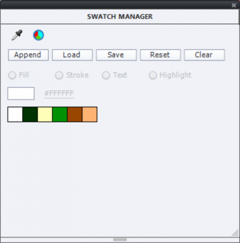
You do not need the Swatch manager, your theme will be saved with Theme Colors palette. How can you get the colors in that Theme Colors palette? Only way  is to find the color value of each of these swatches and type them in the Theme Colors editing window. Not so user friendly. This explains my present topic title: NOT to use the Swatch Manager, although I am aware that many trainers and books still mention it. Personally they could take out the Swatch manager, it is a legacy feature.

Use Color Values

Starting from the txt file you got with all the color values, open the Theme Properties panel, and go into Edit mode. To enter a color of the theme, you need 4 steps:

  1. Copy the hexadecimal value for the txt file
  2. Open a color
  3. Go to the Color wheel
  4. Paste the value

Here is a screenshot illustrating the workflow:

It is still a cumbersome workflow,. Sorry, but this is due to the fact that ASE import is impossible in the Theme Colors palettes. 

The palette has now 5 main colors, you can add 5 more. Have a good look at the existing palette: do you have enough light and dark colors to provide contrasts? Often it is a good idea to add neutral colors as black, white grey. It is not really compulsory to have/use 10 colors (+tints). In all cases if you want to switch to another palette you have to be very careful. Here I think about branding the QSP project slides.

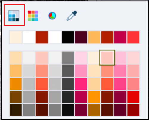
Some users/trainers recommend and use the color picker a lot. Not a good idea at all. Check it out: you will not always get the color you want when checking its value in the Color wheel. The Theme color palette is directly available (see screenshot below).

When your Theme colors palette is finished, always colors from that palette, never use the Swatch manager. It is the best guarantee to have consistent color management. Moreover, when using other Adobe applications for asset creation or editing (Photoshop, Illustrator) you can easily transfer the colors, using the ASE file or the color values. Even though you’ll use them in a Swatch panel, because that is the default workflow in that application It should be clear now that for Captivate colors are in the Theme Colors palette, not in the Swatch manager. If you open the color dialog, and the used color of the item is a Theme color, the dialog will open in its first state (highlighted in screenshot) automatically. Forget the Swatch manager (second state), the color wheel (third state) and the color picker (last state).

If you like this introduction, could write more detailed articles. Just let me know what you’d like? 

If you want make me happy, add your voice to my repeated request to make it easier to import a color scheme (from Color or Capture) to create a Theme Colors palette.

Guides and Fluid Boxes: Best Buddies!

Intro

If you do follow me since a while, you are aware of the fact that I am a big fan of the Rulers and Guides which appeared with version 9.0.1. They have a lot in common with the same feature in other Adobe applications (Illustrator, Photoshop to mention two). Shortly after the release I wrote an article about possible use cases in normal (blank projects): Guides Rule!

Using Fluid Boxes as alternative for Breakpoint views is an added feature with CP2017, about which you'll find a lot of articles, webinars and videos.  I am always stumped because none of them ever shows the use of Rulers nor Guides. This article will try to convince you that Guides are even more important for Fluid Boxes design than for normal projects.

Fluid Boxes and Themes

There are some limitations when using Fluid Boxes. Some objects cannot be used: zoom object, highlight box, click box (if placed over another object), line shape and some possibilities for multistates. You cannot use groups neither. Most of those limitations are linked with the 2-dimensionality of Fluid Boxes. Static Fluid boxes are a workaround, but you'll lose a lot of 'fluiditiy4. I will talk about my personal workarounds for those limitations in a later post.

Less known are the limitations for Themes. I start every project, even a small one, by customizing an existing theme or creating a theme (based on the Blank theme). Such a custom theme will save a lot of time later on, if small design changes have to be done. THe components of a Theme are described in more details here.

Object Styles

Fluid Boxes workflow will save you time when setting up object styles for Text containers: captions and shapes. You don't need to set up the font size for different screen resolutions, as is necessary for Breakpoint views. Text will rescale automatically when the screen resolution changes. Maybe you'll have to decrease the minimum font size which is set to 14p (for Breakpoint Views it used to be 10p, still readable on smartphones). 

Master Slides

All the included themes in Captivate have Fluid Boxes on the master slides (the 'virgin' Blank theme has them only on the quiz/score masters) . Two exceptions: you  will not find Fluid Boxes on the main master slide, nor on the Blank master slide. You'll see a lot of informational stuff where every presenter starts always with a slide based on the Blank master slide because it is also 'virgin'. Be careful when editing the Blank master slide, because it is needed for PPT-import and software simulation slides, edit only a duplicate).

I found it clarifying to explore the Fluid Boxes on the master slides of the included themes. Result of that exploration were two blog posts :

  • Fluid Quiz Slides: describes the setup of Fluid Boxes for the Quiz slides; interesting is the use of the static Fluid Box for feedback messages. The Blank theme has the same setup as the other themes.
  • Fluid Boxes and Master Slides: explores the content master slides in the themes, and how to use them. 

During the research for this post I discovered that it is not possible to insert Fluid Boxes on the Main Master Slide. I am used to have some information on that Main Master slide, which I want to show on all slides. Here is an example of the bottom part of the Main Master slide:

That is not possible within a Fluid Box. I tried to set up the Position Properties (which are available) but often weird positioning showed up when published. It is not possible to have different font sizes: either you let everything rescale proportionally and get very small text on phones, or you have to keep the size in px which will maintain the objects and font size fixed. Not really a workable solution.

Alternative for objects which you want on all slides, is to put them on the first slide and time for the Rest of the Project. However you cannot time objects for the rest of the project when using Fluid Boxes, not a workaround in this case.

My solution: insert the objects on each master slide you'll need in the project in Fluid Boxes. That is where Guides are indispensable to me.

Fluid Boxes and Guides

Turn on the Rulers under the View menu and you'll see that they are in percentage, not in pixels as for normal projects? 

For all to be used master slides, I want a setup, with a Fluid Box at the bottom to accomodate the text and button(s) as shown above. That FB should have a height of 10%. That FB will be divided in two: 70% width to the left (text), 30% to the right (buttons). To achieve that, create two Guides

  1. Horizontal Guide at 10% from the bottom by double-clicking on the 90% mark of the vertical ruler
  2. Vertical Guide at 70% by double-clicking on the 70% mark of the horizotal ruler
  3. Lock the Guides (View, Lock Guides)
  4. Turn on "Snap to Guide" in View menu

The guides will be visible as well in Master Slide as in Filmstrip view. You can change guide color in the Preferences, Be sure to change the Guide% color.

Switch to the Master slide panel. You'll get the step-by-step work flow to add a 10% Fluid Box at the bottom of two master slides (Title and Custom master slide), and have two child fluid boxes in that first FB.

Edit Title Master Slide

All included themes (also the OldPaper theme I use in this example) have one Fluid Box on the Title master slide, filled with one Title Placeholder. It is not possible to add a Fluid Box, the button Fluid Box on the Big Button Bar is dimmed. To solve this and be able to recover the placeholder:

  1. select the placeholder
  2. check the option 'Unlock from Fluid Box' on its Properties panel
  3. drag the placeholder off the stage in the scratch area
  4. uncheck the option 'Unlock from Fluid Box', later on we'll drag it back on the master slide

Select the parent fluid box (drag a rectangle half off the stage). You can now insert two vertical Fluid boxes. You will have to change the setup of the Parent Fluid box. The wrap option 'Squeeze in a column' is fine as are the alignments, but in order to use all available space you need to activate the options Stretch to fit, both Horizontally and Vertically.

Use the horizontal guide to change the height of the bottom Fluid box. This Fluid box needs these settings:

  • Flow: Horizontal
  • Wrap: Squeeze in a Row (to have text and buttons alwas next to each other), 
  • Horizontal: Space Around (eventually define some padding) and Stretch to fit
  • Vertical: Middle Align and Stretch to fit

The top fluid box: I choose vertical Flow, kept all the other default settings.

You can now insert two horizontal Fluid Boxes and change their width using the vertical guide, Flow horizontal for both.

The left Fluid box needs to have Left Align horizontally and the right one Right Align. I choose a horizontal padding for both and a vertical for the right Fluid Box. You can now insert the text (doesn't have to maintain the aspect ratio) and the Next Shape button.

I dragged the Title Placeholder back on the slide and created this Title slide from the edite Title slide:

Custom Master Slide

If none of the content master slides fits your purpose, you can start from a duplicate of the Blank Master slide. Insert two vertical Fluid Boxes. Although that master slide doesn't have a starting Parent Fluid box, it will be automatically created when you insert fluid boxes. The work flow to set up the bottom fluid boxes is pretty much the same as for the main master slide. You can now add a Back button as well. If you want more fluid boxes, go ahead. Here is a example of a custom master slide, which you could try to reproduce: And get a (Belgian) beer after success.

Conclusion

Now it should be clear why I love the Rulers and Guides for designing any project, but especially when using Fluid Boxes workflow. The Guides which you set up are saved with the project, you can hide them from the View menu and they'll always be ready to help you out when necessary :)


What's in a Theme - a Template?

Intro

When trying to help Captivate users, I often bump onto confusion between themes and templates. Same confusion can be found in many training schedules and books. There has been a lot of evolution in Captivate since versions, slowly but steadily. Those are not the big hype features that were emphasized everywhere. You know that I often appreciate more the hidden gems, which help any developer to save time and frustration. This article will explain how I am creating custom Themes, and also why I am using Templates a lot less than in earlier versions of Captivate (before version 6). 

Theme versus Template

The goal of a Captivate theme is to keep a consistent design throughout your project. It can be 'applied' to any project, even after creation. Although most themes will be created for a certain resolution, when designed carefully it is not necessary to apply it only to projects with the same resolution. When you apply a well designed theme to a project, the 'look' will change immediately and you'll not have to edit the design a lot afterwards. A theme is saved in a file with extension cptm. You can have themes for a normal (blank)  or for a responsive theme. Captivate 8 and 9 both have several themes in the box, most of them being responsive themes. They show up as thumbnails when you click on the Big Button 'Themes'. Those Captivate themes are stored in the Public Documents, under the subfolder 'Layouts' of the 'eLearning Assets', at the same level as the Theme Colors palettes.

You can store your custom themes in this folder or wherever you want. The Thumbnails view (under Themes button) has a Browse button which allows you to navigate to any folder. I will mostly save a custom theme in the project folder when working for a client. But you see in the screenshot that I have a custom theme (CP8Theme) in the default folder. That folder is a copy of the original Layouts folder in the Gallery under the Captivate installation folder. If you ever have messed up one of the themes in the Public documents, you can restore it from that original folder. If you delete the whole Layouts folder in the Public documents, while Captivate is closed, on restarting the application a new copy of the original folder will be installed in the Public documents (see also my article: Keep your Customisation).

To save a theme you need to use the Themes menu, not the big button 'Themes'. Use the option 'Save Theme as' if you started from an existing Captivate theme.

template in Captivate has to be chosen before you create a project. You have to use the option File, New Project, Project from Template. This means that a template needs to have exact the same resolution as you want for your project. As for a theme, there is a difference between a template for a responsive, and one for a normal (blank) project. A template file has the extension cptl. When you create a project from a template, it will get the normal extension cptx. You can edit a template, and that will the only reason why you would save it again as a cptl. It is also possible to create a template from a normal cptx-file with the option 'File, Save As'. There is no 'reserved' folder for templates, Captivate has no included 'templates'. The term is often wrongly used: most Captivate 'templates' that you can find on the web, are just cptx-projects, not templates in the Captivate language. 

When a template is saved, the used theme, preferences etc are saved with the template. However you can always apply another theme later on. 

Components of a Theme

It is rather important to know what exactly will be saved in a custom theme. . Remember: if you ever want to use that theme in a responsive project, be sure to create the theme in such a project. I will list up the components in the logical sequence to be followed when editing or creating a custom theme :

1. Theme colors palette

The start point for design consistency in a project is guaranteed by the consequent use of a Theme, which starts with the creation of a palette with 10 colors that will be used for object styles, master slides, skin, and within learning interactions. I have written some articles about the creation of a Theme colors palette:  Colorful 2015  and   Theme Colors. Beware: it is no longer possible to save an ASE file with Adobe Color (as described in the first article): that means that the Swatch Manager is not very useful anymore. My recommendation is to ignore the Swatch Manager and focus on the Theme Colors Palette, which is available in any Color Dialog box.
When saving a theme (using the Themes menu), the used theme colors palette will be saved with the same name. In the mentioned articles you'll find a way to save a theme colors palette independently from a theme as well.

2. Object Styles - Object Style Manager

Most design-oriented applications have a work flow for creation and use of styles (Word, InDesign, Framemaker). All experts and good trainers will tell you to use styles, and to avoid overridden styles. Captivate is no exception in that world: it has a great Object Style Manager to be found under the Edit menu (or by using the the shortcut key SHIFT-F7). Object styles can be saved individually, have the extension cps, only useful in case you want to export/import such an individual style. In most use cases you'll save all the object styles necessary for a project in a custom theme, no need to export/import styles anymore as was the case before themes appeared in Captivate.

If you are working on a responsive theme: first define the breakpoint views you want in the theme, before launching the Object Style Manager. In the styles you will be able to define the look for the breakpoints that are available in the project.
Make some decisions about which objects you'll be using in the theme as well. Just an example: if you prefer using shapes instead of captions for feedback messages, capture messages etc you do not need to change all the caption styles. A similar situation exists for normal buttons vs shape buttons. 

Some tips:

  • Use only colors from the palette defined in Step 1.
  • Do not hesitate to change one of the (grayed out) styles between brackets [Default...]. You can overwrite those styles, since you are working on a custom theme. Those are the styles that will be applied immediately when you insert an object. Another approach is to clone a style and set it as Default style. The problem is that you'll end up with tons of custom styles, which makes selecting the proper style in dropdown lists not easier. That is why I always change existing default styles. 
  • For buttons: the InBuilt states Rollover and Down are available together with Normal  for change in the OSM, do not forget to check/edit those states. This is valid for Text Buttons, Image Buttons and Transparent buttons.
  • For shapes: you cannot define a default style for text and another default style for buttons (too bad), but any shape style that you define should include InBuilt states (Normal, Rollover, Down) because any shape can be converted to a button.
  • Quizzing objects are in a separate category. Quiz buttons cannot be replaced by shape buttons (yet), but you can define an individual object style for each quiz button. Feedback captions can be replaced by shapes.
    Feedback captions and shapes not always use theme colors in the default Themes included with Captivate. Be careful: if you want to have consistent colors in your project, you'll need to check those styles.
  • It is not possible to define real Effects in an Object style. Only the 'old' Transitions can be defined.

3. Master slides

The Object styles defined in step 2 - at least the default styles - will immediately be applied to the objects on the Master slides.  If it doesn't look well, you can edit the object style and redefine it, while working on the objects in the Master slides (It can be done with the Properties panel). Be sure to make all added objects responsive (check all the breakpoint views) on the master slides. 
Each theme needs at least 6 master slides (Blank Master slide, 4 Quiz master slides and a Score master slides), besides the main master slide, but you can create as many master slides as you want. You can add different type of placeholders on master slides, but be careful with the 5 master slides for Quiz: the embedded objects (without individual timeline) have a lot of functionality built in!

Some tips

  • Use the new Rulers to assist you for designing master slides: Guides Rule!
  • If you ever will use the theme for software simulations: keep a real Blank master slide, because it is used both for software simulations and for PPT import. You don't want those slides covered up with other stuff.
  • Remember that shape buttons can be used on master slides, they can have actions. This can be a big time saver for custom buttons like the ones from these posts: Toggle buttons   and Replay slide button
  • Do not forget to label the master slides

4. Skin

Use the theme colors palette to customize the skin: playbar, borders and Table of Contents. You can even insert a logo on the TOC and eventually custom expand/collapse icons.

5. Recording defaults

This is only necessary for themes (also) to be used for software simulations. Although you have set up Default object styles in step 2, you still have to indicate which styles have to be used when capturing simulations. Just one example:
  • Create a default style for the highlight box in step 2: with a big bright red stroke and outer fill. Set it to display as default highlight box style.
  • Open Preferences, Recording, Defaults and check the default Highlight box style: it will still be set at the original default style in the original theme. Bit annoying, but it also allows you to save two different sets of object styles within a theme: one for normal slides, and one for software capture slides.

Do not forget to save the theme (using the Themes menu)!


Do you need a Template?

I ask this question often everywhere: with all the design power and flexibility of a custom theme, why would you still need a template? Before themes existed, I used templates to be able to reuse variables and advanced actions (see: Template for reusing script). With the present version of Captivate, we have shared actions which I store in a separate project to be used as external library in any project. Variables, used in those shared actions, get copied automatically when the shared action is dragged into the Library of the new project.  When you copy an object, that triggers an advanced action, the action will be copied along when pasted into another project. 

I used templates to have footnotes on each slide, pointing to the name of the project, showing the slide number and the total amont of slides. But now you can put them on master slides, using system variables or user variables that can be populated later on. 

When would I use a template in Captivate 9? For courses that have several modules, where you want to have some slides in common, maybe have custom navigation/control buttons that cannot be put on the master slide, but need to be timed for the rest of the project. I would rarely use it to have placeholder slides, unless some team members need to have that assistance. Lot of placeholders have fixed object size, which can just be annoying. If you do have a lot of advanced actions (maybe variables), that cannot be replaced by shared actions, identical entries in Project Info, variables not included in shared actions: those would be situations where I would think about creating a template.


Conclusion

I hope this post did clarify the difference between a theme and a template. If you ever see somewhere my question 'Do you need a template', this will no longer be a mystery, right? 


Theme Colors

Intro

In my previous post I explained the work flow to create a custom Theme Colors palette, starting from an Adobe Color palette (ase). Theme Colors palettes can be applied to any theme, they are stored in the Layouts folder of the Public documents, they are not project specific. This article will show the consequences of applying a new Theme Colors palette to a theme. As you probably know a theme has three principal components: object styles, master slides and skin. 

Moreover Captivate 8.0.1 allows to apply theme colors to a bunch of learning interactions (not to all yet). That is a big improvement, because most of those interactions have their own themes and it was a lot of work in former versions to edit colors in the interactions to match the theme of the project. 


How are Theme colors used?

You can customize one of the existing themes by changing the Theme colors in the first place, then adding objects, changing styles, master slides etc. For a totally new theme you will probably start with the Blank theme. Maybe in a third article I will offer some tips about using Blank theme. In this post I will only talk about the other themes, and the way a new colors palette will interact with them.
In the dropdown list under Select Theme Colors, you'll see on top the category 'Custom Theme Colors' and to the bottom 'Pretest Theme Colors'. 

For each included theme you'll find two Theme color palettes in Captivate 8: one with the same name as the theme (in 'Preset Theme Colors'), and one with that name followed by Shade (in 'Custom Theme Colors'). Example: Flat color palette, and Flat Shade color palette. Only the Blank theme is an exception. 

When you open the Theme Colors window, and choose Customize for a palette, you'll see 10 colors. A name has been given to each color, but those names are misleading, as I will explain. 
I prefer to label them color 1-10. Why? What do you expect when seeing a name like 'Title', 'Sub-Title', 'Slide BG', 'Fill', Stroke? I naively (or is it my engineer's mind) supposed that the first color (Title) would be applied to the Titles on the Master slides, the second color (Sub-Title) to the subtitles on master slides, Fill and Stroke to shapes or other objects, Slide BG to the background of the slides (project background). But when I explored the themes, included with Captivate, I discovered that this is almost never the case :). If you download this file, you'll see two tables: one for text styles and one for the three states of Shapes. Some conclusions:
  1. Font color of the default Title Smart Shape Style which is used on the Master slides is the first color 'Title' in themes Flat, Green, Nimble, White and Woodgrain. Blackboard uses Text 2 (Color 4), Clean Blue, Clouds and Vivid use Skin 2 (Color 9), Half Tone uses Stroke (Color 6). 

  2. Font color of the default Sub-Title Smart Shape Style, also used on Master slides is never color 2 'Sub-Title' except for the Flat theme. All other themes use another color.

  3. Font color of Caption text uses quite a myriad of colors: Stroke (color 6), Text 1 (color 3), Sub-Title, Sub-Title tint 5 (color 2 - see tints later on), Title (color 1), Skin 2 (color 9).

  4. Same for the three font styles on Question slides: Title, Question and Answer.

The default Shape style in the Object Style Manager has three states (Normal, Down and Rollover) because every shape can be used as a button. In the second table you'll see Stroke color, Font color, Fill color (Solid or Gradient, and Alpha) for the three states. Only the Font color seems to remain the same for each state - not always a good choice (sometimes unreadable because of change in fill). 

Why did I create those tables? If you change the theme colors, some of the object styles, master slides and skin will change based on the new colors and on setup of the colors in the original palette. This means that the same custom color palette will create a different look, depending on the theme for which it is used.  Not all object styles are using theme colors however, some will not change color: this is the case for the new Success/Failure/Hint smart shapes that you can use to replace the captions for interactive objects and question slides (Preferences). Of course, the old Success/Failure/Hint captions cannot apply theme colors neither, but for the shapes this is possible without having to create custom captions in a graphics editor. 

Example

I created the color palette  'Lilybiri' based on my logo (see previous post). Browse this Picture Gallery. You'll see one slide, with that palette applied to the White, Vivid, Flat and Halftone Themes. Watch the colors of the master slides, Title, Subtitle, Caption and the 'rollover' state of an inserted shape button. You see that the result is totally different.

If you want to change just the theme colors for an existing theme you have to check the master slides and the object styles. I would have preferred to have more consistency in the use of the theme colors in the themes. Especially in this version, because to create a custom theme you need to start from an existing theme, certainly for responsive projects. 

Tints 

In the first article I already explained that Captivate will create 5 tints for each of the theme colors, besides the base colors of the palette. Some of those tints are used in the existing themes: on master slides, in object styles and in the skin.
Contrary to the base theme colors, which I indicate now with codes 1.0, 2.0 .... 10.0, you do not have any control over the way those tints are created. I use code 1.1, 1.2 ... 1.5 for the tints based on color 1.0 in my code system. If you apply a custom theme colors palette, Captivate will create those tints, but my curious mind wondered "HOW"? Because the term 'tint' was used, I suspected that looking at the HSB code would be a better idea than the provided Hexadecimal or RGB codes. HSB is used in a lot of Adobe applications to indicate Hue, Saturation and Brightness. I have now a complete table with HSB-codes for all provided theme color palettes. I didn't include it here, it was meant to discover the logic of the tints creation. And there is some consistency, my conclusions (see also the image below):
  1. For gray colors (like 4D4D4D, E6E6E6...) you'll see that Hue and Saturation remain equal to 0 and only the Brightness will decrease from tint 1 to 5.  Same of course for Black (000000) and White (FFFFFF).

  2. For normal colors the Hue remains constant (there are small variations) for all tints.

  3. First tints (1-3 or 1-4) keep high Brightness but start with lower Saturation that will increase

  4. Last tints (4-5 or 5) keep Saturation of previous tints but decrease the Brightness

Depending on the default Theme you are using, the tints can be slightly different, but not in the same way as what I showed about the style colors in the previous point.


Learning Interactions - Theme Colors

Some learning interactions do have their proper themes. Now it is possible to apply the colors of the active Theme Colors palette to the interactions as well. However, they are not applied automatically, you need to use the Custom button. There are two possible work flows:

For the (older) interactions Accordion, Tabs, Process Circle, Pyramid Stack, Timeline, Circle Matrix, Pyramid Matrix, Glossary, Word Search and Certificate

  • The interaction themes are at the left, with default theme selected; use the Custom button at the bottom

  • Default Colors are activated, and you could customize them using the Customize button, but then you'll see the old cold dialog box, which has no link to your theme colors

  • Click on Theme colors: the preview will be changed immediately, and the Customize button now appears under Theme Colors

  • When using this customize button, you'll see the Theme colors with their tints when changing a color.

For the new games Catch AlphaNum, Jeopardy, Memory and Millionaire

  • After setting up the game, go to the second screen (mostly with an red arrow at bottom right) to Customize

  • Look for the button 'Color settings': in some games it is at the top, in other (like in the screenshot) at the bottom

  • Same work flow there: if you click on Theme colors the present color palette will be applied

  • Customize becomes available under Theme colors instead of Default colors and will show you the Theme colors palette with all the tints.

The other interactions do not yet offer the possibility to use theme colors.

Tips

  • Be careful when creating a custom color palette to apply to an existing theme: look at the two default palettes provided for that theme and try to assign bright colors to the same color number as those palettes, same for darker colors. Maybe the table I offered with the use of the theme colors in all themes can help.
     
  • Check the object styles after applying the new color palette, the easiest way is in the Object Style Manager; do not forget that shapes have colors for the three states

  • After checking the object styles, check the master slides: objects and background will have changed colors as well. If you use shapes for Success/Failure/Hint messages, check their style because they will not be changed to the new color palette.

  • I didn't mention the skin, but playbar as well as TOC settings will also get color changes when applying a new color palette, check them as well

  • When using learning interactions, try to change to Theme Colors if they offer that possibility, and double-check the result that you can edit with the Customize button.


Colorful 2015 with Adobe Captivate

Intro

Color management in Adobe Captivate is improving slowly but steadily. Too bad: the Help documentation is not offering much explanation about color workflows at all. Have a look at what is explained about enhancements in Captivate 8.0.0 and 8.0.1 and tell me if this is sufficient? It is not for me, and I have a 25 years history as a Photoshop trainer. Do you know about the relationship between the Swatches panel, the Color schemes that appear in a lot of dialog boxes (not only for Fill/Stroke, but also in learning interactions), the Theme colors and the colors applied by default in the Object Style Manager, Master slides and Skin? Since many months I'm trying to figure out a good practice using the enhancements in Captivate 8. In previous versions I created color swatches in the scratch area (outside of the stage) to use with the color picker in order to achieve a consistent color use. That is at the least cumbersome compared with color management in applications like Photoshop and Illustrator.  Since October 2014 for those CC applications I'm able to create and use my Adobe Color palettes (ase), stored in the cloud, on any device and system. Adobe Color is installed on my tablets and smartphone, allowing to create color themes at any moment, often from a shapshot. That new sharing feature (Libraries) is not available (yet?) for Adobe Captivate. 

In this first article I will try to find a way in the jungle of Captivate's color terminology and explain my present work flow to manage colors in a project by creating a custom theme color palette, starting with an 'ase' file created in Adobe Color. Let me know if you find this useful, please? In a second article focus will be on the use of Theme colors:  in object styles, master slides, skins and how to use them in (some) learning interactions (new in Captivate 8).

Swatch Manager

In the help you'll find a lot of screenshots where it is labeled 'Swatches'. But in CP8 title was changed to 'Swatch Manager'. I'm working in Expert UI, and have that panel always available in the right docking station, and make it floating when necessary. If you prefer the default newbie UI, there is a video in the Help that explains how you can open this panel: http://helpx.adobe.com/captivate/using/whats-new.html

You'll see a pretty big color palette in the manager: 8 rows with 15 color/tints, starting with 12 gray tints. When you hover over a color you'll see its Hexadecimal code, top left. To see RGB or HSB codes of the existing colors is a lot more complicated. When a color is selected and you click on the color wheel on top, it is not the selected color that shows up (as I expected) but always the gray color #404040. There is no direct way to see other color codes of the swatches (like HSB, RGB), contrary to the Color Dialog box, that will show you the hexadecimal code and RGB (not HSB) when selecting a color and clicking on the Color Wheel.

If an object is selected on the stage, you can use this Swatch Manager to apply one of the swatches as Fill or as Stroke color. For a text container (shape or caption),  in text editing mode, you can use it to apply a swatch as Text or Highlight (background color behind text) color. That is the goal of the radio buttons in the third row. Honestly, I never use that work flow, if you accidentally choose the wrong radio button, you'll change the Fill instead of the Stroke color. 

The color picker and the color wheel (that will show HSB, RGB and hexadecimal code) on top (first row) are meant to add individual swatches. You will be asked to give a name to a new swatch, the default swatches have no names.

TIP  

When you customize the palette in the Swatch Manager, it becomes available for all open projects, it is not project specific. BUT!!! A big problem is that you cannot save the swatches with a project at all. Whenever you reopen the project, the default swatches palette will appear. Even when you put a PC in Sleep mode, after wake up the custom swatches palette has disappeared and you have to load it again. This is the main reason why I never use the Swatches Manager to edit colors in a project as I mentioned before, but use it only to define a Theme Colors palette. 

The buttons in the second row are the most interesting!


Captivate and Adobe Color

I am using the Swatch manager to create a custom color palette, starting with an Adobe Color scheme. The buttons at the second row, from right to left, are:

  • Clear: this will delete all color swatches in the panel - not really necessary if you use Load

  • Reset: will revert to the original 8x15 palette, any added individual swatch, or loaded custom palette will be cleared

  • Save: the present palette will be saved in the Adobe Color format, extension 'ase' (Adobe Swatch Exchange). The default name will be the project name (you can change the name of course); this can be useful if you created a custom color palette in Captivate, for import into another Adobe applications like Photoshop.

  • Load: allows you to load an 'ase' file created in another Adobe application like Adobe Color. Captivate also accepts 'aco' (Adobe Color, have more information like Pantone color) files but I seldom use that palette format. You get a warning that the existing palette will be replaced by the new, but can still revert to the last option:

  • Append: will add color palette described by an ase or aco file to the existing colors.
An Adobe Color ase file will typically have only 5 colors. There are a lot of tutorials around about using Adobe Color (formerly Kuler) and you can install it for free on any device or use it right from the web site. Just an example: you can create a color scheme from a logo in a quick way. The color scheme imported here into the Swatch Manager is based on my company's logo.
Adobe Color is part of the Creative Cloud,with a CC subscription you'll have access to your personal color themes in the cloud from a lot of Adobe applications without having to save/load it using the ase file. Crossing my fingers that in the future this will also be possible for Captivate.

In most cases, 5 colors will not be sufficient for Captivate to have a complete color scheme. The reason is that Theme color palettes in Captivate have 10 colors (see later). 

Add swatches

Second step in my work flow is to extend the palette to more colors (not necessary 10), that match the existing scheme. This can be done, swatch by swatch,  with the color picker or with the color wheel. Very often I will add white or a very light tint of one of the existing colors (using HSB), and a very dark one or black (if it is not yet present). A similar approach is used by the Tints in Theme colors (see later). Depending on the style chosen for the Adobe Color Theme, maybe you'll need a very contrasting color as well.
In this screenshot you'll see how I used the green color to create a very bright one by keeping the Hue (H in HSB) but increasing the Brightness (B) to 100%. I added 3 swatches in total to have a palette with 8 colors.

Color dialog box

The color dialog box has 3 different looks, depending on the buttons on the top. The active look can be detected because that button will have a very thin black line surrounding it (maybe you'll have to get closer to the screen to see it). Those looks are, from left to right:

  • "Theme Colors": this look will appear by default if the selected object's Fill (or Stroke) has a default Object style using a Theme color, or if its color has been applied from the Theme Color palette.
    The top row shows the Theme colors (see later), under them you'll find 5 extra tints for each theme color. I regret that it is not possible to see the color code of any of the colors directly, it would be great if they showed up on hovering over a color (as hexadecimal code) or even better if you could have full info in the color wheel when clicking on a color. That is not the case (yet?). When exploring, I found that all tints have the same hue (in HSB), different Saturation and Brightness.
    At the bottom you'll find the colors as they were last used, last used color is the first in that sequence. Not that useful (my personal opinion). That row is dynamic, changes whenever you use another color.


  • "Swatches": this look will will appear by default if the selected object's Fill (or Stroke) color has been applied using the Swatches Manager.

    You will see the swatches in the upper section, and the 'last colors' palette at the bottom

  • "Color Wheel" will never show up by default. It allows you to choose a different color, either by picking it (click first on the right vertical bar to choose a hue, then you can change saturation and brightness in the big rectangle) or by entering a Hexadecimal or RGB code. Contrary to the dialog box for adding a swatch,  HSB is not available here. It also shows the last used colors.

  • "Color Picker" is the last button, no look on itself. It allows to pick a color somewhere outside of the dialog box. While moving the picker you'll see the Color Wheel showing up in the dialog box.

A similar Color dialog box shows also up for the gradient stops when editing a Fill gradient, when customizing colors in the Theme Color palette, and in a reduced edition when customizing colors for Learning Interactions.

Theme Colors 

This new feature in Captivate 8 allows to change quickly the look of an existing theme (object styles, master slides, skin). Next week I will talk more extensively about those changes, because not every style will be edited automatically when applying a new palette of theme colors. My work flow, after having imported and extended a color scheme in the Swatch Manager, is to create a custom Theme color palette based on those colors. With that work flow, the color dialog box will always appear in its first look and provide besides the original Theme Colors a set of 5 extra tints for each theme color. Although there are by default 10 colors in such a palette, you can assign the same color more than once. More details about the use of the 10 colors will be provided in the next blog post.

Contrary to the color schemes created with Adobe Color - ase file format - the Theme Colors are saved as XML files. You can find them in the Layouts Folder (under eLearning Assets in a public folder). The XML file is pointing to the RGB codes as you can see here:

You could create a custom theme colors palette by creating new XML files, but you'll need a more exact number for RGB in that case then the one provided in Captivate. An alternative is this work flow:
  • Open the Themes list with the big button on the top bar

  • Click on the Theme Colors button, bottom right

  • Theme Colors dialog box, in its Basic view only gives you the dropdown list with color palettes


  • Click the Customize button (bottom right) to open a hidden part of the Theme Colors dialog box (with Basic button you can hide that part again)


  • You'll see the 10 colors, and clicking on a color will open the Color dialog box in its "Swatches" look. You can now customize that color. The names of the colors are not really relevant. Some colors are not really used in most themes but that is another story, which you'll discover in a later blog post.

  • When you are ready, first change the name of the theme: blue text 'White' can be edited; there is no Save as (at least I couldn't find it).

  • Click the Save button: custom Theme Colors palette is created and immediately applied to the present project. You'll find its definition in a XML file with the same name in the public folder I showed before.
From now on you can use these theme colors for all editing. In the next blog post I'll explore how those colors are used in the current themes in Captivate, and how you can apply them to learning interactions. That post has now been published.

Summary

If you made it up till this paragraph, maybe you'll be confused by the Captivate Color Jungle?  Here is a short summary of the described work flow, to create Theme Colors from a custom Adobe Color scheme:
  1. Import the 'ase' file in the Swatch Manager, using the Load button

  2. Add more swatches to the default 5 colors of the scheme, using Color Wheel or Color picker in the Swatch Manager

  3. Save that extended scheme as an 'ase' file (because custom color schemes in Swatch Manager cannot be saved); that way you can reload it if necessary

  4. Open the Theme Colors dialog in its extended version, customize the 10 colors.

  5. Change the name of the default theme

  6. Save the custom Theme Colors palette

Thanks for your patience, please leave your comments! May a lot of your wishes be fulfilled in 2015. I have some for Captivate as well :)