Tips for troubleshooting

Intro

Quite a while ago i created this blog post, explaining how to restore some customisation after having cleared the Preferences:
Keep your Customisation!

That blog is still fully valid for the most recent versions. This one offers some additional tips which still seem to be unknown to many. I deducted this from my daily visits to the Adobe forum and the eLearning community. Often you see these recommendations, to solve a possible corruption:

  • Clear the cache, but be careful because the cache of a recent project can be used as backup
  • Clean the Preferences

I will not repeat how to do both – you’ll find that easily –  but want to offer some less-known tips. Even though some of those tips are over a decade old (will refer to the original authors).

Cache

You don’t need admin rights on Captivate for cleaning the cache. The cache folder is used to speed up the opening of existing projects and should be on your system, never on a networked drive. It can grow very quickly, if you are short on disk space take the time to clear it regularly.

Clearing the complete Cache is easy: use the button ‘Clear cache’ in Preferences, General settings. But:

  • If you do this from the Welcome screen, all cache folders will be deleted.
  • If you do it when one or more projects are opened, the cache folders of the opened projects will not be deleted.

That could be a way to preserve those caches for eventual backups.

However it is less known that the team provided an AIR application (in 2010) to delete selectively cache folders, based on the name of the projects (instead of the cryptic generic names used in the cache folder). The blog announcing this app is still available, the app is labeled ‘dCache‘ and can still be downloaded:

New utility for deleting Adobe Captivate project cache folders – eLearning

Yesterday a user asked if it would still be functional after the demise of Flash Player. This is due to a common confusion between the authoring tool Flash Builder (now renamed to Animate) and the Flash player needed to play SWF output. AIR application can be built with Animate and do not need the Flash Player. I double-checked it with version 11.5, all works as expected. Look at its UI.

The cache folders of all the projects since previous clearing are shown. The one which is dimmed (blue rectangle) means that it is open in Captivate. I have checked two caches (red rectangle) which I can now clear using the Clear button. It is very simple, but avoids having to search for the folder linked with a project.

Preferences

To clean the Preferences you need admin rights for Captivate. You find two clean options under the ‘utils’ subfolder in Captivate’s installation folder. Run the file appropriate for your OS.

Doing that you are deleting a folder in your profile.  I am on Windows and that folder is under AppDataLocalAdobe and it is named ‘Captivate 11.5’ (for the most recent release). When deleting that folder (can also be done manually) Captivate needs to be closed. A fresh copy of the folder will be restored when you restart Captivate. Do not import the previous Preferences, because they may have been corrupted, reason why you cleaned them.

Problem with deleting that folder is that you lose some customization, because they are stored in that folder. Have a look at the structure of the folder ‘Captivate 11.5’ in my profile:

I have marked the most important subfolders with customized items:

  • objects: will store saved custom shapes
  • PhotoshopTextEffects:  custom Text Effects
  • Themes: I never use a custom theme in this folder, but maybe you did.
  • Workspace: custom workspaces if you are working in the Expert UI. The default UI is the Newbie UI (has big buttons for Library and Properties next to the Assets button).

If you want to keep some custom items, make a backup before cleaning the Preferences. You can move the backup back to the subfolders (in AppData) after cleaning. Personally I always keep the workspaces stored somewhere if I need to reset them because Preferences needed cleaning. It saves time. I always store the custom Themes with the projects, not in the subfolder of the Preferences.

What cannot be restored is the choice for the Expert UI. You will have to repeat that workflow, by activating the option ‘Enable custom workspaces….’ under Preferences, General Settings.

How to embed QSP-slides (Ready-to-go slides) in your course?

Intro

Recently I posted this article about ‘Destination/Source Theme’  I warned for using the switch button to the Destination theme after insertion of a QSP slide.  Logically you expect now an alternative workflow?  A general scheme for both responsive and non-responsive projects is however not possible. Reason: the present QSPs have a beautiful design but the technical setup is very different, no rules. 

I will try to offer some tips here to make it possible to blend the inserted QSP-slides into your project design which is probably based on a custom theme. Due to the big variation in technical setup, this first post will be limited to:

  • non-responsive projects
  • Quick Start projects which use master slides in a consistent way

The second condition excludes the project Wired which only uses the Blank master slide.

In a future post I will try to offer similar tips for responsive (Fluid Boxes) QSP-projects

Start situation

The workflow with its screenshots is based on insertion of one QSP slide from the project Aspire.  The receiving project is the DemoProject I mentioned in the previous blog post. Both projects have rather different color palettes:

The DemoProject uses three fonts: Termina, Filson Soft and Trebuchet (rarely), whereas the Aspire project only uses Tahoma.

The inserted slide was the Exit slide of the Aspire project was inserted in the DemoProject as you can see in the screenshot. It really needs branding. If you want to follow along, you can add that Exit slide to one of your projects.

Branding workflow step-by-step

Step 1: Master slide

Open the Master slide panel with the inserted Aspire slide ‘Exit Layout’ selected. You will see all the master slides of the Aspire project, but the used master slide is automatically selected. You see that it is labeled ‘Welcome w/o Sub + CONTENT’. Have a close look at that master slide and its components on the Timeline:

You see from bottom to top: an image placeholder,  a Title (shape) placeholder, a caption placeholder and another shape placeholder meant for a shape button.  Sorry, but the styles used in the master slide are mostly overridden styles, and replaced by other styles on the slide itself. Just for your information, don’t bother about it.

Step 2 Copy master slide

You will copy and paste that master slide to the original course theme (DemoProject) using these steps:

  • Use right-click menu (or Edit menu) to copy the selected Aspire master slide described above.
  • Return to the Filmstrip
  • Select any slide from the original project
  • Open the master slide panel again, it will refresh and show the master slides of your project (here the DemoProject).
  • Paste the copied master slide from the Aspire master slide panel.

The result in this case is visible on this part of the master slide panel. The new master slide is still selected, and kept its original name. This was possible because that name didn’t exist in the DemoProject theme (more about importance of master slide names in next blog . If the same name exists in the receiving (Destination) project, you need to rename the master slide before the copy/paste

Of course the object styles are not what you want. In the screenshot above, the Title shape placeholder is selected, and you see that the style was overridden (+ sign). If that had not been the case, the Default Title Smart Shape style of the DemoProject would have been applied automatically. Another example of the lack of rules for the QSPs

Step 3: Replace styles

Still on the master slides, apply styles for the original project DemoProject theme to the objects. In this case:

  • There is  a Default Title Smartshape Style in the DemoProject theme, needed only to use ‘Reset Style’ for the title. Because the style was centered, changed it to left-aligned but the font (Termina) and the color were applied automatically.
    You see a + sign, because after resetting the style I added the alignment change, didn’t create a new style for this alignment change. It will only be used on the inserted slide, all other titles in the original project are centered.
  • Same workflow is used for the caption, since a Default Caption style exists (Filson Pro and light color)
  • For the shape button placeholder, another shape button style was chosen from the DemoProject theme.

Step 4: Apply Master slide

Open the Filmstrip, and select the inserted Aspire slide. In the Properties panel choose the theme DemoProject and the list with master slides will appear. Choose the ‘Welcome w:o sub…..’ master slide and you should get this result:

You see some remaining problems: the placeholder for the shape button was not used in the QSP, probably deleted and replaced by another button. Either you edit that original button or you keep the placeholder button.

The background has of course not changed. You may need a last step:

Step 5: Final touch

Two more tasks need to be done to have a fully branded slide fitting in your project design:

  1. Replace the image. Changing the Hue with the Edit Image features could work in some situations, but not for an image with a blue sky. Of course, editing in Photoshop while masking the sky is possible.

  2. Replace the blueish gradient at the bottom. It is not a gradient created in Captivate but another image. However it could be possible to use Edit Image, and move the Hue slider for this gradient.

Conclusion?

This workflow may seem cumbersome, but it is safe contrary to the switch to Destination theme.  It is only one example slide, of course. Just hoping you would try this out. It may even lead to improving practice for your custom themes.

Themes are Time savers. What is NEW in 11.5?

Intro

The most recent update to CP2019, version 11.5.0.476 is packed with several enhancements to Themes. The components of a theme, as I described in this post are still the same: theme colors palette, object styles, master slides, skin, Recording defaults. The possibility to use multiple themes in one project is probably the most eye catching enhancement. Even minor changes are very useful, will try to explain them in this post.

Themes thumbnails dialog box

In older versions this dialog box had thumbnails of the available themes in the Layouts folder (and you could browse for themes in other locations). The active theme – which always had to be unique – was highlighted with name and resolution visible. The default theme was marked by a check mark.

In 11.5 this dialog box has two parts, separated by a horizontal line. The next screenshot, and indicated explanation  is valid for projects with one theme, not with multiple themes:

The top part shows the active theme, as usual with name and resolution. For a responsive project it is the resolution for the primary view (desktop).

The bottom part shows more available themes, and you can use the Browse hyperlink to search (custom) themes which may be stored on your system. Themes show name and resolution when hovering over the thumbnail. The default theme is still recognizable at its check mark. You see above that I have set the Blank theme as default theme).

To apply another theme to the project, select the new theme from the bottom part (or browse to it) and accept the warning. All slides will be converted to the new theme, which will replace the old theme in the top part. This workflow has not changed, but you’ll see below that this changes for projects with multiple themes.

Totally NEW is the button ‘Theme Properties’, replacing the former ‘Theme Colors’. You’ll read about this new panel in next point.

Themes Properties panel

Clicking the Theme Properties panel, will open this new panel, which shows you (for a one-theme project) the Fonts used in this theme (new) and the Color palette used:

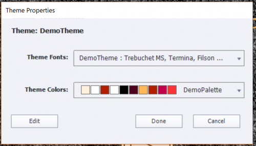
Fonts may not be totally visible the panel cannot be resized (which is the pity). But clicking the Edit button at the bottom will show you all used fonts and colors, ready for editing.

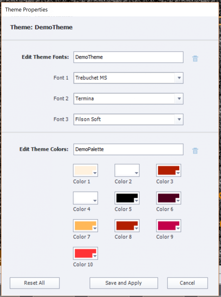
A new functionality, which can save you many working hours: it is now very easy to replace one of the used fonts by another font. I always recommend to avoid using system fonts, use only websafe fonts or Adobe (formerly Typekit) fonts. That way you’ll be sure that all learners will see the font you had in mind, even when using dynamic text (includes variables) or creating a Fluid Boxes project. In older versions, replacing a font was very cumbersome, because you had to screen all object styles in the Object style manager which included characters, and change them one by one ( see Manage the Object Style Manager ). In this editing panel you cannot see however the Usage of the fonts (feature request) but it is already a big enhancement!

As I mentioned in my first review of version 11.5, the colors in the palette have now simple numbered names. The older names (Title, Subtitle, …) were confusing because they were rarely used for those objects. Editing colors in the color palette is the same as in previous versions.

Theme in Slide Properties

Less important for a course with only one theme, but the Slide Properties have an indicator of the used theme for that slide:

Theme fonts in dropdown list PI

When you are in edit mode for text containers (captions or shapes), the dropdown list for fonts will show at the top a group 'Theme fonts', which is new. The following group are the Adobe fonts (formerly Typekit fonts) if you have licensed some. The third group is the usual 'Websafe' group. You should limit font use to those groups, System fonts have to be avoided, especially if you are creating fluid boxes project. If you use system fonts, there is no guarantee that your learners will see that font, that it will be replaced by a generic font like Times New Roman or Tahoma.

 Multi-theme projects

You can insert slides using another theme than the project theme. Once inserted you’ll see in the Filmstrip an icon, showing two options Use destination Theme or
Keep Source Theme (which is the default choice). Beware: this icon only appears when a slide is inserted. When you insert another slide, the icon will disappear, in favor of the last inserted slide.

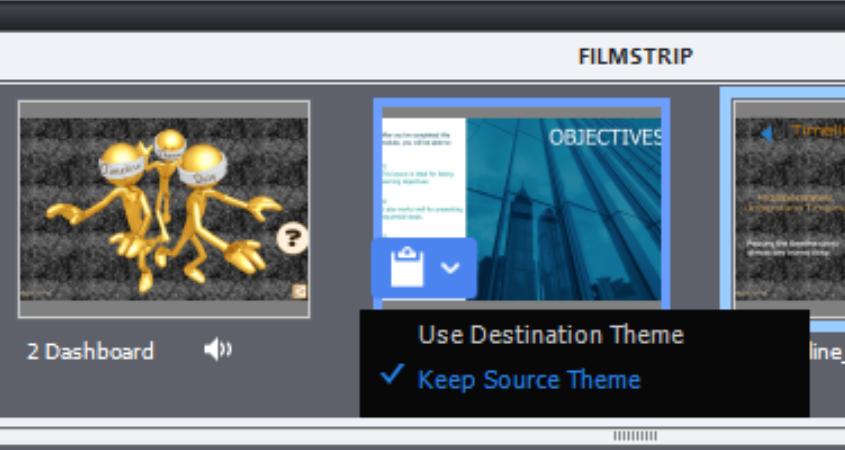
Look at this screenshot, taken after insertion of a slide with the “Earth” Theme (one of the Quick Start Project themes). You see that the first slide no longer has the icon, it was in the theme ‘Aspire’ has no longer the icon. This project has now 3 used themes: DemoTheme (my custom theme), Aspire and Earth. What is now the destination theme for the last slide? It is not the original project theme, but the theme ‘Aspire’ of the previous slide. I find this bit confusing.

You can use one of these two workflows to change the theme of a slide (where you no longer have the icon to change to the destination theme):

  • Select the slide, use the Themes button and click the theme you want as destination theme for the slide. If there is no appropriate master slide, it will be added to the destination theme.
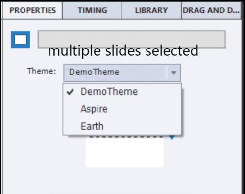
  • Select the slide, use the dropdown list in the Properties panel (see screenshot) and choose the destination theme. If there is no appropriate master slide, you will be invited to choose one of the existing master slides.

In the thumbnails under the big button Themes, all the used project themes appear in the top part. The ‘active’ theme shown is the one of the slide selected at that moment. If you select multiples slides, not all using the same theme, it is the theme of the first slide selected who will show its theme as active?

Clicking the Theme Properties panel will bring you to the properties of the active theme. If you want to see the Properties for another theme used in the project, do NOT click that theme in the top part of the thumbnails, because you would change the used theme for the active slide!. You need to leave the thumbnails dialog box, select a slide in the filmstrip with that other theme to make it active in the thumbnails, in order to be able to access its theme properties.

Master slides

In a multi-theme project, the master slide panel will show only the master slides belonging to the theme of the selected slide, not all the master slide used in the project. Just a warning: if you have both the Filmstrip and the Master slide panel open, which is only possible in the Expert UI, not in the default UI, the master slide panel will not refresh automatically if you choose a slide with another theme than the one showing at this moment. You have to leave the master slide panel and come back to force it to refresh.

If you change the theme of an inserted slide to the destination theme, and it uses a master slide which is not available in the destination theme, an extra master slide will be created. It will use the destination theme colors palette and its object styles.

If that happens, you may have to use the button ‘Reset master slide’ to enforce the use of the new object styles. It is not always happening automatically, if an extra master slide was needed.

Object Styles

Opening the Object Style Manager will show the object styles of the theme used by the selected slide. The logic is similar to the one I explained for the master slides. If an object style used in a slide (or master slide), which is not available in the theme to which you convert the slide, it will be added to that theme.

Theme fonts in PI

Same logic: the dropdown list in the Properties panel, will show the Theme fonts for the theme used by the selected slide.

Skin editor?

When i explored the skin, I found that only one skin exists. In the example I used for the screenshots, the skin designed for the custom theme ‘DemoTheme’ was always applied. Even when I have changed all the slides to another theme, or applied another theme to the whole project (where the message appears that skin is updated). Not sure what is going on, will update this post when I have more information.

I did not check out Recording defaults, last component of any theme.

Version 11.5 Released!

Intro

If you are a fan of my blog, you know that usually I will not talk about a new release on the day it is released (although I have explored it in a beta test group). This time however I am so excited about this intermediate release. It has 'Voor elk wat wils' (interesting features for each developer whatever her/his level) to use a Flemish proverb. Do not expect a full review here, want to talk only about some of my preferred features which do appeal to my level of expertise. My apologies if you don't like that 'egocentric' approach. Be sure I will write more in the future, need some time to explore in-depth. As in the past, I may overlook some little gems which I couldn't dig out yet, will continue the search. You'll find three small gems at the end.

SVG as Button

It has been possible to fill a shape with an image since version 6. Converting the shape to a button was a much easier way to create nice buttons than the older workflow with Image buttons where you needed a graphics application (and had to create several images) Shape buttons also can have custom states besides the InBuilt states which they share with the old button types (Normal, Rolllover, Down, Visitedà. I never use those legacy types anymore, except for Quiz/Score slides where they cannot be used as embedded buttons.

However, those shape buttons have two lmitations:

  • You can only fill with Bitmap images, the much sleeker vector images like SVG were not possible.
  • The clickable area of the shape button is the bounding box, not the image itself.

WIth 11.5 it is possible to use SVG's directly as buttons without the need for a shape. And you can limit the clickable area to the image itself! This is a big step forward. File size of SVG's tends to be small compared with bitmap images, and moreover they are excellent for responsive project due to its vector nature.  The SVG has all the features of a shape button: can be used on master slides, can be timed for the rest of the project (not in Fluid Boxes), can be added to quiz and score slides as extra button. A setup with 3 buttons like this screenshot was not possible in previous versions, because the bounding boxes are overlapping: The screenshot may look blurry (has been converted to bitmap here) but the original SVG's in Captivate are really crisp. Size of the SVG: about 75Kb.

In the default setup, the clickable area is still the bounding box, you have to uncheck that option:

Bitmap images as Buttons

Similar to SVG's, they can now directly be used as button, no need to fill a shape button. Same for the clickable area: can be limited to the image. Depending on the type of images this extends the functionality which I explained in the first point. I dream of custom hotspot questions with partial scoring as described in this older post. Watch out for use cases in future blog posts. Not only are you now rid of the cumbersome workflow which I described here, but if you use a bitmap format which supports transparency (GIF, PNG24) you can uncheck the same feature to reduce the clickable area as for SVG'S.

Themes 

Themes have now a real Properties panel, which can access from the dialog box under the big button Themes. It is the only way, the panel is not to be found in the Windows menu, nor under the Themes menu (which still has to be used to save a customized theme). 
For sure will write more about this in the future, Themes is one of the underrated features, which I like to promote. I am really excited about the easy way to replace fonts (in ALL object stylesà. You can see in the screenshot that I replaced the original fonts in the Windswept theme by three different fonts (all Typekit). It is a smooth process: all object styles which have text related features will be updated for you. That can be a big time saver! I will have to edit this blog, where I complained about the cumbersome workflow to replace one font in a theme.
Of course, you need to avoid any overriding of object styles, and the danger that this will happen with the new copy/paste appearance feature is very real. I will talk about that new feature in another blog post, which will have some warning.
It is now possible to have slides with different themes in the same project, which will then lead to more than one Theme Colors palettes as well. I need some more exploration time to prepare a more complete overview of all the changes related to themes. Please, be patient.

Interactive video

One of the new features in the first release of CP2019 which I really like a lot. Not so much changes after this patch. It is interesting that you now are not only limited to videos on your system or from YouTube, but that you can also use Vimeo videos.

Another improvement is the possibility to insert a sequence of overlay slides (content or KC slides) on a frame of the video. 

VR project/360 slides

Several enhancements:

  • To the actions which can be triggered by hotspots the much asked for 'Play Video' was added.
  • The hotspots are now very customisable, black and white (minstrels?) are over and out: edit the colors as much as you want.
    Double click on the hotspot when inserted, select one of the paths and choose a color.
  • If you trigger Text, you will like the new formatting possibilities. Just a pity that Typekit fonts cannot be used....
  • No need to guess a duration for the popups anymore. Default setting is now a close button in the top right corner as you can see in the previous screenshot.

Small gems

Theme colors: in the screenshot of the new Themes panel inserted earlier, you see that the main theme colors are now named 'Color1.... Color10. This fits better the use of the colors, because in previous versions there was a Title color, which was not always used for titles, a Subtitle colors which was rarely used for subtitles etc...

Drag&Drop:  when selecting Infinite attempts in the Actions tab, the 'Failure action' will disappear, very logical since it will never happen in that situation. Regret however that the wording 'Failure' is still not replace by 'Last Attempt'. The action doesn't occur On Failure, but only at the last attempt, same as for quiz slides.

Preview menu: for non-responsive projects, the option 'Preview HTML5 in Browser (F11)' is now the first option which is great! The death of Flash player for all browsers will soon be a fact, every developer has to switch to HTML5 output. The other Preview methods are all still based on a temporary SWF output (except Play Slide, which is NOT a preview method). To check the future output only the mentioned Preview HTML5 in Browser should be used.

...sure will find more of those.

More...

This was not a complete overview at all. As I explained, need more time for features like the new Assets panel, use of Quick Start Projects, Branching setup, multiple themes, copy/paste appearance etc... 


Responsive Projects: Object styles

Intro

This is the last blog in a sequence of 3. In the first article I explained meaning of Object Styles when creating a custom theme, terminology and how to create a custom object style based on an example on the stage.

The second post explored in depth the Object Style Manager, for creation and management of Object Styles.

In this last article the focus is on Responsive projects: tips and tricks to keep in mind for Object Styles in a responsive theme. Since CP2017 Captivate offers two workflows for responsive projects: first is using Fluid Boxes, second older using Breakpoint Views. Tips will be specific for each of those workflows. If you want to re-read the advantages/limitations of both workflows, may I recommend reading this post. I also mention the workflow of  Rescalable HTML project as alternative for responsive projects.

Fluid Boxes project

For such a project I recommend to use real fluid boxes whenever possible. It is the only way of having a real fluid layout. If you demote (use that negative word on purpose) a Fluid box to a static fluid box to circumvent some limitations like stacking of objects, you lose the real fluidity and the layout can look very weird on smaller browser resolutions.  A static fluid box keeps the width/height ratio, and that may cripple other real fluid boxes on the slide, even when you control the exact position.

Objects not allowed in normal Fluid Boxes

What are the limitations of real fluid boxes? Many objects cannot be used. For the Object styles, that means you don’t have to bother about styling those objects. They all are in the category of the Standard objects:


  • Highlight Box cannot be used because it is meant to be stacked over the object to want to highlight. If outer fill is selected, it is covering up the rest of the slide which is breaking the stack rule..
  • Rollovers are not possible in any fluid box (not even in a static fluid box): Rollover Area, Rollover Slidelet, Slidelet.

  • Zoom object cannot be used for the same stacking rule: Zoom Source and Zoom Destination

Font size in Fluid Boxes

The font size which you define in the Object style, will be used for the highest browser resolution. In the default setup, it is indicated as Desktop (default = 1024x627px). If you have set up a higher resolution for the desktop, maybe for a 1280px wide resolution, you could prefer a slightly larger font size.

No need to bother about the other browser resolutions. After publishing fonts will decrease in size smoothly until the minimum font size is reached. At that moment the famous ‘icon’ will appear to indicating text doesn’t fit in the available text container (shape or caption). Just one tip: set the minimum font size to 10p if you expect to have learners on small browser resolutions.

Breakpoints

To have complete control over the layout in different resolutions, you need to switch to Breakpoint mode workflow, using an option in the Project menu.

Objects not allowed in Breakpoints

All objects allowed for HTML output can be used in Breakpoint mode.  When you check the HTML5 tracker under Project menu, you’ll see warnings about unsupported items like Slide transitions, Text animations. The warning also points to Rollover objects. However they will be functional on desktop/laptop screens when a trackpad or a mouse is used. On Mobile screens, the rollovers will not be functional. I would not recommend to use the Rollover slidelet because it is no longer actively supported and can be buggy.

Font size in Breakpoints

In a Breakpoint views project, the font size will not decrease smoothly when you decrease the resolution of the browser. You have to set up the font size for all the Breakpoints you want to use in your project: from 3 (minimum) to 5 (maximum). Between those breakpoints the font size will remain fixed, equal to the setup for the  higher of the two breakpoints the browser resolution is situation: you’ll keep the font size of the Desktop view until the resolution of the landscape Tablet (if you activated it) or the Portrait Tablet is reached.

It is no secret that the Adobe team is promoting the Fluid Boxes workflow over the Breakpoints (which mean more work but offer more control to the developer). For that reason, there are no real Breakpoint views themes packaged with Captivate 11 (CP2019) anymore. A responsive project will always start with a Fluid Boxes, where you can use a packaged or custom theme. When switching to Breakpoints that theme loses all fluid boxes, but the object styles for fonts are not changed: all breakpoint views keep the same font size which is the maximum font size set up for Desktop (or higher Custom size) in the Fluid Boxes.

This is a situation where I use the Object Style Manager to start with the tedious work, eventually to be edited later on while designing the master slides. The OSM will now have a dropdown list for the activated Breakpoints, whenever font size is needed. That is the case for the Captions and Shapes under Standard Objects and for most of the Quizzing Objects. Of course, you don’t have to bother about Captions if you only use shapes and vice versa. Look at this screenshot, for the Title shape, common style in most themes:

When you check the font size for the 4 Breakpoints below the Desktop, you’ll see that the size is fixed. You need to decrease the size gradually. Minimum font size is 10pt. It is a bit guessing at the start to find a good distribution between the maximum and that minimum font size (which is for Mobile Portrait). My workflow:

  • I look for the smallest used font size on Desktop, that will have to be 10pt for the Mobile Portrait.

  • Once you have chosen Mobile Portrait in the dropdown list, that resolution will remain for the other styles until you change again. Edit all mobile font sizes at once, related to that smallest size.

  • Landscape Tablet doesn’t have to be much smaller than Desktop, unless you use a really big resolution for the desktop breakpoint. So I’ll set up all the font sizes for that breakpoint.

  • etc.

Here is a check list of the objects I usually edit. Know that I never use captions, only shapes as text containers. As for the buttons, only shapes and transparent buttons (compulsory for quiz slides) are used.  They appear in the same sequence as in the OSM.

  • Buttons: I edit the style(s) for the Transparent button and for the Quiz button here (both will also appear for Buttons in the Quizzing category)
  • Text Entry Box: edit only one style which I set as default style.
  • Text Entry Box button switch to Transparent button whose default style has already been edited
  • Smart Shape: for use as text container.
  • Title: often start with 16p for the lowest breakpoint
  • Subtitle: often start with 14p for the lowest breakpoint
  • Success/Failure/Hint Shape: all need same font sizes. Beware some included themes use same style (Success), you’ll want different styles but with same font size in breakpoints.
  • Quizzing Partial Correct Shape: all other shapes use a default style which has been edited under the Standard objects.
  • Quizzing Progress indicator
  • Quizzing Review Area: is only used on the score slide to store the text about passing/failing
  • Short Answer

IMPORTANT:  Do not forget to save the theme when you have finished. Indicate clearly that it is a Breakpoint Views theme. That way you will be able to apply the theme when you have converted another project to a Breakpoint views workflow. If you change the design a lot throughout , it may be worthwhile to create a Blank project with edited font sizes for Breakpoint Views projects.

If you do use Breakpoint views because you have learners using a lot of devices and want to have a simple look for the smallest screens instead of having the same layout fluidized, please log feature requests. It should be possible to choose which workflow to prefer when creating a responsive project: Breakpoints or Fluid Boxes. Fluid Boxes should not be imposed by default  as is the case at this moment in CP2019.

Guides and Fluid Boxes: Best Buddies!

Intro

If you do follow me since a while, you are aware of the fact that I am a big fan of the Rulers and Guides which appeared with version 9.0.1. They have a lot in common with the same feature in other Adobe applications (Illustrator, Photoshop to mention two). Shortly after the release I wrote an article about possible use cases in normal (blank projects): Guides Rule!

Using Fluid Boxes as alternative for Breakpoint views is an added feature with CP2017, about which you'll find a lot of articles, webinars and videos.  I am always stumped because none of them ever shows the use of Rulers nor Guides. This article will try to convince you that Guides are even more important for Fluid Boxes design than for normal projects.

Fluid Boxes and Themes

There are some limitations when using Fluid Boxes. Some objects cannot be used: zoom object, highlight box, click box (if placed over another object), line shape and some possibilities for multistates. You cannot use groups neither. Most of those limitations are linked with the 2-dimensionality of Fluid Boxes. Static Fluid boxes are a workaround, but you'll lose a lot of 'fluiditiy4. I will talk about my personal workarounds for those limitations in a later post.

Less known are the limitations for Themes. I start every project, even a small one, by customizing an existing theme or creating a theme (based on the Blank theme). Such a custom theme will save a lot of time later on, if small design changes have to be done. THe components of a Theme are described in more details here.

Object Styles

Fluid Boxes workflow will save you time when setting up object styles for Text containers: captions and shapes. You don't need to set up the font size for different screen resolutions, as is necessary for Breakpoint views. Text will rescale automatically when the screen resolution changes. Maybe you'll have to decrease the minimum font size which is set to 14p (for Breakpoint Views it used to be 10p, still readable on smartphones). 

Master Slides

All the included themes in Captivate have Fluid Boxes on the master slides (the 'virgin' Blank theme has them only on the quiz/score masters) . Two exceptions: you  will not find Fluid Boxes on the main master slide, nor on the Blank master slide. You'll see a lot of informational stuff where every presenter starts always with a slide based on the Blank master slide because it is also 'virgin'. Be careful when editing the Blank master slide, because it is needed for PPT-import and software simulation slides, edit only a duplicate).

I found it clarifying to explore the Fluid Boxes on the master slides of the included themes. Result of that exploration were two blog posts :

  • Fluid Quiz Slides: describes the setup of Fluid Boxes for the Quiz slides; interesting is the use of the static Fluid Box for feedback messages. The Blank theme has the same setup as the other themes.
  • Fluid Boxes and Master Slides: explores the content master slides in the themes, and how to use them. 

During the research for this post I discovered that it is not possible to insert Fluid Boxes on the Main Master Slide. I am used to have some information on that Main Master slide, which I want to show on all slides. Here is an example of the bottom part of the Main Master slide:

That is not possible within a Fluid Box. I tried to set up the Position Properties (which are available) but often weird positioning showed up when published. It is not possible to have different font sizes: either you let everything rescale proportionally and get very small text on phones, or you have to keep the size in px which will maintain the objects and font size fixed. Not really a workable solution.

Alternative for objects which you want on all slides, is to put them on the first slide and time for the Rest of the Project. However you cannot time objects for the rest of the project when using Fluid Boxes, not a workaround in this case.

My solution: insert the objects on each master slide you'll need in the project in Fluid Boxes. That is where Guides are indispensable to me.

Fluid Boxes and Guides

Turn on the Rulers under the View menu and you'll see that they are in percentage, not in pixels as for normal projects? 

For all to be used master slides, I want a setup, with a Fluid Box at the bottom to accomodate the text and button(s) as shown above. That FB should have a height of 10%. That FB will be divided in two: 70% width to the left (text), 30% to the right (buttons). To achieve that, create two Guides

  1. Horizontal Guide at 10% from the bottom by double-clicking on the 90% mark of the vertical ruler
  2. Vertical Guide at 70% by double-clicking on the 70% mark of the horizotal ruler
  3. Lock the Guides (View, Lock Guides)
  4. Turn on "Snap to Guide" in View menu

The guides will be visible as well in Master Slide as in Filmstrip view. You can change guide color in the Preferences, Be sure to change the Guide% color.

Switch to the Master slide panel. You'll get the step-by-step work flow to add a 10% Fluid Box at the bottom of two master slides (Title and Custom master slide), and have two child fluid boxes in that first FB.

Edit Title Master Slide

All included themes (also the OldPaper theme I use in this example) have one Fluid Box on the Title master slide, filled with one Title Placeholder. It is not possible to add a Fluid Box, the button Fluid Box on the Big Button Bar is dimmed. To solve this and be able to recover the placeholder:

  1. select the placeholder
  2. check the option 'Unlock from Fluid Box' on its Properties panel
  3. drag the placeholder off the stage in the scratch area
  4. uncheck the option 'Unlock from Fluid Box', later on we'll drag it back on the master slide

Select the parent fluid box (drag a rectangle half off the stage). You can now insert two vertical Fluid boxes. You will have to change the setup of the Parent Fluid box. The wrap option 'Squeeze in a column' is fine as are the alignments, but in order to use all available space you need to activate the options Stretch to fit, both Horizontally and Vertically.

Use the horizontal guide to change the height of the bottom Fluid box. This Fluid box needs these settings:

  • Flow: Horizontal
  • Wrap: Squeeze in a Row (to have text and buttons alwas next to each other), 
  • Horizontal: Space Around (eventually define some padding) and Stretch to fit
  • Vertical: Middle Align and Stretch to fit

The top fluid box: I choose vertical Flow, kept all the other default settings.

You can now insert two horizontal Fluid Boxes and change their width using the vertical guide, Flow horizontal for both.

The left Fluid box needs to have Left Align horizontally and the right one Right Align. I choose a horizontal padding for both and a vertical for the right Fluid Box. You can now insert the text (doesn't have to maintain the aspect ratio) and the Next Shape button.

I dragged the Title Placeholder back on the slide and created this Title slide from the edite Title slide:

Custom Master Slide

If none of the content master slides fits your purpose, you can start from a duplicate of the Blank Master slide. Insert two vertical Fluid Boxes. Although that master slide doesn't have a starting Parent Fluid box, it will be automatically created when you insert fluid boxes. The work flow to set up the bottom fluid boxes is pretty much the same as for the main master slide. You can now add a Back button as well. If you want more fluid boxes, go ahead. Here is a example of a custom master slide, which you could try to reproduce: And get a (Belgian) beer after success.

Conclusion

Now it should be clear why I love the Rulers and Guides for designing any project, but especially when using Fluid Boxes workflow. The Guides which you set up are saved with the project, you can hide them from the View menu and they'll always be ready to help you out when necessary :)


Fluid Boxes and Master slides

Intro


A while ago I published a post explaining the setup of the Quizzing Master slides, compulsory parts of each theme, even the almost empty Blank theme. In this article I will try to explain my experiences using Fluid Boxes on Content Master slides. Most themes shipped with Captivate have several content master slides (exception = Blank theme). Let us first start with the master slides that are not behaving like the content or quiz master slides

Main master slide, Blank and Title master slides

Main Master slide

It is not possible to insert Fluid boxes on the main master slide: the button seems active but both options (Vertical and Horizontal) are dimmed. Objects placed on that Main master slide, and inherited by the daughter master slides, are to be set up using the Position Properties panel. Example: the text container with my name and copyright in the example movie.
However after some more testing on iOS devices, the Position properties set up for those objects are not correctly displayed in portrait mode. 
TIP: at this moment avoid putting objects on the Main master slide, since they don't display at the correct location on some mobile devices.

As you probably know, it is not possible to have shape buttons timed for the rest of the project when you use Fluid boxes. You could put a shape button on the main or one of the other master slides but you cannot control it because it has no ID. In the example movie I preferred to have a Next button on the individual slides, because ton most slides it is hidden until the learner has visited everything. However a toggle shape button for Audio, for CC, for the TOC could be on the Main Master slide. They will not behave like objects in a Fluid box however, but act as defined on the Position Properties panel for size and location.

Blank Master slide 

This master slide has no Fluid boxes by default but you could add them. As I have explained in previous articles, you should prefer to duplicate the master slide for editing, don't edit the original slide because it is used for Powerpoint import and for software simulations.

Title Master slide

That master slide has one Fluid box (parent fluid box) but no child fluid boxes. It is set up as 'Squeeze in a Column', and vertically and horizontally centered. Because the title placeholder is inserted directly in that parent fluid box, you are not able to insert child fluid boxes.  Because each new project, using the default theme White will start automatically with a Title slide, this has caused already many frustrations when starting with the use of Fluid boxes. If you want to use fluid boxes on the first slide, you have to change the master slide from Title to Blank (exception Blank theme which starts with a Blank slide).

TIP: if you want to add objects on the Title master slide, first take out the Title Placeholder, to be able to insert child fluid boxes. Then put back the Title Placeholder in one of the child fluid boxes.

Content master slides

It can be a time saver to use a content slide that has already Fluid boxes. In a future next article I'll explain how to create a custom content master slide with the help of Guides, but for now let us focus on an existing master slide, and see how we can tweak it.
In the example movie, the second slide is based on the Content04 master slide from the Theme 'OldPaper'. I didn't customize the theme, just applied the correction explained in my last post

Look at the setup of the Fluid boxes on the master slide: the parent fluid box (FB_15) has two vertcial child FB's (FB_16 and FB_17). The top one is meant for the Title placeholder: 

The bottom Fluid Box has 4 child FB's, (FB_19,FB_20, FB_21, FB_22), which are set up to wrap Symmetrically (when width is too small, two FB's will move to the next row), and have a padding both vertically and horizontally to have some spacing between the FB's. Each of them has a placeholder for an image.

Example movie

Play with this responsive movie (will open in a new window) which has only 3 slides: Title slide (with inserted Next button, and taking over my name from the main master slide), a slide based on Content04 master slide, with a lot of tweaking, and an End slide. The Next button on the second slide will only appear when you have clicked all available shape buttons and seen all the content. 

Refining slide based on Content master slide

The FB setup on the master slides can be tweaked on a slide based on that master slide. You can remove all fluid boxes, but that is has not much sense. To demonstrate I did a lot of tweaking for the second slide of the movie which you just watched:
  • I deleted the image placeholders


  • I decreased the height of the top fluid box (FB_MS2_16) to 10%, originally it was 15% (edited font style as well)

  • I added a third vertical child FB under the parent FB_MS2_15, it is labeled FB_9
    TIP: this will not affect the master slide, if you use Reset Master Slide button in the Properties panel of the slide, you'll get the original layout


  • That last FB_9 got two horizontal FB's, FB_37 (70% of the width) and FB_38 (30% of the width); the last one will be used for the navigation buttons (Back/Next)

  • The setup for FB_38 is visible in this screenshot
  • Each of the four FB's in the center (FB_19,FB_20, FB_21, FB_22) has no longer any object (see 1) and can be divided in two new vertical child FB's


  • As you can see on the screenshot, the top FB will have the button and explanation text (originally hidden, but cannot be grouped in FB's), the bottom one has an example of the style (also initially hidden).

  • Setup for the top FB's here is visible in this screenshot; for the Shape button ('Normal') the option Maintain Aspect Ratio is kept, but not for the Text container, so that it can change for smaller screen sizes (especially in portrait mode).

More questions?

You will have seen that I always had Rulers and Guides activated. My next blog post will focus on the use of that great tool, which almost no one seems to use?

Sure, I have several advanced actions in that movie, but that was not the goal of this post. No explanations here about those actions.


Feedback shapes in Captivate 2017

Why this short post?


If you have read my article about the 3 most important stumbling blocks for Captivate (newbie) users, you'll know that Themes are amongst them.  The components of themes are described in What's in a Theme/template. and in this post you'll learn about he use of Theme colors. Almost daily I see questions, comments on the forums like "I don't use a theme" which is  - sorry for the word - nonsense because every project is based on a theme. The theme with the least intrusive design is the Blank theme, which has no color palette and only offers the minimum set of 6 master slides. 

The themes packaged with Captivate 2017 have some issues with the feedback messages:
  1. Hint shape is using the Success Shape Style, should use the existing Hint Shape Style

  2. Failure shape is using the Success Shape style, should use the existing Failure Shape Style
Shapes are set as default for feedback messages, not captions 
The feedback captions use an appropriate style in the themes Easiest way to solve the problem would be to change Preferences, Defaults and choose for captions if that is not messing up your design.  Below you'll read how to ecit the themes.

Where are default Themes stored?

The original themes can be found under the installation folder, in the Gallery\Layouts for the language you used when installing. I am on Windows, installed the US version of Captivate and the path on my Win system is: 
C:\Program Files\Adobe\Adobe Captivate 2017 x64\Gallery\Layouts\10_0\en_US. 
You'll also find the ThemeColors folder in that location. The included themes are: (Blank), Blue, Clear, Clean, OldPaper, Poise, Suave, White (which is the default theme). All themes are responsive, but can be used for normal, blank projects.

However, while working with Captivate, you will use the themes from a copied folder. In Windows that copied folder can be found under 
Users\Public\Public Documents\Adobe\eLearning assets\\Layouts.  
Reasons for this work flow are possibly:
  •  you cannot mess up the original themes
  •  the Public folder is accessible for developers which do not have administration rights. 

If a theme seems corrupted or is too messed up, you can always restore it by copy/paste from the Gallery (need for administration rights). If you have both CP9 and CP2017 installed, you'll see both Layouts in the copied folder. But the layouts folder for CP2017 has a subfolder 'bpthemes' containing all the CP9 themes on my system (not sure if that is the case when you only have a CP2017 install).

TIP: don't put custom themes in the sames folder as the default themes (Public). If you have to restore all themes by deleting the Layouts folder you will not lose the custom themes. I store them mostly with the project(s) they are used for.


Editing Default Themes 

Restoring the correct object style for the Failure and Hint shapes is pretty easy: open the Object Style Manager (SHIFT-F7), and replace the Success style by the appropriate style (which does exist) as you can see in this screenshot
image

I suspect you will want to keep the correct object styles for the feedback messages for future projects as well. Use the menu Themes, option Save Theme.  The result will be that the theme is edited in the copied folder, in the Public documents To change the original theme in the Gallery, you'll need to do it outside of Captivate, using Explorer and needing administration rights. However a user yesterday reported that the option 'Save Theme' was dimmed(?).  Reason was that he was working in a blank, normal project. All default themes in CP2017 are responsive. To protect the responsiveness, you have to edit the theme from within a responsive project. The option 'Save theme' will be available in that case. You can always use a responsive theme in a normal project.

Theme Colors

Intro

In my previous post I explained the work flow to create a custom Theme Colors palette, starting from an Adobe Color palette (ase). Theme Colors palettes can be applied to any theme, they are stored in the Layouts folder of the Public documents, they are not project specific. This article will show the consequences of applying a new Theme Colors palette to a theme. As you probably know a theme has three principal components: object styles, master slides and skin. 

Moreover Captivate 8.0.1 allows to apply theme colors to a bunch of learning interactions (not to all yet). That is a big improvement, because most of those interactions have their own themes and it was a lot of work in former versions to edit colors in the interactions to match the theme of the project. 


How are Theme colors used?

You can customize one of the existing themes by changing the Theme colors in the first place, then adding objects, changing styles, master slides etc. For a totally new theme you will probably start with the Blank theme. Maybe in a third article I will offer some tips about using Blank theme. In this post I will only talk about the other themes, and the way a new colors palette will interact with them.
In the dropdown list under Select Theme Colors, you'll see on top the category 'Custom Theme Colors' and to the bottom 'Pretest Theme Colors'. 

For each included theme you'll find two Theme color palettes in Captivate 8: one with the same name as the theme (in 'Preset Theme Colors'), and one with that name followed by Shade (in 'Custom Theme Colors'). Example: Flat color palette, and Flat Shade color palette. Only the Blank theme is an exception. 

When you open the Theme Colors window, and choose Customize for a palette, you'll see 10 colors. A name has been given to each color, but those names are misleading, as I will explain. 
I prefer to label them color 1-10. Why? What do you expect when seeing a name like 'Title', 'Sub-Title', 'Slide BG', 'Fill', Stroke? I naively (or is it my engineer's mind) supposed that the first color (Title) would be applied to the Titles on the Master slides, the second color (Sub-Title) to the subtitles on master slides, Fill and Stroke to shapes or other objects, Slide BG to the background of the slides (project background). But when I explored the themes, included with Captivate, I discovered that this is almost never the case :). If you download this file, you'll see two tables: one for text styles and one for the three states of Shapes. Some conclusions:
  1. Font color of the default Title Smart Shape Style which is used on the Master slides is the first color 'Title' in themes Flat, Green, Nimble, White and Woodgrain. Blackboard uses Text 2 (Color 4), Clean Blue, Clouds and Vivid use Skin 2 (Color 9), Half Tone uses Stroke (Color 6). 

  2. Font color of the default Sub-Title Smart Shape Style, also used on Master slides is never color 2 'Sub-Title' except for the Flat theme. All other themes use another color.

  3. Font color of Caption text uses quite a myriad of colors: Stroke (color 6), Text 1 (color 3), Sub-Title, Sub-Title tint 5 (color 2 - see tints later on), Title (color 1), Skin 2 (color 9).

  4. Same for the three font styles on Question slides: Title, Question and Answer.

The default Shape style in the Object Style Manager has three states (Normal, Down and Rollover) because every shape can be used as a button. In the second table you'll see Stroke color, Font color, Fill color (Solid or Gradient, and Alpha) for the three states. Only the Font color seems to remain the same for each state - not always a good choice (sometimes unreadable because of change in fill). 

Why did I create those tables? If you change the theme colors, some of the object styles, master slides and skin will change based on the new colors and on setup of the colors in the original palette. This means that the same custom color palette will create a different look, depending on the theme for which it is used.  Not all object styles are using theme colors however, some will not change color: this is the case for the new Success/Failure/Hint smart shapes that you can use to replace the captions for interactive objects and question slides (Preferences). Of course, the old Success/Failure/Hint captions cannot apply theme colors neither, but for the shapes this is possible without having to create custom captions in a graphics editor. 

Example

I created the color palette  'Lilybiri' based on my logo (see previous post). Browse this Picture Gallery. You'll see one slide, with that palette applied to the White, Vivid, Flat and Halftone Themes. Watch the colors of the master slides, Title, Subtitle, Caption and the 'rollover' state of an inserted shape button. You see that the result is totally different.

If you want to change just the theme colors for an existing theme you have to check the master slides and the object styles. I would have preferred to have more consistency in the use of the theme colors in the themes. Especially in this version, because to create a custom theme you need to start from an existing theme, certainly for responsive projects. 

Tints 

In the first article I already explained that Captivate will create 5 tints for each of the theme colors, besides the base colors of the palette. Some of those tints are used in the existing themes: on master slides, in object styles and in the skin.
Contrary to the base theme colors, which I indicate now with codes 1.0, 2.0 .... 10.0, you do not have any control over the way those tints are created. I use code 1.1, 1.2 ... 1.5 for the tints based on color 1.0 in my code system. If you apply a custom theme colors palette, Captivate will create those tints, but my curious mind wondered "HOW"? Because the term 'tint' was used, I suspected that looking at the HSB code would be a better idea than the provided Hexadecimal or RGB codes. HSB is used in a lot of Adobe applications to indicate Hue, Saturation and Brightness. I have now a complete table with HSB-codes for all provided theme color palettes. I didn't include it here, it was meant to discover the logic of the tints creation. And there is some consistency, my conclusions (see also the image below):
  1. For gray colors (like 4D4D4D, E6E6E6...) you'll see that Hue and Saturation remain equal to 0 and only the Brightness will decrease from tint 1 to 5.  Same of course for Black (000000) and White (FFFFFF).

  2. For normal colors the Hue remains constant (there are small variations) for all tints.

  3. First tints (1-3 or 1-4) keep high Brightness but start with lower Saturation that will increase

  4. Last tints (4-5 or 5) keep Saturation of previous tints but decrease the Brightness

Depending on the default Theme you are using, the tints can be slightly different, but not in the same way as what I showed about the style colors in the previous point.


Learning Interactions - Theme Colors

Some learning interactions do have their proper themes. Now it is possible to apply the colors of the active Theme Colors palette to the interactions as well. However, they are not applied automatically, you need to use the Custom button. There are two possible work flows:

For the (older) interactions Accordion, Tabs, Process Circle, Pyramid Stack, Timeline, Circle Matrix, Pyramid Matrix, Glossary, Word Search and Certificate

  • The interaction themes are at the left, with default theme selected; use the Custom button at the bottom

  • Default Colors are activated, and you could customize them using the Customize button, but then you'll see the old cold dialog box, which has no link to your theme colors

  • Click on Theme colors: the preview will be changed immediately, and the Customize button now appears under Theme Colors

  • When using this customize button, you'll see the Theme colors with their tints when changing a color.

For the new games Catch AlphaNum, Jeopardy, Memory and Millionaire

  • After setting up the game, go to the second screen (mostly with an red arrow at bottom right) to Customize

  • Look for the button 'Color settings': in some games it is at the top, in other (like in the screenshot) at the bottom

  • Same work flow there: if you click on Theme colors the present color palette will be applied

  • Customize becomes available under Theme colors instead of Default colors and will show you the Theme colors palette with all the tints.

The other interactions do not yet offer the possibility to use theme colors.

Tips

  • Be careful when creating a custom color palette to apply to an existing theme: look at the two default palettes provided for that theme and try to assign bright colors to the same color number as those palettes, same for darker colors. Maybe the table I offered with the use of the theme colors in all themes can help.
     
  • Check the object styles after applying the new color palette, the easiest way is in the Object Style Manager; do not forget that shapes have colors for the three states

  • After checking the object styles, check the master slides: objects and background will have changed colors as well. If you use shapes for Success/Failure/Hint messages, check their style because they will not be changed to the new color palette.

  • I didn't mention the skin, but playbar as well as TOC settings will also get color changes when applying a new color palette, check them as well

  • When using learning interactions, try to change to Theme Colors if they offer that possibility, and double-check the result that you can edit with the Customize button.