Get rid of Quiz Feedback messages In New Captivate 12.2

Intro

Multiple users asked me how to get rid of the default Success/Failure messages on quiz slides in the New Captivate version. Especially now that it is possible to have the correct answers hidden during Review, I understand this question. Depending on the situation, you do not always want an immediate feedback after each question.

The two-step Submit process which I have described multiple times on my blog remains the same as in previous versions:

  1. Learner clicks the Submit button, a Success/Last Attempt message appears. That message warns to click the slide or press Y to continue
  2. Learner presses Y or clicks the slide and the pause is released, the specified actions on Success, Last attempt will be done.

That situation is for a question slide with one attempt. If there are multiple attempts in case of Failure a Retry message will appear.

All messages in the new version are now in one multistate object. It replaces the individual messages which were in a static fluid box in the previous versions for a responsive project. 

It is impossible to delete that multistate object, there is no option to get rid of all the messages like was possible in previous versions by the setup in this screenshot:

Consequence of such an edit was that the first step of the Submit process automatically was deleted: no pausing after Submit, no need for the warning for the second step. I didn't succeed to achieve this in the New version, which means that you need to warn the learner to click another time. I have tried many workflows without success: changing the label of the Submit button to 'Continue' is only one of my failed attempts. 

Example output

It is a short quiz with 5 questions. I added an audio clip to the first quiz slide to warn about the extra click. All questions have only one attempt, and there is also one attempt on Quiz level. Review (without seeing correct answers) is possible from the Score slide. I did hide the review messages on that slide as well and added an extra slide (with exit button) after it. Like in previous versions it is still a recommendation not to have the score slide as last slide. You can watch the example below (fixed resolution) or the responsive version by clicking this link. Know that the loading time can be long for this version.

Workflow 1 - all quiz slides

This workflow can be used if you do not want any Success/Failure message. In that case it is important to change the settings before inserting the question slides! It cannot be applied to existing question slides.

Step 1: Default labels

  • Open Quiz Preferences, from the Preferences (Edit menu for Windows, Captivate menu for Mac).
  • Go to Default labels
  • Delete the text for the labels you want to hide. In this example I deleted the Success and Last Attempt message:

Step 2: System colors

You are aware of the fact that this version has no longer object styles. Each of the states in the multistate object with the feedback messages has a solid color at 100% Alpha in the default Themes. Color management has not improved, it is guessing which colors have been used. For the Success message it is the Success System color, and for the Failure message it is the Error System color. I didn't spend (waste) time trying to find by trial and error where those colors were used in other situations, but changed the Alpha for those colors to 0% which makes them transparent.

Result of those two steps: you'll not see a Success or a Last Attempt message, but still have to click the slide to proceed. If you have multiple attempts on quiz level, the Retry message will still appear because you didn't edit that message nor the fill of the box. Same for the message when learner clicks the Submit button without choosing an answer.

Workflow 2 - individual quiz slides

This workflow can be used when you don't want to hide the feedback messages for all question slides, or when you want to hide them on existing  slides.

Step 1: Text color

You cannot delete the text in a state, only edit it to create a custom feedback. You can however change the color of the text. So I changed that color to the background color of the question slide. This screenshot is taken on the Score slide, for the state 'Success' of the Review message. You need to do this for all states with messages you want to hide.

Step 2: Fill colors

This is similar to step 2 in the first workflow. For the states to hide set the Alpha of the Fill color to 0%. In the screenshot of Step 1 of this workflow, you see that this has already been done for the Success state of that area. In the last screenshot of Workflow 1 you have seen where you find the Alpha setting in the Color management dialog box.

Help?

I would be very happy if another expert could find a way to:

  • Style the Back/Next Review buttons the same way as all the other quiz buttons. I really miss the object styles. You cannot use Copy/Paste Appearance on buttons of the quiz/score slide. You cannot apply a new style to all the other objects with same type/style as in previous versions.
  • Avoid the second step of the Submit Process.µ
  • Avoid the weird state change of the images on the T//F questions. I know that you cannot disable the Hover state really, but I changed that state to look exactly like the Normal state. Nevertheless that original Hover state appears after submitting the answer.
  • Getting rid of the dimming or text and state change during Review. Light grey on white background is not very comfortable for people with weak eyes.


Color Management - Intro

Why?

Almost 5 years ago I have published some articles about the Theme Colors. From what I hear on social media, and read in most books and manuals (and in a recent webinar) there is a lot of confusion about this topic. In Captivate 11.5, which has now Quick Start Projects and the possibility for multiple themes (with their palette) in a project, this topic becomes even more important. In personalized training, my trainees will always learn that the creation of a good Theme Colors palette is the first step for a useful  custom theme. No doubt about the relevance of such a theme in a company environment, where you need to apply the style sheet of the company. However even a standalone project benefits largely from a good theme to have consistent design.

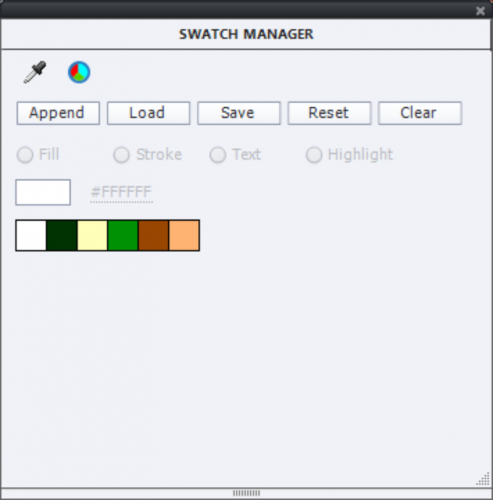
Allow me to remember some Captivate history. Before the introduction of themes as base for course design, Captivate had introduced a ‘Swatch Manager’ panel, similar to several other Adobe applications. I still see many users/trainers refer to that Manager instead of the Theme Colors palette. Personally for the past 6 years I showed that manager only to prove it is outdated, not useful in Captivate. Reason was already in the old posts : there is no link whatsoever between the Swatch manager and the Theme Colors. Even after repeated feature requests, this is still the case in version 11.5.
Creation of Color Scheme (5 colors)

To avoid confusion with Theme Colors in Captivate I prefer to use here the word ‘Color Scheme’ for the palette with 5 colors to which I refer in this part.

Classic color schemes consist of  5 colors, when you use one of the two applications provided by Adobe:

  1. Adobe Color,  a cloud-based (free) desktop application. You can open it using the CC app or with this link.  Years ago it had the name  'Adobe Kuler'. It gets regular updates, only recently that was the case. You can find inspiration in this site because lot of schemes are publicly available. Of course it is also possible to create custom schemes, either starting from one or more colors, or from an image. The schemes typically get saved to … one of your CC Libraries. For most Adobe applications that is fine but Captivate sadly has no access (yet?) to those libraries. As a workaround you could use  Captivate Draft (has access). However since the transfer from Draft to Captivate results automatically in a Fluid Boxes project, that workaround is not useful if you need to create non-responsive projects. 

    There are plenty of tutorials around for Adobe Color. Just one example: YouTube tutorial. If you have access to LinkedIn learning, you could also find courses.
    To get the scheme into a normal cptx project, you can save a color scheme as ASE file. For a reason explained later, not the ideal format for Captivate. You can make the color values visible in Color, but I miss a way to export them easily. When you open such a file in Notepad or similar, you could extract the RGB-codes but that is cumbersome. Or you can write them on a piece of paper.Hexadecimal is fine:
    For that  reason I prefer using a mobile app, around since quite a while:

  2. Adobe Capture: available for iPad and for Android (still beta, but functional). I have it installed on my iPad and my Android phone. Short tutorials included.  You have exactly the same functionality as with Adobe Color, but can also directly shoot an image as basis for your scheme. It can also be used to create shapes (SVG’s) and gradients, but I’ll leave that for another blog. Especially with the enhanced use of SVG's in 11.5, an interesting topic.

    The advantage of Capture is that you are not limited to saving the schemes to a Library, or save to ASE-file. You can export the scheme as ‘color values’ and print or send them by mail, or social media. Much more useful for Captivate. That functionality may be hidden somewhere in the desktop application, but so far couldn’t find it. You’ll get a txt file with all details of the colors, which is the ideal form for Captivate. Here a screenshot of such a file:
    Be sure: I will not explain the different ways of defining colors (although I would love to), Captivate accepts only RGB or HEX format. However,  in the Theme Colors palette I suspect that the HSB format is used to create the tints derived from the main colors.

Transfer Color Scheme into Captivate

Do NOT use Swatch Manager

If you have read my old blog post, you will know that it is possible to import an ASE-file in the Swatch Manager. Follow this workflow:

  • Clear all swatches
  • Click Append
  • Point to the ASE file.

In this screenshot you see the result of such a workflow:

You do not need the Swatch manager, your theme will be saved with Theme Colors palette. How can you get the colors in that Theme Colors palette? Only way  is to find the color value of each of these swatches and type them in the Theme Colors editing window. Not so user friendly. This explains my present topic title: NOT to use the Swatch Manager, although I am aware that many trainers and books still mention it. Personally they could take out the Swatch manager, it is a legacy feature.

Use Color Values

Starting from the txt file you got with all the color values, open the Theme Properties panel, and go into Edit mode. To enter a color of the theme, you need 4 steps:

  1. Copy the hexadecimal value for the txt file
  2. Open a color
  3. Go to the Color wheel
  4. Paste the value

Here is a screenshot illustrating the workflow:

It is still a cumbersome workflow,. Sorry, but this is due to the fact that ASE import is impossible in the Theme Colors palettes. 

The palette has now 5 main colors, you can add 5 more. Have a good look at the existing palette: do you have enough light and dark colors to provide contrasts? Often it is a good idea to add neutral colors as black, white grey. It is not really compulsory to have/use 10 colors (+tints). In all cases if you want to switch to another palette you have to be very careful. Here I think about branding the QSP project slides.

Some users/trainers recommend and use the color picker a lot. Not a good idea at all. Check it out: you will not always get the color you want when checking its value in the Color wheel. The Theme color palette is directly available (see screenshot below).

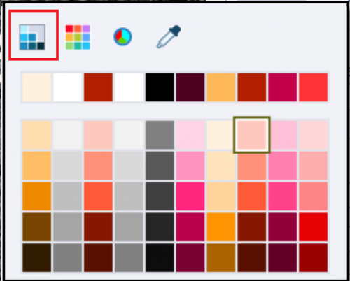
When your Theme colors palette is finished, always colors from that palette, never use the Swatch manager. It is the best guarantee to have consistent color management. Moreover, when using other Adobe applications for asset creation or editing (Photoshop, Illustrator) you can easily transfer the colors, using the ASE file or the color values. Even though you’ll use them in a Swatch panel, because that is the default workflow in that application It should be clear now that for Captivate colors are in the Theme Colors palette, not in the Swatch manager. If you open the color dialog, and the used color of the item is a Theme color, the dialog will open in its first state (highlighted in screenshot) automatically. Forget the Swatch manager (second state), the color wheel (third state) and the color picker (last state).

If you like this introduction, could write more detailed articles. Just let me know what you’d like? 

If you want make me happy, add your voice to my repeated request to make it easier to import a color scheme (from Color or Capture) to create a Theme Colors palette.

Theme mysteries?

Why?

This short blog is meant for newbies,  and is (again) due to what I hear/read on the forums, during (intermediate) training and consultancy job. Recently I tried to answer users in two threads concerning themes:

Change color in theme

Main Master Slide

The last one reports a serious bug in the Help documentation, the first one is more a lack in that documentation. It is a pity that the Help is not something you can cout on, a problem which is not new at all.  I started blogging about 10 years ago because of lacks and bugs in the Help.  An “amazing application which is Adobe Captivate” (a quote of a fellow ACP who is not present in this portal) deserves better!

I’ll try to answer those two questions here, and offer extra tips for Themes..

1. Theme Colors

Editing or developing a theme start with the colors which will be used consistently in that theme.  Each theme  packaged with Captivate  has a Theme Colors palette which is labeled with the same name as the theme.  As described in an old post, that palette has 10 colors + 5 extra tints for each color. It is always available in the Color Dialog box as first button, A well designed theme will use only those colors: backgrounds, fill and stroke colors, font color etc. Most Learning interactions have a button to apply the Theme Colors as well.

If you want to change one color in the palette, as asked in the mentioned forum thread:

  • Rename te original theme (see screenshot: orignal was WindSwept, I renamed to MyWind) in the box with the Palette
  • Click the Customize button: the 10 colors will appear in a dialog box.
  • Click the color you want to change, you can use the Swatches palette, or the Color Wheel (where you can type in the hexadecimal code of the color or the RGB numbers).
  • When finished, confirm using the Save button

Warning!

I already mentioned that the theme has to be well designed, only theme colors should have been used (is not always the case). Moreover no object style can be overridden (+ sign in the Style field) because for those the style will not change.

Another problem are the backgrounds. In the screenshot you see one of Captivate’s default themes, using several bluish colors (first three in the palette).  Those colors appear also in the backgrounds of several master slides: Title slide, Blank slide, etc You’ll find those backgrounds in the Library as…. images! That means they will not change automatically when ou change one of those bluish colors. That will only happen for the colors when they are used in object styles: fill of a shape, stroke of a shape etc….

As I wrote already multiple times: do not rely on names of the colors, they nave no meaning. In the theme mentioned above, the first color (Title) is never used for any title.

2. Main and other Master Slides

User did read this in the Help documentation, quote

The main master slide is the first slide in the Master Slide panel. The name of this slide is the same as the name of the theme. Objects and background color of this master slide appear on all other master slides. Each theme has one main master slide.”

This is indeed not fully correct, text obviously was never upgraded since version….6. First, second and last sentences are OK, but not the one with the bold text.

2.1 Color Main Master Slide

Have a look at this screenshot, where I show the Master Slide panel in front of the Main Master slide:

The name of the main master slide is indeed the name of the Theme (it is a custom theme based on WindSwept). The main master slide has a solid white color as background. There is NO global project background, the used background is ‘Custom’, and that means that you can have a solid color, a gradient, or a custom image/texture. Those are the same options as for a shape fill.

You will see that the label is not appearing in the Properties panel. You can add a label but it will be added to the original name (MyWindSwept), not replace it.

None of the daughter master slides has the white color as background. It may not be very clear, but Content02, Conter07, Conclusion and the Quizzing Master slides also have a solid color background, however it is light grey, not white. All master slides in this theme  use a  ‘Custom’ Background. Look at the Properties of the MyContent master slide

You see that the Background is Custom, which means that the color of the Main Master slide is not inherited. In this case the background is fille with an image from the Library.

To inherit the color of the Main Master slide background, the Background has to be set to ‘Master Slide Background’. Here is a screenshot of the Pearl theme (default theme if you didn’t change it), which has originally a gray scale Color palette. I changed the background of the Master Slide (which is also set to Custom) to a Solid color, light green. You see here the Properties panel of the Title master slide, which inherited that color. It could also have been a gradient or even an image/texture, would have been inherited as well for master slides set to ‘Master Slide Background’.

Conclusion

Summarizing about background color main master slide::

  1. Project Background is always an image which can be imported from the Library or from another location.

  2. Master Slide: where it will inherit the background of the Main Master slide. That can be the Project Background or a Custom Background (solid color, gradient, image/texture). It if is the Project Background, the result of ‘Master Slide’ and ‘Project Background’ is the same for a daughter master slide.

  3. Custom: which can be a solid color, a gradient or an image/texture.

It is clear that this sentence in the  Help text ‘background color of this main master slide appear on all other master slides’   is iwrong.

Warning: identical to the one under Theme Colors. If you use images as background, you’ll have to edit them separately when changing the Theme Colors palette, their colors will not change automatically.

2.2 Objects on Main Master slide

In the first screenshot you see two system variables on the main master slide: at bottom left the name of the author, bottom right the slide number. Those objects are not part of the background, since they have to be generated on runtime.  You could also have shape button (like a Next button) on the main master slide.

They will be inherited on master slides, which have the option ‘Show Main Master Slide Objects’ checked off. In the screenshot of the master slide ‘MyContent’ you see those objects appearing, and the option (highlighted) is checked. On the contrary, the Title master slide for that same theme is not showing those objects:

Usually in the packaged Captivate themes both Title master slide and Blank master slide will not show the Main Master slide objects. Quizzing master slides can show them, but in many instances it would be better to turn them off. Be careful with the Blank master slide: it is meant to be used for PPT import, and for Software simulations.  It is not recommended to have extra main master slides on them.  In the WindSwept theme the Blank master slide has an custom image background, which is very strange, not at all the case in most themes.

Conclusion: 

About the objects on the main master slide, the Help text “Objects …. of this master slide appear on all other master slides” is wrong.

Themes and project types

Be careful when editing/creating themes because you have 3 different types of projects and you need a theme of that type:

  • A non-responsive theme cannot be used for responsive projects with Fluid Boxes, nor for responsive projects with Breakpoint Views.

  • A responsive theme with fluid boxes (as are most included themes in Captivate, can be used for a non-responsive project, the fluid boxes will be ignored. However be careful: if you edit that theme and save it, you’ll not be able to use it for a responsive project anymore.

  • A responsive theme with Breakpoint views is not included with Captivate. You need to check  at least the object styles where text is used, because they need a font size for each breakpoint. You can use it for a non-responsive project, with the same restriction as above when saving the theme.

Some more links for Themes:

Themes and Templates

Fluid-boxes and master slides

Fluid Quiz Slides

Editing/Repairing Themes

Object Styles in Themes


Object Styles in a Theme

Intro

A while ago I posted a blog comparing the use of a Theme for consistent design of a project, with the older Template workflow (which is buggy in the recent versions):

What's in a Theme/Template?

I always start any project by the  creation of  a custom theme, starting mostly from the Blank theme (has the minimum amount of master slides needed for a theme). More recently I offered some tips in Themes Q&A

Due to my past as civil engineer, I see a theme as the structure of a building :

  1. Theme colors palette (see Theme Colors) is the foundation. Palette is independent on type of theme: whether iit is non-responsive, responsive with fluid boxes or with breakpoint views.
  2. Object styles, the topic of this blog are the pillars (vertical structural elements). For Breakpoint views you need slightly different styles for objects containing text.
  3. Master slides are the beams (horizontal structural elements). As in a building there is a lot of interaction between beams and pillars, together they are the structure You will often going back and forth with object styles while creating the master slides. Master slides depend on type of theme.
  4. Can be considered as optional: Recording defaults and Skin, depending on the project if you need them

Now you are ready to complete the building by filling in the walls, floors…. In Captivate we call them slides.and objects.

Captivate’s Object Styles

Contrary to a word processor, Captivate has no Text styles as you know from MS Word:   a bunch of paragraph styles (includes leading, space before and after paragraph, indents, bullets….) and word/character styles. I will post a future blog about the Object Style Manager where you’ll find all object styles used in Captivate’s themes. This blog will show some screenshots taken from the OSM, because you can see what is included in each style:

  • Caption style: includes indeed the font, font size, eventually attributes (bold, italic, light), font color and leading, alignment but also the type of caption, margins within the caption, and the transition type. In the themes packaged with Captivate the caption type is mostly set to transparent, but that was not always the case in older versions and doesn’t need to be always transparent. It comes closes to what you know as text styles, but still... transition is unknown in MS Word..
  • Text Entry Box style: has the formatting of the text but also the Fill (color and transparency) and Transition setting. You cannot edit the stroke, not included.
  • Button style: is more complicated, includes formatting of 3 Inbuilt states (Visited, 4th state is not included).  In the screenshot, which shows a so-called 'Default style' (see later)  you see that when you insert a button (Interactions, Button) in these settings a Transparent button will be inserted. For each state  the text formatting of the label is defined (in case of a Text or a Transparent, button. That setting will not appear for an Image button which cannot have a label. For the transparent button , style includes also the fill (here a gradient, with full opacity), stroke (color, width and style) and the corner radius. Formatting for the two other types is much more limited.
  • Smart Shape style: the most versatile object in Captivate can be a text container, hence the text formatting similar to captions. SInce it can also be used as a button, you can define the formatting of  the same InBuilt states as for the Transparent button. The corner radius is missing  You can choose a rounded rectangle as start for a shape button, and it has a yellow handle to edit the corner radius.

Terminology

It seems useful to list up some important terms concerning Captivate's Object Styles:

Default Style: Previous screenshots showed styles set as ‘Default style’. The checkbox to mark a style as default,  is automatically dimmed in that case.  When you insert an object of that type, it will automatically be inserted with that default style. The other styles, not marked as default style, can be used but you’ll have to change them manually after inserting the object. Here is an OSM  screenshot showing the presence of 3 possible TEB styles. In a previous screenshot I had the Yellow Fill set as default style, this is one of the other styles that can be used:

Overridden Style: If you edit some formatting after inserting an object with its default or manually changed style on the stage, a + sign will precede the style name as you can see in this screenshot (I changed the transparency of the fill and the font size). This is labeled as an ‘overridden style’.

Using overridden styles is considered bad practice in any style-based application. Why? It means that if you have to make changes later on, this object will not be touched anymore. Maybe your client/boss wants to have another font for the TEB? If this is the only TEB in the course, you can find it and edit this TEB in place, thus creating an overridden style. When dealing with more TEB’s it is much easier to edit the object style itself (see later). The edited style will be applied automatically to all TEB’s in the course, exception are those with an overridden style.

Style menu in Properties panel : many sections in the Properties panel have a so-called ‘hamburger’ (or hotdog) menu button. The Styles part has such a mneu button. In this screenshot you see the style menu expanded for theTEB with the overridden style (previous screenshot). You  can choose to create a New style (if I want to keep the default style for later to be inserted TEB’s) or Save the changes to the existing style if you want all the TEB’s in this project to have this edited style. There is also a Reset Style to revert to the original style in this menu.

The option Apply this style to…. is a bit confusing for this situation. Suppose you have another TEB using the Default TEB Blue Fill Style you can use ‘Apply this Style to all objects with Style Default TEB Blue Fill, but it will be the original Yellow style that will be applied, not the overridden style. I would prefer to save first the edited Yellow style.

Creation of a Custom Style

You can create a style in the Object Style Manager, as I will explain in a later blog,  but it is easier to use the ‘from example’ workflow. Step-by-step:

  1. Have a quick look at the Object Style Manager to see what is included in the style for your object type. I showed several screenshots above. It is not always clear from the Properties panel which features are included in the style. Example: Transition is included in some styles, not visible in the Properties panel but in the Timing Properties panel.

  2. Insert an object of that type on the stage. It will be inserted with the style set as Default style.

  3. Edit the features which you detected under 1. until you have the wanted look. That is easier to verify on the stage than with the tiny Preview window in the OSM..  Do not forget the states (Normal, Rollover, Down) for interactive objects. The style field (Properties) will show the +sign to indicate the overridden default style.

  4. Open the Style menu (hamburger) and choose the option ‘Create New Style’

  5. Give the style a significant name and confirm with OK

The style will appear in the Object Style Manager. But you don’t have to use the OSM for these actions

  • Set the style as Default style: is possible from the same Style Menu. Beware: for the example of the shape button, I would not set this as the default style because all shapes would take on that style. Really hope that we can have a default shape button style which is different from the default smart shape style in a future release.

  • Apply this style for all objects with a specific style. This is a workaround I sometimes use: for shape buttons I don’t use the default smart shape style, but one of the other styles (like a hint shape style if I don’t use it in the project) as long as I am not sure about the wanted button style. When I decide to create the definite style for all shape buttons, I can use the Apply this style to replace all those ‘hint’ shape styles by the new shape button style.

This problem only exists for shape buttons. Most other object types are not used for two different goals.

If you want to include features which are not part of the style in a quick way, use the duplicate functionality (CTRL-D). It will keep not only the same style in the copy, but all features, including eventually attached advanced actions.

Third element of your theme (structure) will be the master slides. Advantage of defining object styles before the master slides is that the inserted objects on the master slides will have the new default styles. That can save time.  Just one example: if you use shape buttons on master slides, you will not be able to use 'from example' workflow to create a style for those shape buttons. Reason: the State view cannot be opened when on a master slide, and you need to set up the states. For object styles with a Transition feature, you'll not be able to define them on the master slides neither, because you miss the Timing Properties panel for them.


4 Tips for Interactive Video

Intro

Interactive video is one of the new features in CP2019 (version 11). Over 10 years ago I did choose for Captivate because it had a lot of possibilities for interactivity in any cptx-project, Some users do think that 'interactive video' is the way to go, but to me it is a nice addition especially to make existing passive video a little bit more engaging. To avoid confusion, because already did see a lot of theoretical posts here that talk about normal interactive projects, not about interactive videos, I will continue to point at published cptx- projects as ‘interactive movies’ to show the difference with less interactive 'interactive video'. A standalone interactive video can be nice. However I honestly believe that the combination of interactive video slides with static interactive  slides in a cptx project is more powerful. Later on I will try to show with use cases what I mean. These tips are for 'interactive video' only. 

The first version of interactive video offers the possibility to insert:

  • Bookmarks: which out of the box can be used with the new command ‘Jump to bookmark’ to realize some branching often based on answer to  knowledge check slides.

  • Overlay content  slides: which appear at certain frames of the video on top of the video (can take up part of the screen, with  in a dimmed version of the video in the background). Most Captivate features can be used on those content slides, including advanced/shared actions.

  • Overlay Knowledge Check slides: which are based on the quizzing master slides.  Their appearance is the same as for the content overlay slides. Scored quiz slides are not possible.Contrary to the overlay Quiz slides in a 360 slide, these Knowledge Check slide do honor the used theme, their style can be full controlled. However, you cannot use scored Quiz slides in overlay (which is possible in a 360 slide). 

I will post lin the future a full description of the timeline of interactive video slides, and line up the differences with a normal video. An interactive video is always a slide (synchronized) video, never an event video. Consequence: interactive video is not possible in a fluid box which can only support event video, nor in the state of a multistate object.

In this blog post, I’ll offer some tips for using and enhancing the present functionality of interactive video. I posted an interactive video, as illustration in this article . Explanation of the tips is based on that example, I recommend to watch it if you didn't had time yet.

Tips

Tip 1: Prepare Master Slides for Overlay slides

Interactive video supports two types of Overlay slides; Content overlay slides and Knowledge Check  overlay slides. Both types can have the same size as the project size, but I prefer to have a smaller size for the overlay slides, so that the video itself remains visible in the background (dimmed). That can be done by using a duplicate of the Blank slide, on which you insert a shape with a smaller size than the slide, as background for your content or questions. As with normal content master slides, you can create as many as you need.  Have a look at the 3 master slides used for the example video mentioned before:

Next to the Blank master slide you see two content master slides :

  • OverlayTip: has a bubble shape, semi-transparent as background; the white space surrounding the shape will be ignored in the overlay and show the dimmed video.

  • OverlayWarn: has a different shape, less transparent and also white surrounding space.

The Quiz master slide which I used is a duplicate of the MCQ... master slide. It is necessary to use such a duplicate because you need all the embedded objects with their functionality. I used a rectangular shape as background, not transparent.
Beware: 

  1. use a non-responsive theme, because the Quizzing master slides in a Fluid Boxes theme have a setup with fluid boxes. 

  2. when creating a slides based on this master slide, you need to choose Knowledge Check slides, because normal Quiz slides cannot be used as Overlay slides for an interactive video.

After insertion of 5 overlay content slides and one KC slide, the Filmstrip looks like this (watch the hierarchy symbolized by the smaller size of the overlay slides, and by the icons at the bottom). :

Tip 2:  No fixed duration but a Close button

To me Interactivity means to offer as much control as possible to the learner. Some need more time, some want to proceed quicker. That is why I don’t like the fixed duration for Overlay content slides - which is the default setting.  No problem for the Knowledge Check slides,  the Submit button (with a pausing point at 1,5secs) takes care of keeping the slide available as long as wanted. Same would be the case for a slide with a D&D interaction or when using an interactive learning interaction.

For the static content slides however you need to pause the slide. To achieve that with minimum effort,  I used a shape button on the two master slides OverlayTip and OverlayWarn.:Look at this screenshot, where the Close button is at the bottom left:

For shape buttons on a master slide, the pausing point visible at the end of the Timeline is just an indicator. It will not appear in the Timing Properties because smart master objects have no timing. However, in the default setup, the shape button will pause at the end of each slide, hence the indicator. Look under the Actions tab for the shape button on the master slide. 

The action triggered by the Success event of that button is very simple: ‘Continue‘, to release the paused playhead. Since the pausing point is at the end of each overlay content slide, it will close immediately and the video continues.

Tip 3: Information button

That button is available for the full duration of the project, from the second (video) slide on. . I described the workflow in an older post, which dates from  CP2017: Interactive Video Buttons but is still valid for the present version. It is a simple click/reveal button, which pauses the video and has a close button. That close button takes care of hiding the information and releasing the video playhead.

Tip 4: Navigation Menu

With the Menu button the learner has a TOC to bookmarks available, to review only parts of the video. I described my workflow in this post.

The menu button has a custom state, which is used to close the menu (similar to the Pause/play button of the example video). It triggers this action:

The menu items are hyperlinks triggering advanced actions, which jump to the wanted bookmark and close the menu. As mentioned in the past, for some weird reason the option 'Execute Shared Action' is not available for hyperlinks, or I would have used a Shared action instead of duplicate Advanced actions.

Discover/Use Captivate's System variables - Part 1

Intro

Many years ago I did write out some tutorials explaining how to use variables. They are still available in Adobe's Knowledge base, but of course the screenshots are outdated since they were created in Captivate 4 and 5. Inspired by a recent thread in the forums, where it took a while to explain the use of variables, I want to write out some posts about Variables. This first article will focus on System variables and include a downloadable table which you can use as reference for them.

What is a Variable?

If you 'google' to find a definition of a variable you will get thousands of results. I would say that it is a container identified by a name and the content can change or be changed (is variable). It is a term used in programming languages and applications. It makes them more flexible, powerful. If you are a maths lover, compare this equation: 5 + 6 = 11 with  a + b = c. The a, b, c are variables, and the second equation allows you to create tons of small sums. The first equation uses 'literals', and you have only one sum.

Captivate has by default 6 categories of System variables and 2 automatically defined user variables. This article is only about system variables, they are available for your use in any project. All the system variables start with the characters 'cp'. Lables are, as usual in Captivate, unique for each variable and they are case sensitive. It may be confusing that the two  user variables,  created for each new project (cpQuizInfoStudentName and cpQuizInfoStudentID) also start with the same characters..  When you open the dialog box  Project, Variables the type 'user' is automatically selected, and you see only those 2 variables. Be sure: those are NO system variables, they are necessary for the workflow of Internal Server reporting, but can also be used with many LMS's. The certificate interaction uses  cpQuizInfoStudentName as well.


Categories of System Variables - table

You can download the table from this link.

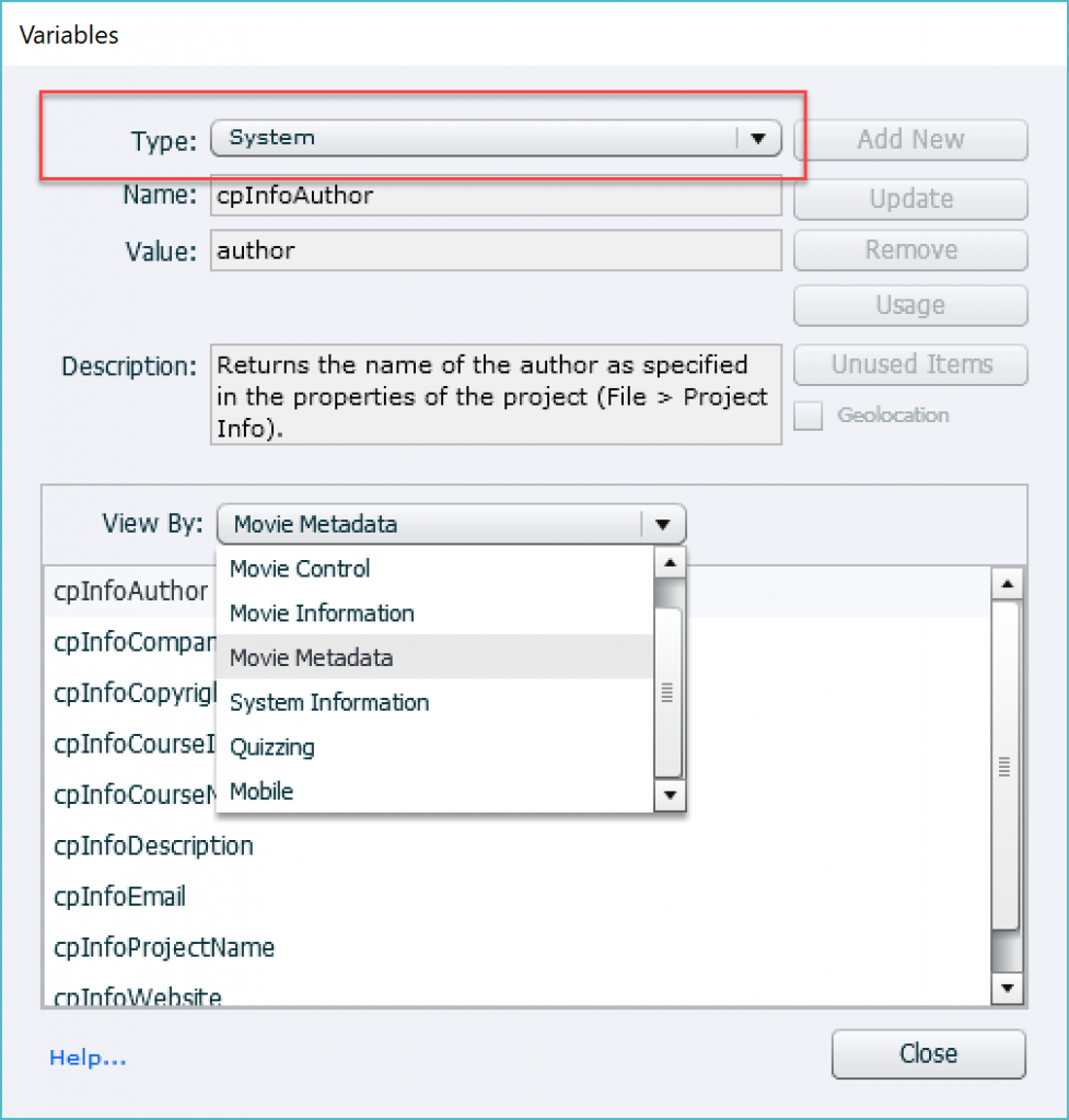
Captivate has 6 categories of system variables. To see them switch to System type in the dialog box:

  1. Movie control: is a very special category, which I will explain in a second post.  They offer a way to control your course by changing a system variable. This is not a normal behavior of variables, and can be considered as a, add-on to more complicated advanced/shared actions. These system variables are also different from those of category 2-5 because their value cannot be displayed in Captivate output.

  2. Movie Information: typical for this movie are the number of slides/frames, the speed (FPS), which frame/slide you are at this moment, etc… All variables of this category are read only. Their value can be used by the developer, they can be displayed in a Captivate file, during Preview and after publishing. I will point out some examples later on that could save you time while developing. In the table you’ll find some references as well.

  3. Movie Metadata: you can add metadata to a course, lot of it can be done using File, Project Info.  The behavior and usefulness are similar to the previous category. More tips below the examples below.

  4. System Information: data about present Date, Time, or which OS you are using if watching on a mobile device are in this category. Like 2-3 these variables are read only but can be used in the same way as those from Movie Information and Movie MetaData. Look in the table for examples.

  5. Quizzing: will not expand on this category because I already posted a blog about using Quizzing System variables

  6. Mobile: has only one system variable which is exceptional because it stores 3 numbers. It cannot be displayed in a course, only be used in actions.

This blog has focus on categories 2-3: they are very useful when you insert them in a course, either during debugging or to be able to show their value in output.  The workflow is the same for all variables that can be displayed (not category 1n nor 6).

Display a Variable

The best way to insert a variable to be displayed is this workflow:

  • Create a text container: either a caption or a shape on the slide
  • Go into edit mode, by double clicking or using the function key F2.
  • You’ll get the Character part in the Properties panel. Find tesee three buttons

    First button inserts a symbol, last button a hyperlink, but you need to click the second button to insert a Variable
  • Switch from the default User type, to System.
  • Choose a category under the dropdown list which has by default ‘All’ as choice
  • Select the wanted variable.
  • The ‘length’ is set by default to 50 characters, but you can edit this number. It is essential to do so if you expect the value to be greater than 50 characters (spaces included).
  • Confirm the insertion with the OK button.
  • While editing the variable will appear as in this first screenshot, between double $$. When previewing or after publishing that placeholder is replaced by the value (second screenshot)

Edit and Runtime view 

Some Examples

1. Slide counter: Slide X/Y

You use two system variables from the category Movie Information: cpInfoCurrentSlide and cpInfoSlideCount. Insert this text on the first slide of your course, and display it for the rest of the project.  Do not forget to check off ‘Always on top’ for the text container.

2. Author name in Theme

You will use the variable cpInfoAuthor from the category Movie Metadata. While creating a custom theme to be used in multiple courses, insert this variable in a text container on the main master slide. Master slides are part of the theme. Do not forget to warn your colleagues to fill in the fields under File, Project Info.

3. Course name in Theme

If you use a Title master slides, you can insert the variable cpInfoCourseName on that master slide as title. That variable also blelongs to the category Movie Metadata. Same comment: Project Info has to be defined by the developer. You can also use this variable in a footer of course.

4. Debugging Timeline

As I mentioned many times, understanding how to pause the timeline, and its consequences on objects is very important. I always recommend to insert a text container with the variable cpInfoCurrentFrame to watch pauses while Previewing the project. It is a variable from the category Movie information. You can see that I apply this recommendation myself in this movie:
Captivate’s Timeline

You’ll certainly find more examples. When used in combination with advanced or shared actions, lot more is possible but that is beyond the scope of this introduction.  One example: to show the elapsed time on the course (the real time spent, not the developer’s time based on slide durations), you cannot just insert the variable cpInfoElapsedTimeMS (from Movie Information) because it is defined in milliseconds. You need to do some simple maths to make it readable to the learner, and that means …. advanced action.

What Now?

Have a look at my next blog post, where you'll start to take control of your courses with the system variables of the Movie Control category. It is a good 'step up' to challenge your next goal: using advanced/shared actions.


Tips for 'Fluid' Quiz Slides

Intro

When publishing my first reflections on Fluid Boxes work flow versus Breakpoint View work flow I didn't mention my expectations for a smoother creation of Quiz slides using FB's. In my experience with responsive projects in previous versions, the most frustrating part were those (damned?) quiz slides. You are probably aware of the very strict rules to honor for quiz slides: need to be careful with 'embedded' objects which include functionality that can be broken. Styling quiz/score slides is tough even in normal (blank) projects and turns into a nightmare when having to do it for up to 5 breakpoint views. Every post I published about quizzes gets a lot of visitors. Many questions about quizzes are posted on the forums as well. This explains why I listed Quizzes as second most important stumbling block for Captivate users in this article.

The present post is not (yet) the promised upgraded version of the most popular article I ever wrote about questions, only a summary of tips I discovered while exploring the Fluid Boxes work flow for quiz slides (score slide will be subject of a later post). If you are new to Fluid Boxes, please take some time to read the articles posted by Zeeshan. Up till now, he published 3 but promised more on their way:

Using Fluid Boxes - Knowledge Facts 3

Quizzing Master Slides -Setup Fluid Boxes

All quiz slides, and the score slide, are based on a dedicated Master slide. Master slides have embedded objects (no individual timeline): Title, Question, Answer Area with Answers, buttons, feedback messages, progress indicator to mention some. The functionality of the quiz is embedded in those master slides (two-step Submit process, updating quizzing system variables, tracking attempts on question/quiz level, review and retake on score slide, etc). 

if you choose the Fluid Box work flow for a responsive project in Captivate 2017, the included themes will also have Fluid boxes on the quizzing master slides. There is one exception: the Likert master slide has no Fluid Boxes because Likert questions are not supported for responsive projects. Each theme needs to have at least a main master slide and 6 daughter master slides. Besides the Blank master slide which is essential for Software simulations and PPT-import, the other 5 daughter master slides are all about quizzes: MCQ,T/F,FIB,Sequence; Matching; Hotspot; (Likert = not supported in responsive); Result. 

The Setup for the quizzing master slides is common for all included Themes. I will explain extensively the most used master slide (MCQ, T/F...) and summarize only the differences for the other quizzing master slides. The score slide, which causes a lot of issues at this moment, will be explained in a future blog post, hoping that some of the problems will already have dissipated by a patch?

Setup Fluid Boxes in MCQ,T/F,FIB,Sequence Master slide

This is the most used master slide for sure. You have the Root fluid box (ID/ FB_8) containing 6 child Fluid Boxes. The ID's I mention for the Fluid boxes are from the master slides. Apparently the ID has to be unique as usual. When a quiz slide is created based on a master slide the ID will change: 3 characters will be inserted, referencing to the slide number. Example: FB_MS5_10 is the fluid box for a question based on the MCQ master slide, originally on slide 5. Beware: that ID will not change when you reorder the slides, which can make it quite confusing if you are used to reorder a lot. The Root fluid box (ID/ FB_8) is set up this way.

  • Flow: Vertical (has 6 child fluid boxes)
  • Wrap: Squeeze in a column , which means the child fluid boxes will never be rearranged. the 80% has no consequences, because stretch to fit is activated.
  • Horizontal Alignment: Center with Stretch to fit activated
  • Vertical Alignment: Space around
  • Padding: none, which means the space around has no effect on the child fluid boxes

The 6 child fluid boxes, from top to bottom,have this content and setup:

Title Fluid Box (ID: FB_9)

  • Flow: Horizontal - has mostly only one item, the title shape or caption
  • Wrap: Wrap to Next Row
  • Horizontal Alignment: Space around with 'Stretch to fit' activated
  • Vertical Alignment: Middle Align with 'Stretch to fit' activated
  • Padding: none, which means theoretically the title could touch the left and right side of the fluid box/slide. Personally I avoid that by adding a small horizontal padding (5-10px).

Tip: in theme 'Clear' the title overlaps with a design element. You can change the Vertical alignment to Bottom, and eventually increase the height of this first child fluid box to fix that. Another solution is to turn off that design element by unchecking the option 'Show Main Master Slide Objects.

Later on you'll see that the Advanced answers feedback messages will cover up this FB. Be careful when resizing and moving those messages. You could mess up the arrangement of this Title fluid box. Best way is to unlink those messages from the FB before touching them.

Question Fluid Box (ID: FB_10)

  • Flow: Horizontal (but has mostly only one item, the question shape or caption); text in that container is vertically aligned to top, to allow wrapping of longer text questins
  • Wrap: Wrap to Next Row
  • Horizontal Alignment: Space around with 'Stretch to fit' activated
  • Vertical Alignment: Middle Align with 'Stretch to fit' activated; for the inserted text placeholder text is aligned at the top; you could eventually change that to middle as well if you don't have long questions.
  • Padding:  50px horizontal (text placeholder is indented from left and right side of the slide/fluid box). If the focus is on smartphones, this padding could be too big (lot of smartphones have only a width of 320px).

Answers Fluid Box (ID: FB11)

  • Flow: Horizontal 
  • Wrap: Wrap to Next Row
  • Horizontal Alignment: Space around with 'Stretch to fit' activated
  • Vertical Alignment: Middle Align with 'Stretch to fit' activated; 
  • Padding:  50px horizontal (placeholder is indented from left and right side of the slide/fluid box); 20px vertical, the inserted answer area doesn't touch the top and bottom of the Fluid box. Comment about this being maybe too much for small screens is valid here as well.

Tips: the individual answer placeholders cannot be resized in the master slide (as is the case since CP6). They are designed to have only one line (contrary to the question placeholder which has space for multiple lines). If you have answers that are pretty long, font size will be decreased to squeeze the answer in the available space. If answers have different lengths, this could result in  different font size for the answers which is certainly not wanted (see image below). Here are two workarounds:

  1. If you don't mind the font size to be decrease but want the same font size for all the answers on a slide, check the option 'Enable Uniform Text Scaling' in the Properties panel for the slide. Eventually you can decrease the mininum font size which is set pretty high in 2017 (14p, minimum was 10p in previous versions).

  2. If you don't want to have the font decreased, but prefer text wrapping, you have to resize the individual answer containers on the side (not possible on the master slide). Start by increasing the container height for the longest answer, use the Align menu ro resize all to the same height, move them as far away from each other and Distribute vertically. Eventually you can decrease the vertical padding to have more space, and/or make this Fluid Box higher, which will decrease the height of the other boxes. This work flow is certainly necessary if you allow shuffling of the answers. Whenever the answer cannot fit in the container anymore the usual icon 'read more' will appear. 

In this image you'll see the result: Default setup on top, in the middle the result when 'Enable Uniform Text Scaling' is activated and at the bottom the same answers after manually resizing, moving and distributing vertically.

If your goal is a good experience on smartphones, I would recommend to reduce the padding in this Fluid box: 2x50px horizontally is a lot if the browser has only 320px in the width. 

Messages (ID: FB_15)

Since the Feedback messages are all in the same location, this had to be a Fluid Box of the Static type to allow overlapping objects. 

Issues: The usual problem for editing those messages remains: to edit a message you have to get all other messages out of the way, since they are embedded (they don't have a separate timeline). which means you cannot hide them on the stage  If the messages are the same on all quiz slides, you can edit them - before inserting quiz slides - in Preferences, Quiz, Default Labels (same for the button labels).
However if you want individual messages on the quiz slides themselves, I used to move each message to be able to edit the one below. Problem is that they will be moved over another Fluid box, and that means you cannot select them anymore.  I thought to use the Arrange menu but.... it is not available on quiz slides, only on the quizzing master slides! Not available in the right-click menu, dimmed in the Align toolbar. I tried to move the message in the scratch area (horizontally) for editing, but with the focus loss when zooming in, this is a real pain. Best way I detected (time consuming) is:

  • Edit the top most message in place (mostly Correct); since most of the messages are in a (semi) transparent shape/caption, increase the Alpha to cover up the other messages for editing.
  • Move the top message out of the way (I use shortcut keys like Shift-Up)
  • Edit the next message (same for Alpha as for the first one)
  • Move it also out of the way
  • Do not forget the Retry message if you have multiple attempts
  • When finished, use 'Reset Master Slide' to move all the messages back in their Fluid Box (FB_12). Since the object styles will be reset as well, the Alpha of the shapes/captions will be reset to the initial value. Beware: be careful not to override object styles in this case (indicated by + sign next to style name).

Here is some good news: if you choose multiple Failure messages (up to 3 still) because you have multiple attempts, those extra Failure messages (#2 and #3) will appear over the Answer FB. Contrary to messages moved over that box, these can be selected and edited easily. When previewing/publishing the slides all Failure messages will appear in the same location although being in different locations on the stage.

When using Advanced Answer options for MCQ, one correct answer, to show feedback messages for each answer, another problem appears.The text captions for the feedback are very small, and in the top right corner (over the Title Fluid Box), slightly off stage. Depending on the number of answers, some will appear lower, over the Answer Fluid Box.

Buttons Fluid Box (ID: FB_16)

  • Flow: Horizontal 
  • Wrap: Symmetrical, which is almost the same as One Row. Only when the number of buttons is even, will you have a rearrangement in two rows.
  • Horizontal Alignment: Space around with "Stretch to fit" not activated
  • Vertical Alignment: Middle Align with Stretch to fit not activated
  • Padding: 0px horizontal and 2px vertical

The maximum amount of buttons is 6: two Review navigation buttons, Clear, Back, Skip and Submit. If you are used never to insert Back and Skip buttons (which is my normal setup) you can better increase the font size (now 20px) to 28px or even 30px. If the option 'Enable Uniform Text Scaling' enabled, the label will rescale nicely and especially the small symbols << and << on the Review navigation buttons will be readable even on small screens. The buttons don't have the option 'Maintain aspect ratio' enabled, which means that the width only will be resized.

Progress indicator Fluid Box (ID: FB_17)

  • Flow: Horizontal 
  • Wrap: Wrap to next row.
  • Horizontal Alignment: Center Align "Stretch to fit" not activated
  • Vertical Alignment: Middle Align with Stretch to fit not activated
  • Padding: none

This fluid box has only one text caption with the progress indicator, in font size 12p which is smaller than the minimum font size. The text will never rescale even if 'Enable Uniform Text Scaling' is activated.

Setup Fluid Boxes in Matching Master slide

This master slide has one extra child Fluid box for the Column Titles. The Answer Fluid box is bit different. The ID's of the fluid boxes on this master slides are:

Root Fluid Box FB_18

Title Fluid Box FB_19

Question Fluid Box FB_20

Column Title Fluid Box FB_21

  • Flow: Horizontal, has two text placeholders for the column titles
  • Wrap: Squeeze in a row.
  • Horizontal Alignment: Center Align "Stretch to fit" not activated
  • Vertical Alignment: Middle Align with "Stretch to fit" not activated
  • Padding: none
  • Answer Fluid Box FB_22: this Fluid box has now two answer areas, linked by the line indicators
    Messages Fluid Box FB_23
    Button Fluid Box FB_24
    Progress Indicator Fluid Box FB_25

    Setup Fluid Boxes in Hotspot Master slide

    This master slide has only 5 child Fluid boxes, because Question and Answer are now in one box. Moreover it is a Static box, which means overlapping objects are possible. These are the ID's of the boxes:

    Root Fluid Box FB_26

    Title Fluid Box FB_27

    Question Fluid Box FB_28: static fluid box, will contain the image with the hotspots

    Messages Fluid Box FB_29
    Button Fluid Box FB_30
    Progress Indicator Fluid Box FB_31

    General tips

    I would recommend to activate the option 'Enable Uniform Text Scaling' for question slides in most circumstances. Since this option is at slide level, it will be valid for all Fluid boxes on the slide. 

    Avoid to override object styles, that is a general rule but even more necessary for quiz slides. It will happen that you want to reset the Master slide and in that case all styles will be reset to the Default style. If you want to change a style, do not hesitate to save the edits to those default styles. 

    Preview is never WYSIWYG certainly not when you are using the slider during preview to see the changes for other screen resolutions. Example: it often happens during Preview that the text in long answers (even when manually resized and redistributed) seem to be cut off for small screens; when published all looks mostly a lot better. 


    Challenges for Starters

    Intro

    Seven years ago I started blogging about Captivate (with version 4 - 5). Most subjects are more advanced, you'll find many use cases for advanced and shared actions. Meanwhile I also have spent thousands of hours on the Captivate forums, answering questions ans solving issues. Moreover I am busy as a Consultant and a Trainer (for Captivate and other Adobe applications), both in live and online classes. Based on the combination of those 'Captivate' experiences with my former career as college professor, I planned to write this article to line up the three most important Challenges for any Captivate developer, especially for newbies.  It doesn't matter whether you are developing software simulations, soft skills training, responsive or normal projects, if you master those Captivate features you'll feel more comfortable and save a lot of time. Bonus for me: less questions on the forums :). Imagine standing before this natural stone porch, in the middle of the most beautiful desert in the world. You got that Captivate license, but how to start, where to go?

    Challenge 1: Timeline

    Why?

    Captivate's Timeline is without any doubt one of the first stumbling blocks for Captivate newbies. This observation is based on the many problems popping up in forums and social media, on my experiences with consultancy and while offering basic training. It is not the normal timeline that you have in video applications, or in animation apps. It shows all objects at once on the stage, timeline is per slide, not for the whole project. Lot of reasons to be confused. Pausing the timeline by a command or by an interactive object is THE key to building interactivity in a Captivate course which is the main reason why you have chosen for an eLearning authoring tool instead of a video capturing tool. Understanding the Timeline and being able to control should be the first priority of any Captivate learning (and training) process. How do you stop this touareg caravan ;)?

    Resources

    Nothing can replace a live (or virtual) training for this challenge, but recently I published a sequence of 5 articles on my blog and in the eLearning Community to clarify this subject.  Here are the links, not in the 'logical' sequence which I used for publishing, but ranked by importance:

    Pausing the Timeline, why and how?

    Captivate Timeline(s) in cptx-file demystified

    Introduction

    Color codes and shortcut keys

    Captivate Timeline in cpvc (Video Demo)


    Challenge 2: Quiz

    Why?

    Captivate quiz and score slides have pretty strict rules. A lot of functionality is built in the quizzing and score master slides. The two-step Submit process, the priority of the embedded objects cause a lot of problems for starting Captivate users. That explains why every blog post I ever wrote about Quizzing is very popular. Most of them, even after many years, are still visited daily. The challenge here is about the normal Quiz slides, not custom Quiz slides that are created using standard objects, widgets, variables and advanced/shared actions. Those custom question slides are challenging for intermediate/advanced users (watch out for a later blog post for those users). Drag&Drop slides, used as Question slides can be included in the starter's challenge because they make a quiz more engaging.

    What a relief when the car transporting our food and cook was found after a long quest:

    Resources

    Some of these blog posts do need an update, although most of the information is still valid

    Question Question Slides - part 1     with the new Review buttons in Captivate 9 the confusion Next-Skip is gone

    Question Question Slides - part 2

    Knowledge Check Slides

    Drag&Drop tips

    Drag&Drop Captivate 9 - InBuilt states


    Challenge 3: Theme

    Why?

    It is one of the most hidden gems in Captivate: design of any project can be streamlined when using a custom Theme. A theme includes all object styles, master slides, skin and defaults for software simulations. All are based on a (custom) Theme colors palette, which can even be applied to most Learning Interactions. Creating or editing a theme before starting any project may seem a waste of time, but I guarantee that it will save a lot of time in the process. Small changes to the design, so often asked for, are done in minutes. In many circumstances a well-designed theme makes templates superfluous. 

    Architects of Macchu Picchu knew very well how to prepare 'design' of their city. Sorry for my adding the acronym TQT (Timeline, Quiz, Theme):

    Resources

    Here are some links to get you started with Themes and Theme colors:

    What's in a Theme/Template?

    Theme Colors


    Conclusion

    This was my personal view on the stumbling blocks for Captivate starting users. I am not pointing to any step-by-step work flow which may seem astonishing. My focus is on what is often causing the most frustrations for the so-called 'newbies', whatever their experience with other applications. As a college professor I used Flipped classes long time before the word was invented: do not spend valuable training time by explaining processes that can easily be found somewhere (videos). Students do not need a trainer for them. Spend class time by taking away obstructions that are slowing down the learning process.


    What's in a Theme - a Template?

    Intro

    When trying to help Captivate users, I often bump onto confusion between themes and templates. Same confusion can be found in many training schedules and books. There has been a lot of evolution in Captivate since versions, slowly but steadily. Those are not the big hype features that were emphasized everywhere. You know that I often appreciate more the hidden gems, which help any developer to save time and frustration. This article will explain how I am creating custom Themes, and also why I am using Templates a lot less than in earlier versions of Captivate (before version 6). 

    Theme versus Template

    The goal of a Captivate theme is to keep a consistent design throughout your project. It can be 'applied' to any project, even after creation. Although most themes will be created for a certain resolution, when designed carefully it is not necessary to apply it only to projects with the same resolution. When you apply a well designed theme to a project, the 'look' will change immediately and you'll not have to edit the design a lot afterwards. A theme is saved in a file with extension cptm. You can have themes for a normal (blank)  or for a responsive theme. Captivate 8 and 9 both have several themes in the box, most of them being responsive themes. They show up as thumbnails when you click on the Big Button 'Themes'. Those Captivate themes are stored in the Public Documents, under the subfolder 'Layouts' of the 'eLearning Assets', at the same level as the Theme Colors palettes.

    You can store your custom themes in this folder or wherever you want. The Thumbnails view (under Themes button) has a Browse button which allows you to navigate to any folder. I will mostly save a custom theme in the project folder when working for a client. But you see in the screenshot that I have a custom theme (CP8Theme) in the default folder. That folder is a copy of the original Layouts folder in the Gallery under the Captivate installation folder. If you ever have messed up one of the themes in the Public documents, you can restore it from that original folder. If you delete the whole Layouts folder in the Public documents, while Captivate is closed, on restarting the application a new copy of the original folder will be installed in the Public documents (see also my article: Keep your Customisation).

    To save a theme you need to use the Themes menu, not the big button 'Themes'. Use the option 'Save Theme as' if you started from an existing Captivate theme.

    template in Captivate has to be chosen before you create a project. You have to use the option File, New Project, Project from Template. This means that a template needs to have exact the same resolution as you want for your project. As for a theme, there is a difference between a template for a responsive, and one for a normal (blank) project. A template file has the extension cptl. When you create a project from a template, it will get the normal extension cptx. You can edit a template, and that will the only reason why you would save it again as a cptl. It is also possible to create a template from a normal cptx-file with the option 'File, Save As'. There is no 'reserved' folder for templates, Captivate has no included 'templates'. The term is often wrongly used: most Captivate 'templates' that you can find on the web, are just cptx-projects, not templates in the Captivate language. 

    When a template is saved, the used theme, preferences etc are saved with the template. However you can always apply another theme later on. 

    Components of a Theme

    It is rather important to know what exactly will be saved in a custom theme. . Remember: if you ever want to use that theme in a responsive project, be sure to create the theme in such a project. I will list up the components in the logical sequence to be followed when editing or creating a custom theme :

    1. Theme colors palette

    The start point for design consistency in a project is guaranteed by the consequent use of a Theme, which starts with the creation of a palette with 10 colors that will be used for object styles, master slides, skin, and within learning interactions. I have written some articles about the creation of a Theme colors palette:  Colorful 2015  and   Theme Colors. Beware: it is no longer possible to save an ASE file with Adobe Color (as described in the first article): that means that the Swatch Manager is not very useful anymore. My recommendation is to ignore the Swatch Manager and focus on the Theme Colors Palette, which is available in any Color Dialog box.
    When saving a theme (using the Themes menu), the used theme colors palette will be saved with the same name. In the mentioned articles you'll find a way to save a theme colors palette independently from a theme as well.

    2. Object Styles - Object Style Manager

    Most design-oriented applications have a work flow for creation and use of styles (Word, InDesign, Framemaker). All experts and good trainers will tell you to use styles, and to avoid overridden styles. Captivate is no exception in that world: it has a great Object Style Manager to be found under the Edit menu (or by using the the shortcut key SHIFT-F7). Object styles can be saved individually, have the extension cps, only useful in case you want to export/import such an individual style. In most use cases you'll save all the object styles necessary for a project in a custom theme, no need to export/import styles anymore as was the case before themes appeared in Captivate.

    If you are working on a responsive theme: first define the breakpoint views you want in the theme, before launching the Object Style Manager. In the styles you will be able to define the look for the breakpoints that are available in the project.
    Make some decisions about which objects you'll be using in the theme as well. Just an example: if you prefer using shapes instead of captions for feedback messages, capture messages etc you do not need to change all the caption styles. A similar situation exists for normal buttons vs shape buttons. 

    Some tips:

    • Use only colors from the palette defined in Step 1.
    • Do not hesitate to change one of the (grayed out) styles between brackets [Default...]. You can overwrite those styles, since you are working on a custom theme. Those are the styles that will be applied immediately when you insert an object. Another approach is to clone a style and set it as Default style. The problem is that you'll end up with tons of custom styles, which makes selecting the proper style in dropdown lists not easier. That is why I always change existing default styles. 
    • For buttons: the InBuilt states Rollover and Down are available together with Normal  for change in the OSM, do not forget to check/edit those states. This is valid for Text Buttons, Image Buttons and Transparent buttons.
    • For shapes: you cannot define a default style for text and another default style for buttons (too bad), but any shape style that you define should include InBuilt states (Normal, Rollover, Down) because any shape can be converted to a button.
    • Quizzing objects are in a separate category. Quiz buttons cannot be replaced by shape buttons (yet), but you can define an individual object style for each quiz button. Feedback captions can be replaced by shapes.
      Feedback captions and shapes not always use theme colors in the default Themes included with Captivate. Be careful: if you want to have consistent colors in your project, you'll need to check those styles.
    • It is not possible to define real Effects in an Object style. Only the 'old' Transitions can be defined.

    3. Master slides

    The Object styles defined in step 2 - at least the default styles - will immediately be applied to the objects on the Master slides.  If it doesn't look well, you can edit the object style and redefine it, while working on the objects in the Master slides (It can be done with the Properties panel). Be sure to make all added objects responsive (check all the breakpoint views) on the master slides. 
    Each theme needs at least 6 master slides (Blank Master slide, 4 Quiz master slides and a Score master slides), besides the main master slide, but you can create as many master slides as you want. You can add different type of placeholders on master slides, but be careful with the 5 master slides for Quiz: the embedded objects (without individual timeline) have a lot of functionality built in!

    Some tips

    • Use the new Rulers to assist you for designing master slides: Guides Rule!
    • If you ever will use the theme for software simulations: keep a real Blank master slide, because it is used both for software simulations and for PPT import. You don't want those slides covered up with other stuff.
    • Remember that shape buttons can be used on master slides, they can have actions. This can be a big time saver for custom buttons like the ones from these posts: Toggle buttons   and Replay slide button
    • Do not forget to label the master slides

    4. Skin

    Use the theme colors palette to customize the skin: playbar, borders and Table of Contents. You can even insert a logo on the TOC and eventually custom expand/collapse icons.

    5. Recording defaults

    This is only necessary for themes (also) to be used for software simulations. Although you have set up Default object styles in step 2, you still have to indicate which styles have to be used when capturing simulations. Just one example:
    • Create a default style for the highlight box in step 2: with a big bright red stroke and outer fill. Set it to display as default highlight box style.
    • Open Preferences, Recording, Defaults and check the default Highlight box style: it will still be set at the original default style in the original theme. Bit annoying, but it also allows you to save two different sets of object styles within a theme: one for normal slides, and one for software capture slides.

    Do not forget to save the theme (using the Themes menu)!


    Do you need a Template?

    I ask this question often everywhere: with all the design power and flexibility of a custom theme, why would you still need a template? Before themes existed, I used templates to be able to reuse variables and advanced actions (see: Template for reusing script). With the present version of Captivate, we have shared actions which I store in a separate project to be used as external library in any project. Variables, used in those shared actions, get copied automatically when the shared action is dragged into the Library of the new project.  When you copy an object, that triggers an advanced action, the action will be copied along when pasted into another project. 

    I used templates to have footnotes on each slide, pointing to the name of the project, showing the slide number and the total amont of slides. But now you can put them on master slides, using system variables or user variables that can be populated later on. 

    When would I use a template in Captivate 9? For courses that have several modules, where you want to have some slides in common, maybe have custom navigation/control buttons that cannot be put on the master slide, but need to be timed for the rest of the project. I would rarely use it to have placeholder slides, unless some team members need to have that assistance. Lot of placeholders have fixed object size, which can just be annoying. If you do have a lot of advanced actions (maybe variables), that cannot be replaced by shared actions, identical entries in Project Info, variables not included in shared actions: those would be situations where I would think about creating a template.


    Conclusion

    I hope this post did clarify the difference between a theme and a template. If you ever see somewhere my question 'Do you need a template', this will no longer be a mystery, right? 


    Colorful 2015 with Adobe Captivate

    Intro

    Color management in Adobe Captivate is improving slowly but steadily. Too bad: the Help documentation is not offering much explanation about color workflows at all. Have a look at what is explained about enhancements in Captivate 8.0.0 and 8.0.1 and tell me if this is sufficient? It is not for me, and I have a 25 years history as a Photoshop trainer. Do you know about the relationship between the Swatches panel, the Color schemes that appear in a lot of dialog boxes (not only for Fill/Stroke, but also in learning interactions), the Theme colors and the colors applied by default in the Object Style Manager, Master slides and Skin? Since many months I'm trying to figure out a good practice using the enhancements in Captivate 8. In previous versions I created color swatches in the scratch area (outside of the stage) to use with the color picker in order to achieve a consistent color use. That is at the least cumbersome compared with color management in applications like Photoshop and Illustrator.  Since October 2014 for those CC applications I'm able to create and use my Adobe Color palettes (ase), stored in the cloud, on any device and system. Adobe Color is installed on my tablets and smartphone, allowing to create color themes at any moment, often from a shapshot. That new sharing feature (Libraries) is not available (yet?) for Adobe Captivate. 

    In this first article I will try to find a way in the jungle of Captivate's color terminology and explain my present work flow to manage colors in a project by creating a custom theme color palette, starting with an 'ase' file created in Adobe Color. Let me know if you find this useful, please? In a second article focus will be on the use of Theme colors:  in object styles, master slides, skins and how to use them in (some) learning interactions (new in Captivate 8).

    Swatch Manager

    In the help you'll find a lot of screenshots where it is labeled 'Swatches'. But in CP8 title was changed to 'Swatch Manager'. I'm working in Expert UI, and have that panel always available in the right docking station, and make it floating when necessary. If you prefer the default newbie UI, there is a video in the Help that explains how you can open this panel: http://helpx.adobe.com/captivate/using/whats-new.html

    You'll see a pretty big color palette in the manager: 8 rows with 15 color/tints, starting with 12 gray tints. When you hover over a color you'll see its Hexadecimal code, top left. To see RGB or HSB codes of the existing colors is a lot more complicated. When a color is selected and you click on the color wheel on top, it is not the selected color that shows up (as I expected) but always the gray color #404040. There is no direct way to see other color codes of the swatches (like HSB, RGB), contrary to the Color Dialog box, that will show you the hexadecimal code and RGB (not HSB) when selecting a color and clicking on the Color Wheel.

    If an object is selected on the stage, you can use this Swatch Manager to apply one of the swatches as Fill or as Stroke color. For a text container (shape or caption),  in text editing mode, you can use it to apply a swatch as Text or Highlight (background color behind text) color. That is the goal of the radio buttons in the third row. Honestly, I never use that work flow, if you accidentally choose the wrong radio button, you'll change the Fill instead of the Stroke color. 

    The color picker and the color wheel (that will show HSB, RGB and hexadecimal code) on top (first row) are meant to add individual swatches. You will be asked to give a name to a new swatch, the default swatches have no names.

    TIP  

    When you customize the palette in the Swatch Manager, it becomes available for all open projects, it is not project specific. BUT!!! A big problem is that you cannot save the swatches with a project at all. Whenever you reopen the project, the default swatches palette will appear. Even when you put a PC in Sleep mode, after wake up the custom swatches palette has disappeared and you have to load it again. This is the main reason why I never use the Swatches Manager to edit colors in a project as I mentioned before, but use it only to define a Theme Colors palette. 

    The buttons in the second row are the most interesting!


    Captivate and Adobe Color

    I am using the Swatch manager to create a custom color palette, starting with an Adobe Color scheme. The buttons at the second row, from right to left, are:

    • Clear: this will delete all color swatches in the panel - not really necessary if you use Load

    • Reset: will revert to the original 8x15 palette, any added individual swatch, or loaded custom palette will be cleared

    • Save: the present palette will be saved in the Adobe Color format, extension 'ase' (Adobe Swatch Exchange). The default name will be the project name (you can change the name of course); this can be useful if you created a custom color palette in Captivate, for import into another Adobe applications like Photoshop.

    • Load: allows you to load an 'ase' file created in another Adobe application like Adobe Color. Captivate also accepts 'aco' (Adobe Color, have more information like Pantone color) files but I seldom use that palette format. You get a warning that the existing palette will be replaced by the new, but can still revert to the last option:

    • Append: will add color palette described by an ase or aco file to the existing colors.
    An Adobe Color ase file will typically have only 5 colors. There are a lot of tutorials around about using Adobe Color (formerly Kuler) and you can install it for free on any device or use it right from the web site. Just an example: you can create a color scheme from a logo in a quick way. The color scheme imported here into the Swatch Manager is based on my company's logo.
    Adobe Color is part of the Creative Cloud,with a CC subscription you'll have access to your personal color themes in the cloud from a lot of Adobe applications without having to save/load it using the ase file. Crossing my fingers that in the future this will also be possible for Captivate.

    In most cases, 5 colors will not be sufficient for Captivate to have a complete color scheme. The reason is that Theme color palettes in Captivate have 10 colors (see later). 

    Add swatches

    Second step in my work flow is to extend the palette to more colors (not necessary 10), that match the existing scheme. This can be done, swatch by swatch,  with the color picker or with the color wheel. Very often I will add white or a very light tint of one of the existing colors (using HSB), and a very dark one or black (if it is not yet present). A similar approach is used by the Tints in Theme colors (see later). Depending on the style chosen for the Adobe Color Theme, maybe you'll need a very contrasting color as well.
    In this screenshot you'll see how I used the green color to create a very bright one by keeping the Hue (H in HSB) but increasing the Brightness (B) to 100%. I added 3 swatches in total to have a palette with 8 colors.

    Color dialog box

    The color dialog box has 3 different looks, depending on the buttons on the top. The active look can be detected because that button will have a very thin black line surrounding it (maybe you'll have to get closer to the screen to see it). Those looks are, from left to right:

    • "Theme Colors": this look will appear by default if the selected object's Fill (or Stroke) has a default Object style using a Theme color, or if its color has been applied from the Theme Color palette.
      The top row shows the Theme colors (see later), under them you'll find 5 extra tints for each theme color. I regret that it is not possible to see the color code of any of the colors directly, it would be great if they showed up on hovering over a color (as hexadecimal code) or even better if you could have full info in the color wheel when clicking on a color. That is not the case (yet?). When exploring, I found that all tints have the same hue (in HSB), different Saturation and Brightness.
      At the bottom you'll find the colors as they were last used, last used color is the first in that sequence. Not that useful (my personal opinion). That row is dynamic, changes whenever you use another color.


    • "Swatches": this look will will appear by default if the selected object's Fill (or Stroke) color has been applied using the Swatches Manager.

      You will see the swatches in the upper section, and the 'last colors' palette at the bottom

    • "Color Wheel" will never show up by default. It allows you to choose a different color, either by picking it (click first on the right vertical bar to choose a hue, then you can change saturation and brightness in the big rectangle) or by entering a Hexadecimal or RGB code. Contrary to the dialog box for adding a swatch,  HSB is not available here. It also shows the last used colors.

    • "Color Picker" is the last button, no look on itself. It allows to pick a color somewhere outside of the dialog box. While moving the picker you'll see the Color Wheel showing up in the dialog box.

    A similar Color dialog box shows also up for the gradient stops when editing a Fill gradient, when customizing colors in the Theme Color palette, and in a reduced edition when customizing colors for Learning Interactions.

    Theme Colors 

    This new feature in Captivate 8 allows to change quickly the look of an existing theme (object styles, master slides, skin). Next week I will talk more extensively about those changes, because not every style will be edited automatically when applying a new palette of theme colors. My work flow, after having imported and extended a color scheme in the Swatch Manager, is to create a custom Theme color palette based on those colors. With that work flow, the color dialog box will always appear in its first look and provide besides the original Theme Colors a set of 5 extra tints for each theme color. Although there are by default 10 colors in such a palette, you can assign the same color more than once. More details about the use of the 10 colors will be provided in the next blog post.

    Contrary to the color schemes created with Adobe Color - ase file format - the Theme Colors are saved as XML files. You can find them in the Layouts Folder (under eLearning Assets in a public folder). The XML file is pointing to the RGB codes as you can see here:

    You could create a custom theme colors palette by creating new XML files, but you'll need a more exact number for RGB in that case then the one provided in Captivate. An alternative is this work flow:
    • Open the Themes list with the big button on the top bar

    • Click on the Theme Colors button, bottom right

    • Theme Colors dialog box, in its Basic view only gives you the dropdown list with color palettes


    • Click the Customize button (bottom right) to open a hidden part of the Theme Colors dialog box (with Basic button you can hide that part again)


    • You'll see the 10 colors, and clicking on a color will open the Color dialog box in its "Swatches" look. You can now customize that color. The names of the colors are not really relevant. Some colors are not really used in most themes but that is another story, which you'll discover in a later blog post.

    • When you are ready, first change the name of the theme: blue text 'White' can be edited; there is no Save as (at least I couldn't find it).

    • Click the Save button: custom Theme Colors palette is created and immediately applied to the present project. You'll find its definition in a XML file with the same name in the public folder I showed before.
    From now on you can use these theme colors for all editing. In the next blog post I'll explore how those colors are used in the current themes in Captivate, and how you can apply them to learning interactions. That post has now been published.

    Summary

    If you made it up till this paragraph, maybe you'll be confused by the Captivate Color Jungle?  Here is a short summary of the described work flow, to create Theme Colors from a custom Adobe Color scheme:
    1. Import the 'ase' file in the Swatch Manager, using the Load button

    2. Add more swatches to the default 5 colors of the scheme, using Color Wheel or Color picker in the Swatch Manager

    3. Save that extended scheme as an 'ase' file (because custom color schemes in Swatch Manager cannot be saved); that way you can reload it if necessary

    4. Open the Theme Colors dialog in its extended version, customize the 10 colors.

    5. Change the name of the default theme

    6. Save the custom Theme Colors palette

    Thanks for your patience, please leave your comments! May a lot of your wishes be fulfilled in 2015. I have some for Captivate as well :)