Version 11.5 Released!

Intro

If you are a fan of my blog, you know that usually I will not talk about a new release on the day it is released (although I have explored it in a beta test group). This time however I am so excited about this intermediate release. It has 'Voor elk wat wils' (interesting features for each developer whatever her/his level) to use a Flemish proverb. Do not expect a full review here, want to talk only about some of my preferred features which do appeal to my level of expertise. My apologies if you don't like that 'egocentric' approach. Be sure I will write more in the future, need some time to explore in-depth. As in the past, I may overlook some little gems which I couldn't dig out yet, will continue the search. You'll find three small gems at the end.

SVG as Button

It has been possible to fill a shape with an image since version 6. Converting the shape to a button was a much easier way to create nice buttons than the older workflow with Image buttons where you needed a graphics application (and had to create several images) Shape buttons also can have custom states besides the InBuilt states which they share with the old button types (Normal, Rolllover, Down, Visitedà. I never use those legacy types anymore, except for Quiz/Score slides where they cannot be used as embedded buttons.

However, those shape buttons have two lmitations:

  • You can only fill with Bitmap images, the much sleeker vector images like SVG were not possible.
  • The clickable area of the shape button is the bounding box, not the image itself.

WIth 11.5 it is possible to use SVG's directly as buttons without the need for a shape. And you can limit the clickable area to the image itself! This is a big step forward. File size of SVG's tends to be small compared with bitmap images, and moreover they are excellent for responsive project due to its vector nature.  The SVG has all the features of a shape button: can be used on master slides, can be timed for the rest of the project (not in Fluid Boxes), can be added to quiz and score slides as extra button. A setup with 3 buttons like this screenshot was not possible in previous versions, because the bounding boxes are overlapping: The screenshot may look blurry (has been converted to bitmap here) but the original SVG's in Captivate are really crisp. Size of the SVG: about 75Kb.

In the default setup, the clickable area is still the bounding box, you have to uncheck that option:

Bitmap images as Buttons

Similar to SVG's, they can now directly be used as button, no need to fill a shape button. Same for the clickable area: can be limited to the image. Depending on the type of images this extends the functionality which I explained in the first point. I dream of custom hotspot questions with partial scoring as described in this older post. Watch out for use cases in future blog posts. Not only are you now rid of the cumbersome workflow which I described here, but if you use a bitmap format which supports transparency (GIF, PNG24) you can uncheck the same feature to reduce the clickable area as for SVG'S.

Themes 

Themes have now a real Properties panel, which can access from the dialog box under the big button Themes. It is the only way, the panel is not to be found in the Windows menu, nor under the Themes menu (which still has to be used to save a customized theme). 
For sure will write more about this in the future, Themes is one of the underrated features, which I like to promote. I am really excited about the easy way to replace fonts (in ALL object stylesà. You can see in the screenshot that I replaced the original fonts in the Windswept theme by three different fonts (all Typekit). It is a smooth process: all object styles which have text related features will be updated for you. That can be a big time saver! I will have to edit this blog, where I complained about the cumbersome workflow to replace one font in a theme.
Of course, you need to avoid any overriding of object styles, and the danger that this will happen with the new copy/paste appearance feature is very real. I will talk about that new feature in another blog post, which will have some warning.
It is now possible to have slides with different themes in the same project, which will then lead to more than one Theme Colors palettes as well. I need some more exploration time to prepare a more complete overview of all the changes related to themes. Please, be patient.

Interactive video

One of the new features in the first release of CP2019 which I really like a lot. Not so much changes after this patch. It is interesting that you now are not only limited to videos on your system or from YouTube, but that you can also use Vimeo videos.

Another improvement is the possibility to insert a sequence of overlay slides (content or KC slides) on a frame of the video. 

VR project/360 slides

Several enhancements:

  • To the actions which can be triggered by hotspots the much asked for 'Play Video' was added.
  • The hotspots are now very customisable, black and white (minstrels?) are over and out: edit the colors as much as you want.
    Double click on the hotspot when inserted, select one of the paths and choose a color.
  • If you trigger Text, you will like the new formatting possibilities. Just a pity that Typekit fonts cannot be used....
  • No need to guess a duration for the popups anymore. Default setting is now a close button in the top right corner as you can see in the previous screenshot.

Small gems

Theme colors: in the screenshot of the new Themes panel inserted earlier, you see that the main theme colors are now named 'Color1.... Color10. This fits better the use of the colors, because in previous versions there was a Title color, which was not always used for titles, a Subtitle colors which was rarely used for subtitles etc...

Drag&Drop:  when selecting Infinite attempts in the Actions tab, the 'Failure action' will disappear, very logical since it will never happen in that situation. Regret however that the wording 'Failure' is still not replace by 'Last Attempt'. The action doesn't occur On Failure, but only at the last attempt, same as for quiz slides.

Preview menu: for non-responsive projects, the option 'Preview HTML5 in Browser (F11)' is now the first option which is great! The death of Flash player for all browsers will soon be a fact, every developer has to switch to HTML5 output. The other Preview methods are all still based on a temporary SWF output (except Play Slide, which is NOT a preview method). To check the future output only the mentioned Preview HTML5 in Browser should be used.

...sure will find more of those.

More...

This was not a complete overview at all. As I explained, need more time for features like the new Assets panel, use of Quick Start Projects, Branching setup, multiple themes, copy/paste appearance etc... 


Timeline for 360 slides (static/video)

Intro

A while ago I published several blogs and interactive movies (created with Captivate) about the ins and outs of the Timeline in Captivate, which is still the feature that causes most frustrations because of lack of understanding. With CP2019 some new features are added to that timeline, for the VR projects (360 slides) and for interactive video. Looks like it is time to explain those new features. This blog has focus on the timeline in 360 slides inserted in a non-responsive project.  Those slides are not able to have overlay Quiz slides as is possible in a full VR project. In a future post I will talk about the overlay Quiz slides and their timeline. I published recently a short post with some tips for a VR project.

360 slides

In a non-responsive project you can use the big button Slides to insert a slide which has a centered button to choose either a 360° static image or a 360° video. It is not possible to drag a 360 item to the slide from the Library, you need to use that button.

The 360 image is inserted as background, whereas a normal image inserted on a slide will have an individual timeline. In the Library you will see the images in the Background folder, and you have to use 'Find Background'.

Static 360 image

Editing a 360 slide is more limited than editing a normal slide. You will not have an Actions tab in the Properties panel, which means that you cannot use the On Enter/On Exit events for the slide. The Big Button Bar is mostly dimmed. There are only two assets that can have a timeline as you are used to:

  • Audio (under Media button) can be added as slide audio, which will have its timeline as expected under the slide timeline. Slide audio can be paused on a 360 slide by a hotspot, just like by any interactive object: you find the feature 'Stop Slide Audio' on the Options tab of the hotspots (including Character which is also inserted as hotspot). 
  • Label (under Text button): can be added, formatted and timed. It can be used for titles or for instructions that need to be available even if the playhead moves. Labels can be moved and will be 'distorted' to fit in the spherical image if necessary. IT is not possible to apply an effect on the labels. 

You will see 'Characters' available' under the Media button as well. However inserting a character will create a hotspot where the character is used as custom image.  It is not possible to resize the image, only the location. In most cases the characters will be very big due to that lack of editing.

The functionality of a 360 image is mainly in the so-called  'HOTSPOTS' to be inserted from the big button with that name. Referring to existing terminology, a hotspot is a new type of  interactive object similar to click boxes, (shape) buttons. However hotspots have a timeline with zero duration. In the timeline the visual representation of a hotspot is  either a half circle (brownish) if the hotspot is on the first frame of the slide, or a full circle (when on a later frame).  A selected hotspot has a blue circle surrounding the normal icon. In the following screenshot Hotspot2 is selected. The generic names were kept, but I have changed the stacking order by dragging hotspot 2 on top of Hotspot3.  Each hotspot is marked on the stage and after publishing by one of the SVG's, a custom image or a character as mentioned above. 

Default setting for each hotspot is to keep the timeline paused. For simple actions triggered by buttons in normal slides, the default setting is 'Continue playing the project'. For the hotspots, that setting is unchecked by default (if you trigger 'Play Audio' with a hotspot it will change as expected to Continue movie after audio is finished).

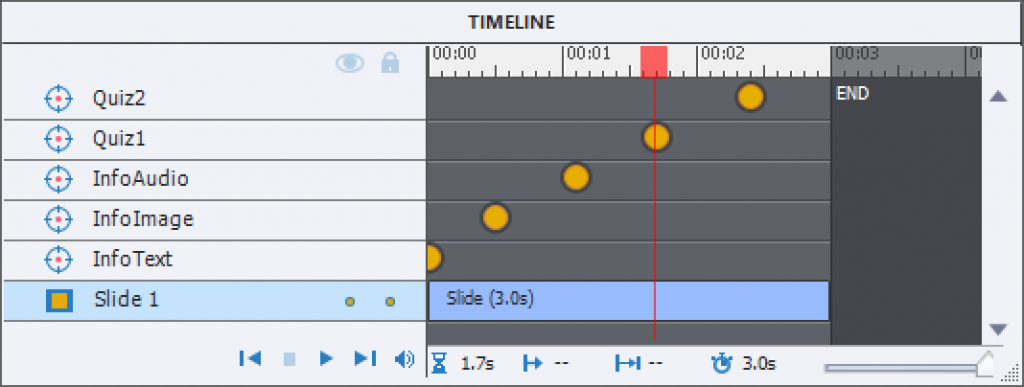
If you leave that option unchecked, the playhead will remain paused. If you use the option 'Explanatory', this means that all hotspots sharing that frame will be visible to the learner. In some cases you'll have only hotspots in the first frame (look at the sample project), but to avoid overload in a complicated image, you could choose to have groups of hotspots in a later frame. You see an example in the screenshot of the timeline inserted earlier: two hotspots are in the first frame and 3 more in frame 45(1,5secs). In that case you have to release the playhead, which can be done in two ways:

  1. By checking the option 'Continue playing the project', not so interesting if you have set up the image in 'Explanatory' mode where the earner can choose the sequence of clicking the hotspots. But it can be a solution in 'Guided' mode.
  2. By adding a hotspot with the action 'Continue', which is available in the dropdown list. That was the case for the screenshot above: it has a character hotspot (with attached audio) and a second Continue hotspot. One of the hotspot icons is clearly recognizable as a 'Play' icon.
  3. By showing the playbar (and maybe instruct the learner to click the Play button). Both commands 'Hide Playbar' and 'Show Playbar' are available to be triggered by a hotspot, but I was never able to use them using a hotspot in a slide. However you can show the playbar by default or use a slide event on a previous static slide.

As I explained in previous articles, the Timeline panel is also a Layers panel, defining the stack order of objects. In a 360 slides the stacking order is not always respected: even if you put a label on top of the stack, it will always be covered by any hotspot in the same location.

However for the hotspots it also has a third functionality, only for Guided mode. The stacking order will define the sequence in which the hotspots are presented to the user: starting from the bottom. In the example screenshot, at frame 45 hotspot 2 will be presented before hotspot 4.  You can change the order by switching the layers.

The dropdown list with actions to be triggered by the hotspots is more limited than for another interactive object. I already mentioned the command 'Continue' and its possible use. There are several navigation commands (previous, next slide, jump to slide and to last visited slide). There is the Exit and No Action commands which are self-explanatory. The most useful  commands are :

  • Display Image:  the image will be displayed for a duration specified in the Properties panel, Actions tab. You cannot choose an image in the Library, and once the image is imported it will not appear in the Images folder of the Library but in the Backround folder. Images folder only has the SVG icons of the used hotspots, whereas the SVG folder remains empty. Once the image has been displayed for the chosen duration,  the hotspot is converted to a visited state but remains active.  It is possible to click another hotspot before the duration of the first has ended. If you want all displayed assets to remain you have to choose a long duration for each of them.
  • Display Text: behaves the same way as Display image, you need to specify the duration. Very little formatting is possible, hence a suggestion in a previous blog post to replace Text b: y images with text in the wanted font and with controlled colors for the background. Hotspot will also have a visited state.
  • Play Audio: you can import a clip, or get it from the Library (they are stored in the Audio folder). No need to define a duration, once an audio clip is started it will continue playing unless you launch the command 'Stop Triggered Audio' from another hotspot.  If you have several hotspots using the Play Audio command and the learner clicks next hotspot before the first audio is finished, that first audio will automatically be stopped. That is the normal behavior of those audio clips as I explained in 'Pausing Timeline and Audio Clips'

360 Video slide

When you insert a 360 video in a 360 slide, it will end up in the correct folder 'Video' in the Library (under Media). I couldn't find a 'Find in Library' option. The video is represented the same way as a Video Demo slide or a FMR slide in a software simulation, it is merged into the background of the slide (mention for Usage in the Library uses also 'Background of slide).

Of course, the location of the playhead is now more important than for a 360 image. You can have an image where only the first frame is used to stack all the needed hotspots. However that makes no sense for a video, where movement is crucial. It will not be easy to create an engaging experience if the video has already audio embedded, because each hotspot will pause the video, which means also the embedded audio. Adding slide audio is possible the same as for a static 360 slide. However synchroniang will not be easy neither.  I need more exploration of this type of slides, but here are some first tips:

  • Try to offer audio only by using hotspots. I start the video with an inserted character that is set up to play audio, and have the video continue immediately after the audio is finished.
  • If you have only one hotspot in a frame, activate also the option 'Continue playing the project' whether you use Display Image/Text or Play Audio.
  • If you have more than one hotspot in the same location, and you use the Guided status, keep that setting only for the last hotspot to be presented. For the Explanatory status, you probably will need the playbar or a hotspot with the Continue command.

In the screenshot you see the video slide in its first frame. That frame has a character (selected) as hotspot which will play auio. The label indicates what the learner has to  do, but cannot be put on top of the character. When the audio is finished the video starts playing. It will pause again at 4.3 seconds which has two hotspots. The last hotspot has also Continue selected, status was here Guided.


Tips and Tricks for VR projects.

Intro

The ability to embed 360 images/video in an eLearning course is an enhancement (CP2019) which can be used in a lot of eLearning courses. As a civil engineer I think about the organisation of a construction site, detection of lack of safety in a building etc. The most recent release of Captivate allows to use those assets in two different type of projects: either a full VR project, or on individual slides in a normal cptx project.  You will have to use a normal (blank) project, as far as I know it is not possible in a responsive project with fluid boxes.

A VR project will be created right from the welcome screen. It can only have slides with a 360 Image or Video. All other Slide types except 360 slide are dimmed under the big button Slides, and the menu Insert is completely dimmed. You can add hotspots to trigger several possible actions,to the 360 slides, and overlay Question slides (not KC slides) where two types are possible: T/F and MCQ). The score slide is available but will not show up as overlay for the 360 slide, you’ll have to define a background slide for it.  I will offer some tips for the overlay Quiz slides, and for the Quiz Preferences.

If you use a 360 slide in a normal (blank) cptx-project (tp be inserted from the big button Slides), you’ll have the same hotspot functionality but will not be able to have overlay question slides. However you can use normal quiz slides and KC slides in the project. You’ll find more information about 260 slides in a future blog post.

In this article I will only talk about VR Projects using 360 Image slides. You can use multiple slides of that type, also 360 video slides, but no static slides.

VR project

Overlay Quiz slides – tips

Quiz Preferences

Quiz Preferences are available for the graded Overlay Quiz slides. But lot of the options are dimmed. Reporting setup is the same as in any other project with a quiz. In Settings options are limited to:

  • add the Clear button
  • add the Review navigation buttons if Review is allowed for the learner
  • hide or show the Score slide
  • allow Review

As usual for all Quizzes in Captivate, I strongly recommend to keep the Required field set to the default ‘Optional’ to avoid problems. You have same control over Quiz Result Messages and Quiz Review Messages as in any other quiz.

In Pass or Fail you can set the passing score (in % or points). But for the number of attempts on quiz level, you have only th choice between 1 or Infinite Attempts. In the last case you should activate the Retake button on the Score slide. There are no actions possible for Passing or Failing grade. No advanced actions are possible in a VR project, not only here for the Quiz, but also for the hotspots, for the On Enter events of any slide.

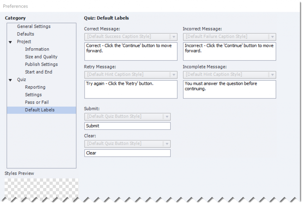
Default Labels are stripped out as you can see in this screenshot. It is impossible to change a style, only the Feedback messages, Clear and Submit button labels are available:

Styling the Quiz and Score slides

In a VR project, Themes are not available. Moreover the Object Style Manager cannot be used (as you did see in Quiz Preferences, Default Labels).  That seems to be a show stopper if you want to implement the font and colors that are part of your company’s default styles. However it is possible, manually,  to change the font and other features of the different text containers on quiz and score slides. You can even use Typekit fonts. It is of course more work than just applying another style, which is a pity. Maybe launch a feature request?

Score slide

Since the score slide needs a background slide, I tried to add slide audio to that background slide. However that audio played, but only for 1,5sec. As usual the pausing point for the sore slide (as for quiz slides) was set at 1,5secs.  You can move that pausing point and increase the length of the slide. But I did not succeed to make the audio play in combination with the score slide showing up.

Hotspots and actions

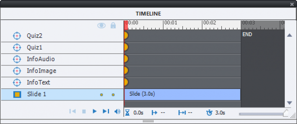
A hotspot is similar to a click box, but without a duration. It shows in the Timeline up as a brown circle. If you just add a number of hotspots without touching the timeline, they will all show up on the first frame of the slide, which means they’ll all be available to the learner at the same time, when in ‘Exploratory’ mode. If you prefer to use the ‘Guided’ mode, the sequence used to show a hotspot is following the stacking order: bottom hotspot shows up first, top hotspot last:

You can also scatter the hotspots over the timeline. But I will dedicate a separate article to the timelines of the 360 image and video slides in a near future:

Possible actions triggered by clicking hotspots are limited:

  • Show/Hide Playbar
  • Navigation commands: Go to Previous Slide, Go to Next Slide, Jump to Slide, Go to Last Visited Slide
  • No Action, Continue, Exit
  • Play Audio/Stop Triggered Audio.  There are more ways to have audio playing in a VR project:
    • You can add slide audio.  There is no way to pause that slide audio however with a custom action triggered by a hotspot (Pause is lacking in the commands). The only way to pause or mute the audio is with a playbar that has the appropriate buttons.
    • Hotspot audio: you can add audio to a hotspot like with any object. Be aware of the fact that this audio will play when the object becomes visible. This means that if the hotspots are all in the first frame, all audio clips start playing immediately (maybe even parallel with slide audio). If you scatter the hotspots, this is a way to combine a Display Text or Image command with audio. More info later in an article about the Timeline of a 360 Slide.
    • I mentioned above that adding
  • Display Text: the text will always be in Times New Roman, no way to change the style at all. The only possible workaround I see at this moment is to create an image with text in the appropriate font, size and color. Beware: you need to have a background for the text, or it will not show up. You also have to take care of eventual have a lower opacity, which means you will be limited to PNG  images, because JPEG doesn’t support transparency. Here is an example of a simple text image which I created in Word (text box, not simple text), captured with Snagit and lowered the opacity to 80% (this is not visible here, but shows well up in the VR project.:
  • Display Image: can also be combined with audio as explained before, and is probably the most versatile way of adding information. I mostly use it also for Text display?

Zooming?

The question has appeared a couple of times in the forums. It is not possible to zoom in on the 360 image, hoping this will make it in a future release. At this moment, a possible workaround is to take a 2D enlarged image and insert it on a hotspot that displays that image. Not the real stuff of course. I used it to display a full shot of my kitchen appliances in a 3D image of my kitchen.