Quiz Basics 5: Master slides

Intro

This is the fifth blog post about default Quizzing slides. Five of the compulsory master slides in any theme are linked with Quizzing. For this article the type of project is important: non-responsive project, responsive project with Fluid Boxes, Responsive project with Breakpoints. Same master slides are used for Pretest and Knowledge Check slides.

With CP2019 Overlay Knowledge Check slides are available in an Interactive Video. Those slides also use the master slides in the chosen theme. The Quiz slides in a VR project however cannot be formatted using master slides at this moment. You have to accept the default styling. It is possible to edit the text containers (mostly shapes) but that has to be done on each slide individually. I sincerely hope that formatting functionality will be extended in next versions.

As for the object styles, for master slides editing depends on the type of project: non-responsive (can be published as scalable HTML output), responsive with Fluid boxes, responsive with Breakpoints. Between those types master slides are not interchangeable.

Non-responsive project

In the previous posts Terminology and Submit Process I explained the meaning of Embedded Objects on the quizzing master slides as being objects without an individual Timeline. You find them on the four master slides for Quizzes. They appear as placeholder on inserted Quiz slides. Each of them is using a dedicated Object style from the Quizzing Category (see Object Style Manager). As I wrote in Preferences it is a bit confusing that for the included Captivate themes, the default feedback messages use shapes as container, not captions which means you cannot change them directly for the Default Labels dialog box where only caption styles are available.

The background of the quizzing master slides can be set up like any other master slide. Since they have a lot of placeholder objects (mostly shapes) which can be styled individually you will mostly see either:

  • Master Slide Background: this means that the background of the Main Master slide is inherited. Often that will be a solid color, a gradient or eventually a not invasive texture image.
  • Custom: if the Main Master slide background is not suited, you need to use this option where you’ll find again a solid color, a gradient or a texture.

However feel free to use an image as background. Or you can override the background on individual quiz slides by inserting an image. Since the embedded objects are always on top of the stack, that image will automatically  be below the quiz objects.

Tips

  1. Use Guides (see Guides Rule) if you want to edit the layout of the placeholders, if you need a Matching, Hotspot and/or Likert question for your course to have a consistent design with the more common MCQ,T/F… questions sharing the same master slide.
  2. If you have a dark background, you can have issues with Matching slides: the link lines between the two columns are black, not possible to edit that color. Moreover since you probably would want a light color for text, the dropdown list will be unreadable. Solution is to create a duplicate master slide, where you put a light shape under Answer Area, and change font color to a dark color (new object style).
  3. If you expect to have multiline answers, the Answer area can be too small. It is not possible to edit the individual answer shapes n the master slides (which is a pity), that has to be done on the quiz slides. Increasing the height of the Answer area will make the workflow easier. Decrease the height of the other placeholders. That is possible for the Question title, the Feedback messages. Be careful with the Question placeholder: questions can also need more than one line. Eventually you can move the Progress indicator next to the Question title, to free up more space for the Answer Area.
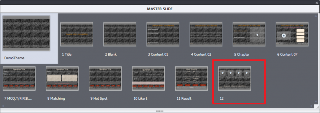
  4. If you want some quiz slides including an image, create another duplicate of the master slide. Decrease the width of the Answer area and insert an image placeholder as shown in this screenshot:
  5. In any custom theme I create, I will always edit the results master slide: drag the Retake button over the Review button. It will avoid that the learner is confused when quiz is set up with multiple attempts, and Review is enabled. Design of Captivate’s quiz means that all attempts are considered to be exhausted  if the learner clicks the Review button. Moving that button will not cause any problems. If there is only one attempt, the Retake button is not appearing, and the Review button is visible immediately. If there is no Review functionality, no problem neither.
    If you want to override the design, and allow Review before a Retake, but without showing the correct answers, you could use the workflow described in Review before Retake.

Responsive project – Fluid Boxes

An in-depth exploration of the quizzing master slides in the Fluid Boxes themes is described in this article.

Every embedded object is in its (normal) fluid box, with the exception of the feedback messages sharing a static fluid box.  That is necessary to save space, they are stacked which is not possible in a normal fluid box.

Some of the tips mentioned for non-responsive projects are also valid for this type of project:

  1. Use of Guides is strongly recommended. For responsive projects rulers are in %. I know that CP2019 allows to use Position Properties panel for fluid boxes, but I find setting up a grid with Guides much quicker.
  2. For Matching questions using a dark background: fill the fluid box of the Answer area with a lighter (semi-transparent) color, and change the font color to avoid the mentioned problems. Do this on a duplicate master slide (MCA, T/F…).
  3. In the article mentioned above, I described the workflow for long answers in the Answer area. Instead of resizing the placeholders you need to resize the fluid boxes.
  4. For the duplicate master slide allowing adding an image, you’ll have create two fluid boxes in the present fluid box for the Answer area. That means taking out first the content by unlocking from Fluid box, dragging it into the scratch area. Create two horizontal child fluid boxes. Relock the answer area to FB and redrag it into one of the new child fluid boxes. You can insert a placeholder in the second child fluid box.
  5. The easy workflow described for a non-responsive project is not possible. The buttons are in a normal fluid box, stacking is not possible. Here a real tweak is needed. Tweaks and special situations will be explained in later blog posts.

Responsive project with Breakpoints

I have to confess that the toughest part of this type of projects is getting the quiz slides behave properly on all mobile devices. Although in some cases I prefer this type of responsive project for content slides because of the real freedom of design allowing to reduce layouts for small screens to the bare minimum by replacing items, quiz slides are a real pain.

It is very important to set up the object styles properly, especially those where fonts are included. Full explanation is to be found in ‘Object styles for Responsive Projects’.

The problem has become bigger, because Captivate no longer has included themes for Breakpoints as was the case until CP9. I still continue to use those themes, especially for the Quizzing master slides. At least they provide a start for setting up the responsiveness. For the rest a lot of testing (trial and error) is needed.

Most of the tips mentioned for non-responsive projects are fully valid, taken into account that you need to use the Position Properties to make all items responsive. No limitations however as for Fluid boxes: stacking is allowed, grouping is allowed etc… You can drag the Review button under the Retake button.

Next?

This fifth post was supposed to be the last one in the sequence about default quiz slides. However I will add another one explaining partial scores and penalties, after seeing several questions in the social media. You should now have a pretty complete overview now. Next articles will be about tweaking the default design (submit process, use of feedback images, use of audio…) and special situations like Branch aware, Pretest setup, Remediation. custom quiz slides, …

I also strongly recommend to get acquainted with the category 'Quizzing' of the system variables.
Quiz basics 1: Terminology

Why?

Since 2008 I have been blogging regularly about Captivate. The most visited post is a rather old one date October 2011. It is labeled  ‘Question Question Slides‘ and believe me, still has daily views.  It is the reason why  I consider Quizzes as one of the three main topics for any Newbie in ‘Three Skills to Acquire‘.  Since 2011 quite a lot has changed in Captivate, although the basic design of quizzes is still the same.  Many peers have asked me in the past to publish a book about Quizzes  (could easily fill a book if it included custom questions). From what I feel in the community, a book is not at all the appropriate medium anymore. However I want to publish a sequence of articles about Quizzes, as I did for the Timeline (another stumbling block), with up-to-date information. It is important to understand the terminology, which is a problem when trying to answer questions everywhere: there is no ‘official’ glossary for Captivate and lot of terms are used in a haphazard way. To avoid any misunderstanding in future posts about Quizzes, I want to start with explanation of the different terms concerning quizzes. Some are ‘official’ also to be found in the Help documentation, some are terms I am using as well.

Drag&Drop will not be included in this sequence of articles, it is not following all the rules of the normal question types

Quiz Menu

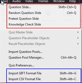
Although you can insert Question slides and Knowledge Check Slides from the big button Slides, the place to be is the Quiz menu:

The red box shows the 4 possible choices:

Question slide

Is based on a dedicated Quizzing Master slide, depending on the type: True/False, Multiple Choice, Fill-in-the-Blank, Short Answer and Sequence have the same master slide, Matching, Hotspot and Likert have each an individual master slide. Beware: Likert type cannot be used in a responsive project, whether Fluid Boxes or Breakpoint workflow is used.

An inserted Question slide will have these settings by default (except Likert which is set to Survey):

  • Graded
  • 10p score, no penalty
  • 1 attempt
  • actions Success/Last Attempt are set to Continue
  • pausing point at 1.5 secs
  • 1 Failure message
  • Reporting turned on
  • Included in Quiz Total

Most settings can be changed. Only one type has the possibility for partial scoring: MCQ with multiple correct answers. MCQ with one correct answer has the functionality of Advanced Answers (message/action). If number of attempts is higher than 1, you can have up to 3 Failure messages.

Question slides have a dedicated  category of system variables, read-only. More information in this post

You can use the On Enter event of a question slide to trigger a custom action, but not the On Exit event. Question slides, like interactive objects have a Success and a Last Attempt event which can be used for actions.

Random Question Slide

Is a placeholder slide, which will be replaced by a random question from a question pool. Pool questions are based on the same quizzing master slides as normal question slides. On Enter event can be used on slides in the pool, not on the placeholder slide. The same quizzing system variables are used for random question slides as for the normal question slides.

You find the option for Random slides also in the dialog box ‘Insert Question’ which you open with Quiz, Question slide.

More details about this type in Random Questions, Do’s and Don’ts

Pretest Question Slide

Slides are based on the same master slides as the normal question slides. They have a special bunch of system variables, will not be included in the variables used for question and random slides. The Pretest slides have only one goal: to have navigation after the pretest based on the results. For that reason you set up a Pretest action. These special slides have limitations:

  • They need to appear in sequence at the start of the course.
  • All free navigation will be disabled: both by playbar and by Table of Contents (reason is that learner cannot go back to the Pretest slides).

Knowledge Check Slide

This new type was introduced with Captivate 9.  Likert questions nor random questions can be used. They are not scored, will not be present in the quizzing system variables nor in Review/Retake. They can be recognized by a special icon in the Filmstrip. This is the default setup:

  • Not graded
  • No score, no penalty, partial scoring in MCQ impossible
  • Infinite attempts
  • action Success is set to Continue
  • pausing point at 1.5 secs
  • No Failure message
  • No Reporting

Some featured can be changed: you can limit the attempts and will then get a Last Attempt action. You can turn on Failure message(s).

A complete comparison with normal quiz slides can be found in Tips for Knowledge Slides

TIPS:

  1. It is possible to copy/paste normal question slides in a question pool  to reuse them as random slides.
  2. It is possible to copy/paste a question slide from a pool as a normal question slide in a project.
  3. It is impossible to convert a normal quiz slide to a Knowledge Check slide nor to a Pretest slide.
  4. It is impossible to convert a Knowledge Check slide to a normal quiz slide nor to a Pretest slide.
  5. It is not possible to convert a Pretest slide to a normal question slide, nor to a KC or random slide.

PS: KC slides can also be used as Overlay slides in an Interactive video. You’ll find more details in Tips for Interactive Video.

Question slides can be used in 360 slides and VR projects. Styling of those slides is limited at this moment, cannot be based on a custom theme.

Import GIFT file

Instead of adding the question/answers in the individual slides, Captivate allows two alternatives, one of them being GIFT import. Moodle developed this ‘language’, you can find the full documentation here. Use a text editor which allows to publish to non-formatted txt files. This file can be used to insert all types of questions in Captivate with the exception of Likert, Hotspot and Sequence types. There are also workflows which start from an Excel file.

Lot of features are supported: for MCQ with multiple correct answers you can set up partial scoring, you can add feedback messages etc.

GIFT import is possible for normal question slides, for slides in a question pool. It is NOT possible for Pretest slides, nor for Knowledge Check Slides.

Especially when dealing with big amounts of question slides, and/or many pools I like to keep the questions ready in a GIFT file as backup and for eventual editing

Import CSV file

New import workflow appeared with CP2019: use of an Excel template which will create a CSV file that can be imported. You’ll need two files which are stored in the GalleryQuiz under the installation folder of Captivate. I published a small article about this workflow. Using the macros in CSVQuestionsCreationMacro file is pretty straightforward and documented in this tutorial by Dr. Pooja Jaisingh.  Same question slides are supported as for GIFT import (T/F, MCQ, Matching, FIB and Short Answer). There are some limitations, reason why I still stick to the GIFT alternative:

  • You cannot indicate partial scoring for MCQ with multiple correct answers
  • CSV file not really suited as backup, since you cannot edit a question once it has been added to the CSV sheet
  • Got some errors when trying CSV editing with importing to an Excel file, and exporting to CSV. File was not accepted by Captivate.

Quizzing Master Slides

All types of question slides described above are using the Quizzing Master slides. Each theme in Captivate needs at least 6 master slides, whether it is a blank (non-responsive) project, a Fluid Boxes (responsive) or a Breakpoint Views (responsive) project. Blank master slide is always required (for PPT import an software simulations), 4 question master slides and one score master slide. The Blank theme used to show this minimum set, but for some reason in CP2019 a Title master slide was added (?) which I deleted in this screenshot.

I will focus on editing those quizzing master slides in a later article. In this introduction I just want to point out some very special aspects of those slides.

Timelines

The timeline of the quizzing master slides, and the result master slide is very simple: you see only the slide timeline. There are no placeholders, no object timelines like you normally find  on content master slides. However when you look at the content of those master slides, you see a lot of objects!

You don’t see any pausing point on the master slides, not for the questions, nor for the score master. However when you insert a question slide (any type) it gets automatically a pausing point at 1.5secs. Same for the Score slide.

When you select an object on the master slide (button, a feedback, Question, Answer area) they still don’t show a timeline. Their properties will appear. I will point to the objects in a question (master) slide or a score (master) slide as:

Embedded Objects

My definition: objects that do not have an individual timeline, not on the master slide nor on the slide itself. Those objects have functionality built in, which control the workflow for the slide. I talk about the Submit process (see future article), the appearance of messages, the inclusion in quizzing system variables etc. Just one tip: be careful when dealing with Embedded objects.

Those objects have absolute priority in the z-order, also known as stacking order. They will always appear on top of extra inserted custom objects.

Puzzling: normally the only interactive object allowed on a master slide is a shape converted to a shape button. However on the quizzing and score master slides the used buttons are all Transparent buttons.

When creating a question slide or a score slide, not all objects will appear. It depends on the setup in Quiz Preferences (see later article), the Quiz Properties of the slide and… on the situation. The Review Navigation buttons (with the double arrows) on quiz slides will only appear during Review. The Retake button on the score slide can only appear if more than one Attempt on Quiz level is allowed.

Next?

So much has to be told about Quizzing, always more than I expected. In future posts I will try to write about:

  • Two-step Submit process
  • Tweaking/customizing that process
  • How to handle Embedded Objects
  • Quiz Preferences
  • Editing the Master slides for quizzing
  • (Setting up the Pretest condition)
  • Audio on Quiz slides
  • Custom objects on quiz/score slide
  • Custom score slide
  • Scoring for KC slides
  • ….

I am sure this list is not complete. If you want to add more ideas, feel free to comment.

Quiz/Score slides in Quick Start Projects - part 2: Responsive projects

Intro

Recently I posted about using Quiz slides as ready-to-go slides from the available Quick Start projects, in their non-responsive version. The conclusion was not very positive, because most themes didn’t include the necessary master slides to allow you to create all types of quiz slides with the theme look/design. For the Score slides the situation is even worse, because they cannot be inserted as ready-to-go slide, they will appear automatically after insertion of a quiz slide, or after setting up the Quiz Preferences to show a score slide (for scored objects). If the Results master slide has not been created in a theme (as was the case for multiple QSPs) you’ll not be able to get them in your project, unless by using the long workaround I explained in that post.

This second part refers to the responsive versions of the Quick Start Projects. It is a relief to see that the situation is better for the used themes. You will be able to download a table, with the same indications as in the first post.

Table

The number of Quick Start Project with a responsive (fluid boxes) set up is more limited than for the non-responsive projects. You can find a similar overview like the one provided for the non-responsive projects in this downloadable table:

QuizQSPResp

Items marked in red need some explanation, have a look at the Tips below

TIPS

Similar to the non-responsive projects, there are QSPs (Quick Start Project) with a fully developed theme, including dedicated master slides for the score slide and the quiz slides. That group includes the projects Safety, Wellbeing and Alliance. A second group (Earth, Rhapsody and Wired) has master slides but only partially similar to the example slides. Mostly images are lacking, but since you are dealing now with Fluid Boxes, it will need some knowledge of that workflow to reproduce the look of the quiz and score slides.

The project Aspire  has several example MCQ slides, only one of them is using a dedicated master slide. It has also an incomplete Results master slide. The project League has incomplete quiz master slides.

The situation for the score slide is different. As told before, you cannot insert a score slide as a standalone slide. It will be inserted automatically after you have inserted a question slide of the same theme, or when you select the option ‘Show score at the end of the Quiz’ in Quiz Preferences, Settings.

The tips for the question slides, mentioned in the previous post, are valid here as well. For that reason, focus in the TIPS is only on the Results (score) slide. If you want to learn more about the Fluid Boxes layout for question slides, and about editing the feedback messages, have a look at:

Tips for Fluid Boxes quiz slides

Feedback Messages in Fluid Boxes question slides

Score slide

Three groups of Quick Start Projects, each with a different approach.

Group 1: Safety, Wellbeing, Alliance

These projects have a Results master slide consistent with the global Theme design. The content (inserted fields) is similar to Results slides in all themes packaged with Captivate. That means that you can use choose the to be inserted fields, using Quiz Preferences,  Settings, button ‘Quiz result messages. The screenshot below shows an example, where two fields (Max. Score and Attempts) have been unchecked. The Fluid boxes layout will adapt to those changes.

No problems with this group at all. When you insert any question slide from one of these QSPs the results slide will automatically be inserted and have the design of the master slide of that same QSP.

If you insert a question slide directly (using Quiz menu) the theme of the project will have priority and the project Results master slide will be used. This is due to the fact that version 11.5 supports the use of multiple themes.

Group 2: Aspire and Rhapsody

Those projects have two Results slides. This screenshot shows them for Aspire:

The first master slide (Result) is the default master slide used when the Results slide is inserted (due to insertion of a question slide). It has only partially adapted the Theme design.

The second master slide (Custom Result) is used in the Alliance project for the example results slide.  You can switch the existing Results slide to this master slide if you want. BUT! the big problem is that you’ll miss the Advanced action used for this results slide, and the text content for some text captions.  This is a big problem if you are not familiar with those features.

Group 3: Wired, Earth and League

These projects have no Normal Result master slide. By Normal I mean that you can add/delete fields as shown in the screenshot ‘Quiz Result Messages’ under Group 1. These projects have only a customized Result slide, which is using an advanced action.

This is a problem: when you insert a question slide from one of these projects, the companion Results slide will be that custom slide. That means that you will have to find the advanced action and attach it, after having filled in the missing information.

Two possible solutions: either you will replace the custom Results slide by the default Results slide from the project theme. These two screenshots may illustrate the workflow. It is a project using the ‘Cement and Steel’ theme packaged with Captivate.  A T/F question slide was inserted from the QSP ‘Earth’, which resulted also in the Results slide of ‘Earth’, and you can see the result here (missing Text, advanced action). You see the results slide at the back (with part of the missing fields in the scratch area), the Filmstrip and the Properties panel of the results slide. You see that the Results slide belongs to the ‘Earth’ theme:

To replace the Results slide by the one belonging to the theme ‘Cement and Steel’, use the dropdown list (showing Earth) to switch, and you’ll get only one possible master slide: the Results Master slide of ‘Cement and Steel.’ Select that master slide, and you’ll get all the fields back, no advanced action needed, although the design may need some editing.

Post a comment, if you want to learn how to recover the advanced actions for the custom results slides in groups 2 and 3.

Quiz/Score slides in Quick Start Projects - part 1: Non-responsive projects

Intro

I already published blogs to help you using and editing content slides from the Quick Start projects which you find under the Assets. Those individual slides are also indicated as ‘Ready-to-go Slides’.  The first blog was about the static objects, second one treated the interactions:

Editing Ready-to-go slides (Quick Start Projects) - part 1: Text and Images

Editing Ready-to-go slides (Quick Start Projects) - part 2: interactions

In the forum a question was posted about customizing Quiz and Score slides in Quick Start Projects.  You can consider this post as a third part, because those particular slides are tricky compared with normal content slides. If you know the ins and outs of quiz slides, you can skip the next part and go immediately to the Practical tips. Since the Quick Start Projects are coming in two flavors: responsive (fluid boxes) and non-responsive, this blog will focus on the non-responsive ones, the next blog on the responsive projects.

Quiz Refresher – Overview table

Quiz and Score slides are always based on dedicated Master slides, which are compulsory in each Theme: 4 master slides for questions and one for the Results slide. Those master slides have a lot of embedded object with inbuilt functionality. An embedded object has no individual timeline, and should not be deleted if there is no way to uncheck its presence on the slide.

Those master slides are also used for Knowledge Check slides and for Pretest slides. You cannot convert a slide created as one of the three types to another type. That is the reason you’ll find in the QSPs both Knowledge Check and normal Quiz slides.

The Results or Score slide will appear automatically when you insert a question slide, but you may also choose to create a score slide when you have only scored objects using the Quiz Preferences. It is impossible to delete a score slide, it can only be hidden. Reason: it is still providing functionality even when it is hidden. This blog post can clarify what I mean.

Tables

You can download this table identifying the Score, Quiz and Knowledge Check slides in the QSPs available at this moment (May 2021).  In the table you’ll see the slide number of the slides, type of question and whether they have a dedicated master slide (which should be the case in a custom theme). The score slide and its possible master slide is mentioned separately (see first Tip).

QuizQSPNonResp  is the table for non-responsive Quick Start Projects. Red-colored items can cause problems.

Tips

Score slide

It is NOT possible to insert a results (score) slide from any QSP in a custom project at all.  This may come as a disappointment. They are dimmed in the Assets panel. If you want them as standalone slide in your project this is the only possible workflow:
  • Open the QSP as a project.
  • Delete all slides you don’t want to use; even if you delete all quiz slides in the QSP, the results slide will still remain. Of course the inserted fields (system variables) will only get a value if you have at least one scored object or question slide.
  • Add your slides to the project. If you have quiz slides or slides with scored objects which are set to include in the total score, the results slide will get the values of the uses quizzing system variables on runtime.

You don’t like this (neither do I)? If the QSP of your choice has a complete custom theme you are lucky: the results slide has been edited and will be used once you add the first quiz slide from this QSP. On adding a quiz slide, the results slide will be added automatically and will use the results master slide of that theme. Bad news: only a limites group QSPs are in that situation, Safety and Wellbeing. The QSPs League and Earth have a master slide which is partially customizedand you can easily make it look like the one in the Assets panel. But the other themes fail for score slide design.

There may be another issue with a custom score slide, if you want to add more system variables. I will explain that more in detail in the second part (responsive projects), because it is even more important for Fluid Boxes projects.

Quiz slides

Inserting a quiz slide as ready-to-go slide is possible, if the type you want is available. All the QSPs in the table have slides for Multiple Choice questions. Sometimes you’ll find both MCQ with one correct answer, and MCQ with multiple correct answers but changing from one to multiple correct answers can be done easily.  Some projects also have a True/False question. Three QSPs (Safety/Wellbeing/Alliance) also have a Matching slide.

Why is this important to know?  Reason is the same as for the Score slide: if the theme has master slides used to create the example slides this is not important. Once you have the master slides of the QSPs you can add quiz slides from the quiz menu, they will get the look which you expect, similar to the downloaded quiz slide. That is even true for other types of questions. The two excellent QSPs for that feature: ‘Safety’ and ‘Wellbeing’ are in that situation. They have designed three out of the 4 quizzing master slides: “MCQ:T/F,…  “, “Matching” and “Hotspot”. Only the Likert type (getting deprecated since unusable in responsive projects) is missing.

For those two QSPs, once you have the theme (which is the case when you have one imported slide) you can safely add Quiz slides of all types. They will get the expected look, same as the score slide.

However that is not the case for the other QSPs. The QSPs “Earth” and “League” has some editing to the quizzing master slide, but the top image (normally visible in the Ready-to-go quiz slides) is not there, can easily be edited.  For the other QSPs you can only use the quiz types offered in the project, but not add any other question types because the master slides are not available. It is possible to duplicate quiz slides, but you will not be able to add a (True/False for some), Matching, Sequence nor a Hotspot quiz slide having the same look. Look at this last screenshot, showing the master slides from the QSP “Wired” which normally has dark blue backgrounds. Not only the backgrounds are missing, but even the object styles are different from  those shown on the example quiz slides:

You will be able to edit some features after insertion of a Ready-to-go question slide: feedback messages, score, penalty, shuffling, switching from one to multiple correct answers for a MCQ, actions and when available Advanced answer feature.

Summary – conclusion

What are the possibilities if you want to use a quiz, Knowledge Check, Score slide from one of the Quick Start projects? Look at the table I provided above and you’ll see that there are two groups of Quick Start projects, based on the availability of master slides reflecting the ready-to-go slides:

Group 1: ‘Safety’, ‘Wellbeing’ and – with some restrictions - ‘League’ and ‘Alliance’

I would first recommend for ‘League’ to add the images (which you can easily find in the Library using the right-click menu) to the quizzing master slides.

  • You want an available question slide: no problem, you can even insert them directly from the Quiz menu, because the master slide has all the design of the question slides.
  • You want question slide which is not available: with the exception of ‘Likert’ use the Quiz menu to insert the question slide, it will have the look of the available question types in the QSP.
  • You want a score slide: you cannot insert the available score slide as an individual slide. However if you have at least one question slide, the automatically inserted Score slide will have the design of its dedicated master slide.

Group 2

All the other QSPs are in this group.  Repeating the same choices:

  • You want an available question slide: insert them as individual slides from the QSP. You can duplicate the question slide (for a scored slide check the Interaction ID, but normally it will be changed) to have more slides of that type.
  • You want question slide which is not available: that is a problem since you don’t have edited master slides. Some workarounds are possible: you can use a MCQ slide to mimick a T/F slide. However that is not possible with Sequence, Fill-in-the-Blank, Matching (if it is not available).
  • You want a score slide: impossible unless you use the full project workaround described before. You will get a score slide, but it will use the master slide of the project itself, which will for sure not have the look you expect.


Fluid Boxes and Interactive Video? (Position Properties panel)

Intro

With CP2019 the Position Properties panel, originally used only in Breakpoint Views workflow, can also be used for a Fluid Boxes project. From recent questions on the forum I detected that this can lead to confusion, especially for starting users. Some use only the Position Properties panel to create slides and ignore the Fluid Boxes setup.  That was not the goal of adding access to this panel. 

If you choose to set up a responsive project with Fluid Boxes workflow, it is compulsory that you leave the layout to be monitored by Fluid Boxes control as primary. Only for specific situations Fluid Boxes should be overridden by using Position properties. It is similar to the use of Static fluid boxes: their use should also be limited as much as possible or you lose most of the fluidity which is typical for Fluid Boxes.  Besides object stacking, one of the excluded items in a normal fluid box is Interactive video. This blog tries to explain best practice for such a slide, which will not have any fluid boxes. 

Position Properties panel can also be used for objects which are unlocked from any fluid box. 

Interactive video slide

It is not compulsory to have fluid boxes on each slide. Be careful: if you use a packaged responsive theme, it is possible that the theme provides fluid boxes on the master slide(s). Same is valid when you use slides and theme from one of the Quick Start Projects.  The savior in this case in any correct Captivate theme is the Blank master slide. It shouldn never have fluid boxes. 

Recommendation: use the Blank master slide to insert an interactive video. That is the case for the example screenshots. The video was taken by night, hence very dark. For that reason I changed the background color of the Blank master slide to black instead of the default white. That way it could blend more easily with the video if it is not filling the slide (setup 1). This has consequences for the overlay slides as you'll see later.

In a normal fluid box you cannot have slide video.  Similar to bitmap images it is very important that the width/height ratio is maintained whatever the browser resolution on the device. That is where Position Properties are important. Two possible setups, to have the video adapting to any browser resolutions will be described.. 

The images are for a video in 4:3 format. The desktop resolution is 1024x627 as you can see in this screenshot. The width of the video is 1024, which means that part of the height (765) is outside. 

I turned on the feature ‘Preview Height’ under the Style tab, which results in the yellow surrounding box and the indication of the device size.  When the resolution changes, there are two ways to keep an acceptable view, while not distorting the video. The setup is realized using the Position Properties panel. If you don't see that panel, turn it on using the Window menu.

Setup 1: Width = 100%, Height = Auto

This will result in having the video  always completely visible. The following screenshot shows the iPad situation. Due to the black background the empty slide pixels blend in well with the video. Next to the result you’ll see the Position Panel setup, with Advanced part expanded. Vertical and horizontal alignment are turned on, reason why the % for Left, Right, Top and Bottom are greyed out

Setup 2: Width = Auto, Height = 100%

This will result in cropping the video as you can see in the setup and the screenshot of the same iPad situation as in the first setup:

The choice between both setups  depends on the video and whether you need to preserve it to be fully visible or not. For the second setup, if you want to keep another part than the central part, you can add specific setting for the X and Y position of the video, instead of using the center horizontally option.

How do you treat the overlay slides? They need to be created individually, should you use a master slide with or without fluid boxes? Read on.

Content overlay slides

After a lot of exploration, I detected that you get the best result when creating Overlay slides without using Fluid Boxes as well. For the layout, use a similar approach as you used for the video with the Position Properties.  Using Fluid boxes could mess up the slides when they appear in the interactive video. Here is a screenshot of such an overlay slide, when using Setup 1 (Width set to 100%):

It has been set up without vertical alignment in this case. As you may know, the black background (because the video is on a black background) will become transparent when the overlay slide appears to allow the dimmed video to be visible (more about this in an older post).

This screenshots shows the same overlay slide for setup 2:

Knowledge Check  Overlay slides

The situation is different now. This is a Fluid boxes project, so it is impossible to create those KC slides without using the responsive masters for quiz slides.  I tested this out in the same short (dirty) example project and everything works as expected. Just a warning: do NOT use a playbar, because it causes a lot of flickering when a Knowledge Check slide appears.  If you want navigation possibilities for the overlay slides (when you want a sequence of slides) create custom navigation. 

Similar use cases

Background images for slides or master slides can be treated the same way. 

Position properties panel can also be useful when taking out objects from a fluid box, to attach it to the one of the slide edges, or to another item. A company logo is a typical example. 

Those use cases have been treated in many videos, but I never found one about the workflow for an interactive video. since you have to deal with the overlay slides as well, suspected this could be a useful blog.

Using SVGs instead of bitmap images in or out of fluid boxes in a responsive project can lead to weird situations. Stuff for another blog.

The example project is not provided. If you want to play with it, contact me by mail or through my website. It is just a trial and error project, not an example of a nice interactive video.

Embed Software Simulations (Knockout slide)

Intro

Over 10 years ago I posted a blog 'Create/Use a Knockout Master slide'. At that moment SWF was the only way to publish a Captivate project, and in versions 5 and 5.5 Themes were not ‘grown up’ yet to their present power. Meanwhile I have pointed many users to that old article, and many claimed it was still useful. However time to clarify the slight differences and offer updated tips., Of course I will use a HTML example. 

Example Tutorial: 'Shared actions as Template'

This is a Captivate tutorial explaining how you can use a Shared action to create variables and as template for advanced actions. There are two versions. Here is a screenshot showing the difference in sim slides between version 1 (Full-size) and 2 (Embedded)

Version 1: Default software simulation

Personally I never use a software simulation in Demo mode, because it is better replaced by a Video Demo for its quality and advanced editor. I created a Training simulation, meant to learn about this Captivate topic. The UI of Captivate is rather complicated, hence my choice of a resolution 1600x900px. The ratio is important, here the common 16:9. In the limited space here, I don't want to embed the simulation because that would be almost useless. I published it as a HTML rescalable project. You can watch it using this link:

Full-size tutorial

In this first version, instructions are given using Audio. The captured Backgrounds (see Library) are filling the slides. Although this tutorial is rescalable, you will realize that using this on the limited space of a smartphone with a phone browser is not appropriate. It may be used on tablets (no incompaté:ible features), but the preferred devices are laptop/desktop. 

Version 2: Embedded in a content slide

I used the workflow explained below to create a second version, where the software sim slides are rescaled and embedded in content slides (1280x720px). On those slides there is space for a logo and more. The narration was replaced by text instrutions on the same slide as the software sim. Published project is also rescalable HTML. Even a tablet will probably be impractial in this version. Use this link:

Embedded tutorial


Setup for Embedded sim slides

For this example the simulation slides need to be embedded in a project  with a resolution of 1280×720 pixels. The captured slides were created with a resolution of 1600x900pixels, which is larger than the final resolution.  

To embed the sim slides, they need to be rescaled. If the original simulation slides have the correct resolution ready for embedding, you can skip Step 0.

Step 0 in Captivate (only if captured resolution is not correct)

Rescaling the software simulation to 2/3, which leads to a resolution of 1066x600px. You choose the resolution needed for your project, but keep 'Maintain Aspect Ratio' and 'Rescale all objects'.  Those are the default settings.

Step 1 (in Photoshop or other app) – create the Knockout image

In Photoshop I created images on two layers: the first one (FullTexture' will be used for normal content slides, the second one is the 'Knockout' image which has a transparent part.  Size of the file is same as the end resolution (1280×720). I used one of the provided textures in Photoshop as Fill. In the second layer I deleted a rectangle of 1066x600px to create a ‘knockout’ part in which the sim slides would fit. You see the size of the margins (with texture) in the screenshot: to the left – a vertical bar with a width of 200pixels, to the right one with a width of 14px; at the top another with a height of 90 pixels and a the bottom a bar with a height of 30 pixels. 

You can import the Photoshop file, and will have both layers as PNG images. See 'Roundtripping with Photoshop'.
You can use another graphics application if you cannot use Photoshop. You could also create a freeform filled shape in Captivate, start with the hexagon, which has 6 points.

Step 2 (in Captivate) 

Some maths to start with:
  1. calculate the difference between the widths of the vertical bars:     200 – 14 = 186 pixels
  2. new width project will be 1066 + 186 = 1252 pixels
  3. calculate the difference between the heights of the horizontal bars:   90 – 30 = 60 pixels
  4. new height project will be 600+ 60 = 660 pixels
Rescale the project using these settings:
  • deselect ‘Maintain aspect ratio’ and introduce the new dimensions
  • under ‘New Size is Larger’, select ‘Keep project the same size and position project Bottom Right; I choose this because the bottom bar and the right bar have the smallest dimension; you can choose another option if your smallest margins are elsewhere.

The result will look like this:


Step 3 (in Captivate)

 Rescale now to the final size, for this example to 1280x720 pixels, with settings:
  •  deselect ‘Maintain aspect ratio’ and introduce the final dimensions
  • under ‘New Size is Larger’, select ‘Keep project the same size and position project Center

After this rescale of the project it will look like this:

Step 4 (in Captivate): Master slides

 In the original blog post it was possible to create a master slide which is partially transparent, but that is no longer possible in the present versions with the Themes (new since Captivate 6).  Here is the master slide panel, where you see some master slides of the custom Theme 'Knockout' which I created:

I used the two imported PNGs from the Photoshop file to create:

  1. The Main master slide, where the FullTexture image is set as background image. You see the setup in the Properties panel:
  2. Based on that Main master slide, I created some content master slides. You see acouple of them in the master slide panel above (Title, Light). The Blank master slide always has to remain Blank, it is not using the Main master slide.
  3. The Knockout master slide. You cannot use the KnockoutTexture image as was done in the Main master slide, it needs to be a separate image as you can see in the Timeline and in the Properties panel. I added some objects and placeholders:

Step 5: Apply Knockout to simulation slides

Up till now the simulation slides used the Blank master slide. Change the master slide to the Knockout Master slide. It is very important that you do NOT check the option 'Master slide objects on top', because you'll lose the textured parts of the image.


Images in a Matching question?

Intro

Not so long ago I posted a blog about replacing textual answers in a Multiple Choice Question by images. That worked quite well, by rearranging the embedded objects on the quizzing master slide, and on the quiz slides themselves.

Last week a similar question appeared here in the portal, about using Images in Matching questions. I posted an answer without having tested it out, because Matching questions are rather different. Today I found some time to double-check my answer, and want to post about the possible problems. You’ll get – as usual – an example project as result of the exploration.

Example

This published project uses the packaged ‘City Vibes’ theme (with some editing of course). You will see a Quiz with three Matching questions:
  1. Default Matching Type question: images are in the first column.
  2. Default Matching Type question: images are in the second column.
  3. Drag&Drop custom question slide as alternative.

There is one attempt on question level, and 3 attempts on quiz level. Review Quiz is possible after passing the quiz or having exhausted the attempts. You can use a scalable version using this link, or watch the embedded version below:


Workflow for Matching Type with Images

Similar to the MCQ workflow when using images, part can be done on the Quizzing master slide, part on the quiz slides themselves.

Editing Master slide

You need to make both column areas bigger, which means moving and reducing the space for other objects.  I also needed to create a duplicate Master slide for the second quiz slide, which needed a wider second column, whereas the first master slide has a wider first column. To emphasize the size of the two column areas I have added a dashed stroke.


Editing Quiz slide

It is not possible to re-arrange the individual answer size on the master slide, that has to be done on the quiz slides. Rearranging the answers in the first or the second column can be seen in these screenshots.  The first master slide (small second column) was applied correctly on a quiz slide, for the second one (small first column) I had to correct the size again on the quiz slides. This may be a bug.

Problems – limitations

For Matching type slides it is impossible to take out the numbering, which was possible for a MCQ slide.

You should not activate the Shuffle option, because that will not work if images are present.

Changing the vertical alignment for the numbering leads to problems. Often the numbering just gets lost.

As you may have experienced, it is not always easy to drag the item to the correct one in the second column, especially for the second slide.

Since the added images are custom objects, they are below the embedded objects on the quiz slides (z-order). That makes exact moving difficult, and editing the colors of the SVGs (second slide) as well. Some tips:

  • Do not try to select the custom objects on the stage, select them in the Timeline.
  • To resize a custom object, do not try to use the handles but use the Options tab of the object.
  • To move a custom object use the shortcut keys (with arrows). SHIFT-arrow moves 10px, CTRL-arrow 16px
  • To edit the colors of the SVGs move them to the scratch area. It will be very difficult to double-click while they are on stage. Of course you can use bitmap images.


Editing Ready-to-go slides (Quick Start Projects) - part 1: Text and Images

Intro

The Quick Start Projects (QSP) available under the Assets button in Captivate 11.5 are popular. It is understandable that new (and other) users look for inspiration and to save some time by using existing design layouts and interactions.

In the past I already posted some articles with tips about inserting Slides from those projects in your project. To customize those slides you often want to edit texts and replace images. If you are new to Captivate, finding an image can be frustrating. You expect to be able to select an image by clicking it on the stage, but that is not always the case. This article will try to help you in your search. Follow the steps in sequence. Depending on the situation you will not need all steps. Meanwhile you may discover some ‘tools’ as well.

Text mostly is not that hard to find, although there are some exceptions which will be mentioned. All steps here, except when indicated, are valid both for non-responsive (blank) and responsive projects. Example screenshots are taken from the available Quick Start Projects.

If you find this helpful, will write another article about customizing interactions. That will be not as easy, and may need more learning about tools.

Steps

Step 1: Timeline panel

In the newbie UI the timeline panel is collapsed at the bottom, and you see only its title bar. Open the Timeline panel by clicking the Title bar. This is your primary tool. You may ignore that this panel can also be used to select objects like images and text containers instead of clicking them on the stage. Especially when you have a lot of objects, which overlap, this may be an easier for selection. Selected objects have a different color (darker blue) than unselected objects.

If you can select the image on the stage or on the Timeline panel, and you want only to replace that particular image, it is easy. Look in its Properties panel, where you’ll see the name of the image. Click that name and point to the new image. I would recommend to have it imported to the Library (see further), but you can also find it on your system. Once it is imported, it will automatically appear in the Project Library.

Screenshot is for the slide ’70/30 Layout with image horizontally’ from the QSP ‘Alliance’.

Tips:

  • Best practice is to have an image with exactly the same size in px as the original image. Click the button Edit image, to see the size of the image.
  • If you have several slides where you want to replace this same image, it is better to find the image in the Library. Use ‘Find in Library’ from the right-click menu on the image. Edit the image in a graphics application, where you can replace it. Keep the original name and all instances of that image will be replaced in your project.

Extra

I didn’t encounter this other possibility yet on a Ready-to-go slide but have not checked all of them. It is possible to have an image as background on a slide. In that case it will be visible on the state, but not on the Timeline. You can only see that image as shown in this screenshot:

You see that a Custom background is used. It is an Image, and under ‘Slide Color’ you see a preview of the image. Clicking the small triangle at the bottom allows you to choose another image.

Step 2: Image on Master slide

If you cannot select the image on the stage, nor in the Timeline it may be on the used Master slide.

Click the Master slide button, and the Filmstrip will be replaced by the Master Slide panel. The master slide on which your slide is based will automatically be selected. It is possible that need to scroll to see that selection, it is a thick blue border.

Keep the Timeline panel, it is also used by master slides. Try to select the image either on the stage or in the Timeline. If you are able to do so, you can replace that image the same way as on a slide. All slides based on this master slide will be updated automatically and show the new image.

Screenshot is for the slide ‘Image 1’ from the QSP ‘Wellbeing’.

Extra:

Similar to slides (and more used) an image can be used as Custom background in a master slide.


For a Fluid Boxes project it is also possible that a Fluid box is filled with an image. Same comment as with the background for master slide. I have not detected this use of images in the QSP-slides which I have screened.

Step 3: Multistate objects

No luck so far, no images on timeline of slide nor master slide? You are able to view that image when previewing the course, but it is not visible in the editing environment on the stage? In that case the mysterious image is probably in a state of a Multistate object. Same can be possible for text, which appears when previewing but is invisible on the stage when editing.

Find the multi-state object for hidden images?

Preview the slide (in browsers) and try out the interaction, mostly by clicking buttons or arrows. Try to remember one of the images which you want to replace.

When back in the editing environment, you probably will have an image on the stage. Use the right-click menu to ‘Find in Library’. The developers of the QSPs will have labeled the images in a consistent way. Try to find the image by scrolling in the neighbourhood of the selected image.

To see if it is used in a multistate object, click the Usage button in the Library. If this confirms that the image is on the same slide, you have found the multistate object.

Screenshot: this is the slide ‘Slideshow Layout’ from the QSP ‘Business’. The image which shows on the stage is labeled ‘photo_1’.  Near that image I found the one needing to be switched ‘photo_4’ and it is confirmed that this image is also used on slide 2., in state4.

Open the Object State panel by clicking the State view button in the Properties panel for the Multistate object.

In the Object State panel, find state4.  You can now follow the same workflow to exchange for another image as described on top for the very first step:

When you are finished editing states, you can return to more editing for the slide after clicking the Exit State button on top (bit far away IMO).

To find a hidden text, it is not so easy because texts are not in the Library. You need to preview. If the hidden text appears after having clicked some interactive object (button, arrow) try to remember its location and size. In that location you may have another text or image, but it can also be an invisible shape. In editing environment try clicking in the remembered location. If you see a selection rectangle with handles, try its State view button.

Typical slides with multistate objects are the Flipcard slides and the Accordion slides.  If you cannot find a text… ask here or in the Adobe forums. I have helped identifying multistate objects for multiple users.

How to embed QSP-slides (Ready-to-go slides) in your course?

Intro

Recently I posted this article about ‘Destination/Source Theme’  I warned for using the switch button to the Destination theme after insertion of a QSP slide.  Logically you expect now an alternative workflow?  A general scheme for both responsive and non-responsive projects is however not possible. Reason: the present QSPs have a beautiful design but the technical setup is very different, no rules. 

I will try to offer some tips here to make it possible to blend the inserted QSP-slides into your project design which is probably based on a custom theme. Due to the big variation in technical setup, this first post will be limited to:

  • non-responsive projects
  • Quick Start projects which use master slides in a consistent way

The second condition excludes the project Wired which only uses the Blank master slide.

In a future post I will try to offer similar tips for responsive (Fluid Boxes) QSP-projects

Start situation

The workflow with its screenshots is based on insertion of one QSP slide from the project Aspire.  The receiving project is the DemoProject I mentioned in the previous blog post. Both projects have rather different color palettes:

The DemoProject uses three fonts: Termina, Filson Soft and Trebuchet (rarely), whereas the Aspire project only uses Tahoma.

The inserted slide was the Exit slide of the Aspire project was inserted in the DemoProject as you can see in the screenshot. It really needs branding. If you want to follow along, you can add that Exit slide to one of your projects.

Branding workflow step-by-step

Step 1: Master slide

Open the Master slide panel with the inserted Aspire slide ‘Exit Layout’ selected. You will see all the master slides of the Aspire project, but the used master slide is automatically selected. You see that it is labeled ‘Welcome w/o Sub + CONTENT’. Have a close look at that master slide and its components on the Timeline:

You see from bottom to top: an image placeholder,  a Title (shape) placeholder, a caption placeholder and another shape placeholder meant for a shape button.  Sorry, but the styles used in the master slide are mostly overridden styles, and replaced by other styles on the slide itself. Just for your information, don’t bother about it.

Step 2 Copy master slide

You will copy and paste that master slide to the original course theme (DemoProject) using these steps:

  • Use right-click menu (or Edit menu) to copy the selected Aspire master slide described above.
  • Return to the Filmstrip
  • Select any slide from the original project
  • Open the master slide panel again, it will refresh and show the master slides of your project (here the DemoProject).
  • Paste the copied master slide from the Aspire master slide panel.

The result in this case is visible on this part of the master slide panel. The new master slide is still selected, and kept its original name. This was possible because that name didn’t exist in the DemoProject theme (more about importance of master slide names in next blog . If the same name exists in the receiving (Destination) project, you need to rename the master slide before the copy/paste

Of course the object styles are not what you want. In the screenshot above, the Title shape placeholder is selected, and you see that the style was overridden (+ sign). If that had not been the case, the Default Title Smart Shape style of the DemoProject would have been applied automatically. Another example of the lack of rules for the QSPs

Step 3: Replace styles

Still on the master slides, apply styles for the original project DemoProject theme to the objects. In this case:

  • There is  a Default Title Smartshape Style in the DemoProject theme, needed only to use ‘Reset Style’ for the title. Because the style was centered, changed it to left-aligned but the font (Termina) and the color were applied automatically.
    You see a + sign, because after resetting the style I added the alignment change, didn’t create a new style for this alignment change. It will only be used on the inserted slide, all other titles in the original project are centered.
  • Same workflow is used for the caption, since a Default Caption style exists (Filson Pro and light color)
  • For the shape button placeholder, another shape button style was chosen from the DemoProject theme.

Step 4: Apply Master slide

Open the Filmstrip, and select the inserted Aspire slide. In the Properties panel choose the theme DemoProject and the list with master slides will appear. Choose the ‘Welcome w:o sub…..’ master slide and you should get this result:

You see some remaining problems: the placeholder for the shape button was not used in the QSP, probably deleted and replaced by another button. Either you edit that original button or you keep the placeholder button.

The background has of course not changed. You may need a last step:

Step 5: Final touch

Two more tasks need to be done to have a fully branded slide fitting in your project design:

  1. Replace the image. Changing the Hue with the Edit Image features could work in some situations, but not for an image with a blue sky. Of course, editing in Photoshop while masking the sky is possible.

  2. Replace the blueish gradient at the bottom. It is not a gradient created in Captivate but another image. However it could be possible to use Edit Image, and move the Hue slider for this gradient.

Conclusion?

This workflow may seem cumbersome, but it is safe contrary to the switch to Destination theme.  It is only one example slide, of course. Just hoping you would try this out. It may even lead to improving practice for your custom themes.

Themes are Time savers. What is NEW in 11.5?

Intro

The most recent update to CP2019, version 11.5.0.476 is packed with several enhancements to Themes. The components of a theme, as I described in this post are still the same: theme colors palette, object styles, master slides, skin, Recording defaults. The possibility to use multiple themes in one project is probably the most eye catching enhancement. Even minor changes are very useful, will try to explain them in this post.

Themes thumbnails dialog box

In older versions this dialog box had thumbnails of the available themes in the Layouts folder (and you could browse for themes in other locations). The active theme – which always had to be unique – was highlighted with name and resolution visible. The default theme was marked by a check mark.

In 11.5 this dialog box has two parts, separated by a horizontal line. The next screenshot, and indicated explanation  is valid for projects with one theme, not with multiple themes:

The top part shows the active theme, as usual with name and resolution. For a responsive project it is the resolution for the primary view (desktop).

The bottom part shows more available themes, and you can use the Browse hyperlink to search (custom) themes which may be stored on your system. Themes show name and resolution when hovering over the thumbnail. The default theme is still recognizable at its check mark. You see above that I have set the Blank theme as default theme).

To apply another theme to the project, select the new theme from the bottom part (or browse to it) and accept the warning. All slides will be converted to the new theme, which will replace the old theme in the top part. This workflow has not changed, but you’ll see below that this changes for projects with multiple themes.

Totally NEW is the button ‘Theme Properties’, replacing the former ‘Theme Colors’. You’ll read about this new panel in next point.

Themes Properties panel

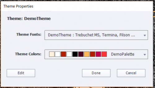
Clicking the Theme Properties panel, will open this new panel, which shows you (for a one-theme project) the Fonts used in this theme (new) and the Color palette used:

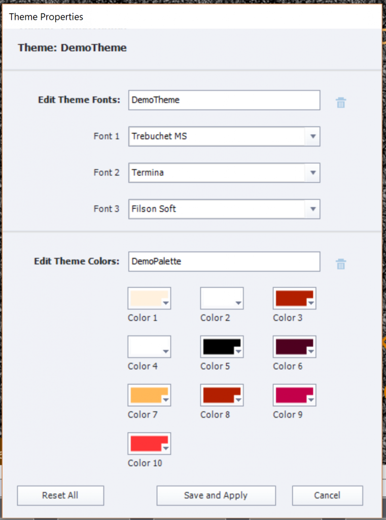
Fonts may not be totally visible the panel cannot be resized (which is the pity). But clicking the Edit button at the bottom will show you all used fonts and colors, ready for editing.

A new functionality, which can save you many working hours: it is now very easy to replace one of the used fonts by another font. I always recommend to avoid using system fonts, use only websafe fonts or Adobe (formerly Typekit) fonts. That way you’ll be sure that all learners will see the font you had in mind, even when using dynamic text (includes variables) or creating a Fluid Boxes project. In older versions, replacing a font was very cumbersome, because you had to screen all object styles in the Object style manager which included characters, and change them one by one ( see Manage the Object Style Manager ). In this editing panel you cannot see however the Usage of the fonts (feature request) but it is already a big enhancement!

As I mentioned in my first review of version 11.5, the colors in the palette have now simple numbered names. The older names (Title, Subtitle, …) were confusing because they were rarely used for those objects. Editing colors in the color palette is the same as in previous versions.

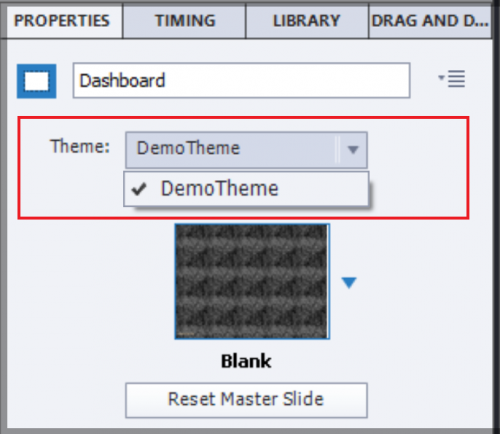
Theme in Slide Properties

Less important for a course with only one theme, but the Slide Properties have an indicator of the used theme for that slide:

Theme fonts in dropdown list PI

When you are in edit mode for text containers (captions or shapes), the dropdown list for fonts will show at the top a group 'Theme fonts', which is new. The following group are the Adobe fonts (formerly Typekit fonts) if you have licensed some. The third group is the usual 'Websafe' group. You should limit font use to those groups, System fonts have to be avoided, especially if you are creating fluid boxes project. If you use system fonts, there is no guarantee that your learners will see that font, that it will be replaced by a generic font like Times New Roman or Tahoma.

 Multi-theme projects

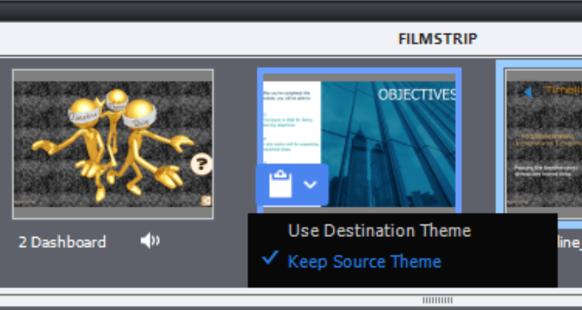
You can insert slides using another theme than the project theme. Once inserted you’ll see in the Filmstrip an icon, showing two options Use destination Theme or
Keep Source Theme (which is the default choice). Beware: this icon only appears when a slide is inserted. When you insert another slide, the icon will disappear, in favor of the last inserted slide.

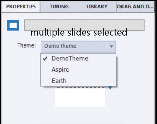
Look at this screenshot, taken after insertion of a slide with the “Earth” Theme (one of the Quick Start Project themes). You see that the first slide no longer has the icon, it was in the theme ‘Aspire’ has no longer the icon. This project has now 3 used themes: DemoTheme (my custom theme), Aspire and Earth. What is now the destination theme for the last slide? It is not the original project theme, but the theme ‘Aspire’ of the previous slide. I find this bit confusing.

You can use one of these two workflows to change the theme of a slide (where you no longer have the icon to change to the destination theme):

  • Select the slide, use the Themes button and click the theme you want as destination theme for the slide. If there is no appropriate master slide, it will be added to the destination theme.
  • Select the slide, use the dropdown list in the Properties panel (see screenshot) and choose the destination theme. If there is no appropriate master slide, you will be invited to choose one of the existing master slides.

In the thumbnails under the big button Themes, all the used project themes appear in the top part. The ‘active’ theme shown is the one of the slide selected at that moment. If you select multiples slides, not all using the same theme, it is the theme of the first slide selected who will show its theme as active?

Clicking the Theme Properties panel will bring you to the properties of the active theme. If you want to see the Properties for another theme used in the project, do NOT click that theme in the top part of the thumbnails, because you would change the used theme for the active slide!. You need to leave the thumbnails dialog box, select a slide in the filmstrip with that other theme to make it active in the thumbnails, in order to be able to access its theme properties.

Master slides

In a multi-theme project, the master slide panel will show only the master slides belonging to the theme of the selected slide, not all the master slide used in the project. Just a warning: if you have both the Filmstrip and the Master slide panel open, which is only possible in the Expert UI, not in the default UI, the master slide panel will not refresh automatically if you choose a slide with another theme than the one showing at this moment. You have to leave the master slide panel and come back to force it to refresh.

If you change the theme of an inserted slide to the destination theme, and it uses a master slide which is not available in the destination theme, an extra master slide will be created. It will use the destination theme colors palette and its object styles.

If that happens, you may have to use the button ‘Reset master slide’ to enforce the use of the new object styles. It is not always happening automatically, if an extra master slide was needed.

Object Styles

Opening the Object Style Manager will show the object styles of the theme used by the selected slide. The logic is similar to the one I explained for the master slides. If an object style used in a slide (or master slide), which is not available in the theme to which you convert the slide, it will be added to that theme.

Theme fonts in PI

Same logic: the dropdown list in the Properties panel, will show the Theme fonts for the theme used by the selected slide.

Skin editor?

When i explored the skin, I found that only one skin exists. In the example I used for the screenshots, the skin designed for the custom theme ‘DemoTheme’ was always applied. Even when I have changed all the slides to another theme, or applied another theme to the whole project (where the message appears that skin is updated). Not sure what is going on, will update this post when I have more information.

I did not check out Recording defaults, last component of any theme.