Using cpQuizInfoAnswerChoice for Survey (Conversion from SWF to HTML)

Intro

Eight years ago I wrote a blog post about ‘Secrets of cpQuizInfoAnswerChoice’. Of course the embedded published project was SWF at that moment. This specific quizzing variable is very useful when you need to evaluate the results of survey slides in order to make decisions. I created a new example file, partially based on slides from the Quick Start Project Alliance. It is part of a ‘decision tree’ which could be used for those who want/need to convert legacy projects to make them ready for publishing to HTML5.

Example file instructions

There is no audio in this example. All quiz slides are Survey slides, and navigation is based on the results of the Survey slides.  Type of slides used are True/False, MCQ with one correct answer, MCQ with multiple correct answers. At the end of each branch (there are quite a lot of possibilities) you will end up on a slide with possible workflows. In this example you’ll find only three ‘results’ slides:
  1. If you have only the SWF output of the legacy project.
  2. If you have the cptx-file but cannot use it directly in the present Captivate version
  3. If you have the cptx file which can be opened in the present version.

To explore a new branch, please refresh the browser. There are more than 3 recommended workflows because of sub-branches.

You can watch the embedded movie below (fixed size) or use the link for a rescalable version.


Values of cpQuizInfoAnswerChoice

This system variable belongs to the category Quizzing. Typical for that category is that the variables are read only, you cannot edit them in Captivate directly.

It is a reused variable, gets a different value after the Submit process on each quiz slide. The value you are getting depends on:

  • Type of question (see below)
  • Numbering (if available) in the question. For several types you can choose between capital characters (A, B, ..), small characters (a, b, …), numbers or None.  None will result in the same value as numbers (my preferred numbering)

In the example file I used three types of questions, which are very common in surveys:

  1. True/False. For that type the value of cpQuizInfoAnswerChoice will be either a character or a number, depending on the chosen numbering type.
    Example: if learner choses “True” value will be A, or a, or 1 (also for None as numbering)
  2. MCQ with radiobuttons (one answer): value will be the character or number of the chosen answer. No problem when shuffling the answers. Although the numbering on runtime will be changed in that case, the original number, as seen in the editing environment, will be stored in the variable.
    Example: Second slide in the example had three answers. You may shuffle the answers on runtime, but if the learner selected this answer, the value of cpQuizInfoAnswerChoice will be ‘1’.
  3. MCQ with checkboxes (multiple answers possible): all chosen answers will be stored, using a separator (in my case a semicolon). If you use shuffling, the reported value will take the numbers originally assigned in the developing environment:
    Example: first slide in the example file looked like this. With the shown selection, the value of the variable will be ‘2;3;4’ even if due to shuffling the numbering was different on runtime.

Short description of the other Question types:

  • Matching: the chosen corresponding  numbers in the first column, with separator(s) will be reported similar to MCQ with multiple answers.
    Example ‘A;C,B’ indicate that in the first column those were chosen to connect with A, B, C in the second column.
  • Sequence: I couldn’t figure out what the meaning was of the reported value, very strange. Look like IDs (like Interaction IDs) separated by semicolumns. Maybe someone can explain?
  • Fill-in-the-Blank: the text chosen for the blanks will appear, with separators.
  • Short Answer: text entered by the learner.

Due to the fact that Captivate’s variables can store strings as well as numbers, if you choose for numbers you can perform calculations (Expression command). I used that feature in an old post about Graded Surveys. Tha particular technique  has not been used in this example.

Used Techniques

I will not explain every detail in this example file, just some tips about the used techniques.

Decision Tree – Branches

Before starting the development, I did sit down to see how many branches I would provide in this survey. The present example results in three main branches, ending up in three different end slides. Those are the slides surrounded by a red box in the screenshot of the Advanced Interaction panel (will blog about its use ASAP). The Survey slides are included in a blue box:

Choice of the branch to follow is tracked by a user variable. Three variables, starting with an empty value:  v_swf, v_cptx, v_scratch. Those variables can have different values, because each main branch has sub-branches.

Example: The branch which will end on slide 12 (SWF_workflows), starts with a value=1 when the learner indicates that the output SWF is the only asset remaining from the legacy file. Based on answers to the other questions, this value can be incremented to 2 or 3. Each of them will lead to different content on slide 12.

Multistate objects

The information on the end slides (12-14) is stored in multi-state containers. The On Enter action of each slide uses the tracking variable for that branch to show the appropriate state. Look at the screenshot of the action triggered On Enter for slide 12:

There are only two decisions  (not 3) because the Normal state is valid for the situation where v_swf==1.

Embedded variables

The result of the poll can navigate to slide 14, with the recommendation to start from scratch. However it is possible that legacy assets can be used: documented/branded theme, assets like graphics files (PS/AI), audio clips, video clips, GIFT or CSV files for questions. To show this information, user variables are inserted in the states on the slide. Their value is either empty, or has a value due to the choices on the very first survey slide. Look at this screenshot, which shows the Normal state (no external library available) for the Scratch slide:

More?

Do you have questions? Please post them in a comment. Maybe we’ll meet at Washington DC, will try to help users struggling with conversion of their legacy projects due to the demise of the SWF player.

Question for you: any idea why a slide seems to be missing in the Advanced Interaction panel (slide 11)?

Sequence check slides (updated version)

Intro

More than 7 years ago I wrote a similar blog post: how can you check the sequence of clicks. Of course the embedded tutorial was a SWF, since only that type of output was supported at that moment. This post is an update with HTML5 output, and taking advantage of new features (multistate objects, SVGs as buttons). 

Example

Play with this example project. I inserted two examples of sequence checks:
  • Geo slide: alphabetically clicks on countries (used English names, not the original names of the coutnries)
  • Keypad slide typing the pincode on a numeric keypad.

First and last slide are taken from the Quick Start Project 'Aspire'. The images used as button also are from the Assets panel.

You probably will have more ideas where this workflow can be used for Knowledge Check slides. There is a sequence type of quiz slide, you can test a sequence with Drag&Drop slides, but these alternatives are less limited in design. ould love to hear your proposals for sequence checks as well


Setup

Variables

Similar to the old post I used only two user variables (to be created):
  • v_counter: will track the number of clicks on interactive objects. It starts with a default value of 0. It is reused on the second sequence slide, by resetting to the default value using the On Enter action of that slide.
  • v_correct: will track the number of correct clicks, set up with default value of 0 and re-used in the same way as the previous variable.

Multistate Objects

Instead of the hide/show workflow used in the original post, multi-state objects to display the feedback are used. That object is labeled Tx_Display (for the Geo-slide) and Tx_DisplayBis (for the Keypad slide). Look at the screenshot of the Object state panel for Tx_Display:

The Normal state is empty (easy to reset, will automatically reset when returning to the slide if ‘Retain State’ is unchecked). The 6 following states correspond with the correct sequence, hence their labeling. The last state is the Wrong state. The sequence of states is important, because I will be using the ‘Go to Next State’ command in the actions.

SVGs

If you did read some recent posts, you know that I am a big fan of the use of SVGs both for image and interactive objects. In this case I used them mostly because they remain crisp at any resolution and lead to very small file size. The file size of the published project is less than 4MB. ¨Probably half of that size is due to the bitmap images on the ready-to-go slides, and the unique PNG which I used for the Background of the Keypad. Look at the timelines of the sequence slides. SVGs are grouped. Too bad that you cannot recognize the interactive object from the color (should be green), but they all have a pausing point set at 1.5secs (Europe SVG is not a button).


The group Gr_Wrong on the Keypad groups all button SVGS which are not used in the pincode. Those buttons are on top of the image, and can be hidden, since the remaining keypad image shows them as well but in a non-interactive version. For the Geo slide, the colored country  SVG buttons are also on top of a big SVG (Europe), but I don’t want the colored ones to disappear, for that reason the buttons will be disabled, not hidden (see advanced actions below).

Actions and events – Geo slide

The colored country SVG buttons trigger an advanced action On Success. There are 6 countries, which means 6 advanced actions (created with the duplicate function). The five first actions are similar to this SV1_Act:

Only the items marked by a red oval have to be switched for the actions SV2….SV5Act: the name of the SVG button in the first decision, and the literal (number) in the second decision. If the clicked country is not fitting in the correct sequence, the learner sees the Wrong state in the multistate shape and the Retry button will appear.

The last country SVG button (SV6) has a slightly different action, derived from the previous one.  Reason: the Next button has to appear if the sequence is correct. That extra command is highlighted by a blue rectangle.

The Next button has the default command ‘Go to Next Slide’ on its Success event.

The Retry button needs to  everything, as you can see in this screenshot. Action is triggered by the Success event:

Actions and events – Keypad slide

Because of the re-use of the variables v_counter, v_correct and the button Bt_Next which is timed for the rest of the project, the On Enter event of this slide is used to reset everything to default values. If you want to allow going back to slides, a similar action would be needed for the Geo slide, but that was not the case in the example file. The On Enter action is pretty simple:

Some explanation may be needed for the Hide command which I highlighted. Since the required pincode (29791) needs the number ‘9’ twice (second and fourth position in the sequence) I have put two SVGs on top of each other: SVG_Two and SVG_Four. By default SVG_Two is visible, but SVG_Four  is hidden and becomes visible With the same action where SVG_Two is hidden. You cannot have two interactive objects on top of each other when both are active at the same location.

The Number buttons trigger an advanced action On Success.  It is similar to the one in the Geo slide, except for using Hiding instead of disabling. Example of the first number button (which is 2):

As explained above, for SVG_Second (number 9) is bit different

Similar to the Geo slide, the last correct button (number 1) will show the Next button if all was correct:

Any wrong number button will trigger this action using its Success event:

The new Retry button, labeled RetryBis is similar to the one on the Geo slide, triggers:

Remember that the SVG button Four  is in the same location as Two, because both have the number 9. That is why SVG_Four has to be hidden and SVG_Two shown.

Why no Shared Actions?

Although we have very similar actions for the SVG buttons, both on the Geo slide and on the Keypad slide, this is a typical use case where it is impossible to use shared actions. Problem are the ‘literals’, which should have been converted to parameters. Look at the screenshot of the action SV1_Act posted earlier. Logically these items should be parameters:
  • The SVG button SV_1 – compulsory parameter in the first decision
  • The literal ‘1’ in the condition of the second edition, not compulsory
  • The multistate object Tx_Display, compulsory parameter in the second decision
  • The state Wrong in the ELSE part of the second decision
  • The button Bt_Next in the ELSE part of the second decision

Why is the literal a problem? Because it is also used in the Increment command. If you replace it by 2 for the second button, this will also be the case in the Increment command. I may have a workaround, but it is not always functional.

Second reason: with the workaround the parameters would increase to 6, which is my limit for a usable Shared action. Whereas using duplicate functionality for the advanced action is lot quicker, since only two items need to be edited.

This blog is already way too long. If you like to hear about my ‘thumb rules’ for choosing between duplicate advanced and shared actions, post a comment. Maybe I’ll dedicate another blog to it.

Power of SVG Buttons

§Intro

In previous posts I have talked about the advantages and disadvantages of the 6 button types, and how you can edit the colors of SVG’s, even in states and when they are used as buttons. SVG’s, being vector images are excellent for use in projects to be viewed on multiple devices, whether it is a scalable non-responsive or a responsive project (fluid boxes or breakpoint views).

Unique about SVG’s used as buttons, is the fact that you have control over the clickable area, which is not the case for other  button types. In the example below you’ll see buttons which would have been impossible to realize with any other button type.

Example file

Watch this two-slide project. The Title slide is taken from the QSP ‘Legacy’ (non-responsive), but I have changed fonts (not fan of Arial). The second slide uses an edited master slide from that same QSP. Click the buttons in circular image in any sequence, and you can also reset the slide (used the Scenario 2 technique described in Replay Slide)

Setup Clickable Area

Six Buttons

The 6 buttons in the circular arrangement have overlapping bounding boxes. Have a look at this screenshot:


By unchecking the option ‘Enable Click in Bounding Box’ the clickable area will be limited to the space within the colored shapes, and those do not overlap. 

I kept only the Normal and Visited InBuilt states of the buttons . In the Visited state I added an icon (also SVG) from the Assets panel,  colored in the same color of the button (which was dimmed). That icon also covered up the number, which was part of the button SVG. Here is the Object state panel for button 6:

Reset Button

For this button I used an icon from the Assets panel. and added a text caption close to this button. The bounding box of the SVG is encreased so that the Reset text looks to be inside of the box. In this case The default option under the Style tab ‘Enable Click in Bounding Box’ remained checked. It now looks as if the learner can click both text and icon. I didn't use the padding option, which would make the icon smaller inside the bounding box.

Other Items

The information is stored in a multistate shape, where the Normal state is invisible (Alpha and Stroke set to 0). A two state shape is used for the final image, which is in a custom state of a circular shape. That circular shape also has an invisible Normal state. 

For the multistate objects the option ‘Retain State on Slide Revisit’ remains unchecked. Since the Reset button is re-entering the slide, all multistate objects will automatically revert to their Normal states.

Actions and variables were custom made, I didn’t use any of the click-reveal interactions from the QSP’s. Sorry about that, but I’m so used to create that type of interactivity that it comes almost naturally. One tracking variable for each buttons was needed to have the final image appear after all buttons have been clicked. 

Tips for using Quick Start Projects (11.5)

Intro

The most recent version, 11.5.0.476 includes the new Assets Panel which I presented in this post.

You are able to use Quick Start projects, or slides taken from those projects to avoid having to design and to work out interactions for your project from scratch. Those projects/slides are available in a responsive (Fluid Boxes) and non-responsive version. I tested it out for a tutorial which you can watch using this link (it is a responsive fluid boxes project):

Button Types

If this topic, also related with 11.5, seems interesting, I will post a more detailed description in the near future. But today you'll get some tips from what I learned creating this tutorial.

QSP tips

You can use a Quick Start Project in two ways:
  1. Open the project, and delete or hide the slides you don’t want to use in your course.
  2. Open a non-responsive or a Fluid boxes project, and insert slides from the Assets panel.

I used the second approach for the tutorial, for a logical reason: I didn’t use even half of the provided slides in the Aspire project. Project has only 17 slides, including a lot of duplicate instances of slides. I used these slides from Aspire:

  • Welcome layout
  • Timeline Interaction 02
  • Main Menu layout 02
  • Subtopic Header layout (used 6 instances)
  • Tab Interaction 01 (used 3 instances)
  • Related Content Interaction (used 3 instances)
  • 3 Column layout
  • Exit Layout

Tip 1 Duplicate slides

If you need the same slide multiple times do NOT insert it multiple times in your project, because that will corrupt the Advanced actions (most slides use them). To avoid this you need to follow this workflow:
  • Insert one instance of the needed slide
  • Go into the Filmstrip, slide will be active (surrounded by a blue rectangle)
  • Duplicate that slide, either with the right-click menu or with the universal shortcut for duplicate: CTRL-D.
  • Move the slide by dragging in the filmstrip to the wanted location.

You can repeat this workflow as many times as needed. Due to Captivate’s smart labeling, the advanced actions will not corrupt in most situations. Why not always? See next tip.

Tip 2: Check Navigation commands

In a slide like the Main Menu Layout, the topic buttons point to another slides in the total project. On insertion of that slide only, without the target slides, all commands will revert to the default navigation command ‘Go to Next Slide’. You have to replace it by ‘Jump to….’ while indicating the correct target slide (in the project the slides of the Subheader Topic layout). This will prove easier if you use the next tip:

Tip 3: Rename slides

Labeling is always a good practice, but for sure in this type of project. Multiple instances of the same layout slide will have the same name (and are very long as well). Taking the time to give them a custom name will save time when you need to find a slide. Moreover, if you want to use the Table of Content, the names will be meaningful.

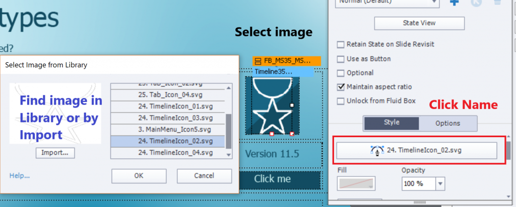
Tip 4: Replace image

Switching to another image is mostly very easy:
  1. Select the image.
  2. Click on its name in the Properties panel
  3. Choose another image from the Library dropdown list, or use the Import button to find it on your system.


However, on many slides an image is used as Fill for a Fluid Box. Look at the Subtopic Header slides (there are 6 in the example): having the image as fill allows to add an image on top of the fluid box. Normally you cannot stack two images, this is a useful solution for that limitations.

If you want to replace the fill for a Fluid box, you need to select that fluid box, you cannot just click the image. After selecting the FB you see that the fill is set to Image, click the second Fill button, use the Browse icon to find an image to replace the image. Be careful to check the Position properties if the new image doesn’t have exactly the same size as the original one.

Tip 5 Multistate objects

The layout slides use a lot of multistate objects.  That is the case for all the Click to Reveal slides (labeled ‘Tab Interaction’ and ‘Related Content Interaction) and probably for many other interactions. You really will need to learn how to use them. Click the State view button in the Properties panel, to open the Object State panel.

More questions?

You may have seen that I have edited some slides quite a lot. This post has only simple tips, not the full explanation of all changes. If you want to know more, post a comment to this blog.

Edit SVG in Captivate 11.5

Intro

If you have read my first blog about this major update, you will know that the extended functionality of SVG’s for use as buttons is one of my favorites. I didn' t mention that you get some editing features within Captivate. Thisat means that you don’t have to do a roundtripping with Illustrator (or use another vector editing application) if you just want to change some colors. This post is meant for those who are rather new to vector images, and the way paths are used.  Next post will be about roundtripping with Illustrator for more complicated editing.

You may also ignore that the new Assets Panel (wait for an in-depth exploration in the near future) includes a set of ‘icons’ which are SVG’s. The hotspots used in 360 slides are SVG's as well, the editing functionality was added to make customizing their colors possible. All SVG’s in your project end up in a dedicated folder of the project Library.

Remember: SVG used as button is only possible for HTML5 output, not for SWF output

.

Example slide

The example uses only included  assets from the Assets panel, to be found in the Audio and Icons part. All icons have edited colors (not meant as a design example) to illustrate the workflow I will explain in this post (and later on in an interactive video). The biggest SVG in the center of the slide is configured as a button. You can click it as many times as you want, you’ll be able to listen to some of the audio assets. There is no poster image in this example, just the default Play button.


Step-by-step ‘Edit colors’

I will explain this for the Normal state of the big SVG which you clicked in the example slide.

1. Insert SVG and resize

As I explained in the intro, this SVG is one of the Icons in the new Assets panel. Insert it from that panel (name ‘Cover’). You can resize either by using the Options tab of the Properties panel for the SVG, or by dragging a corner with the mouse while keepoing SHIFT pressed to preserve the width-height Ratio. Since this is a vector image, you’ll see that it remains crisp even when enlarged considerably.  The original icon uses a uniform dark grey. I check the option to use it as a button, and uncheck the option to make the whole bounding box clickable (Enable Click in Bounding box). You can see that the bounding box extends above the image. There is an option to ‘Fit to Bounding box’ but it would have distorted the SVG.

Step 2: Edit mode

To enter edit mode for the SVG double click the SVG. You find the tooltip when hovering over the Fill in the Properties panel. Do not use the button ‘Edit SVG’, which would let you choose an editing application on your system, nor the option Edit with Illustrator.

Step 3: Select a ‘path’

A vector image is composed mostly from several paths, which can have a width (may be variable) and/or a Fill. The image I used as example has 3 paths, all closed and with a fill. You select a path by clicking it. Selected path will have a blue surrounding line as you can see in this screenshot:

Step 4: change color

Click the Fill icon in the Properties panel to open the Color dialog box. For this simple demo slide I used the color wheel to select a color. In a normal project I would have used the Theme Colors palette of course. Click OK to confirm the color change. Repeat that workflow to the remaining shapes.

SVG button states

When you convert a SVG to a button, the InBuilt states Rollover and Down are added automatically. You can use the edit workflow described above for each of those states. I added also the Visited state (with a speech bubble) and the custom state ‘Done’ which appears after you have listened to the 5 available audio clips. Here is the Object state panel of the big SVG button:

The Visited state is selected in this screenshot. Look at the Properties panel: you see that the opacity is reduced to 50%. This always applies to the full SVG, but in this case only to this state of course. You see a user variable inserted in the added speech bubble. That bubble has no reduced opacity, it is not part of the original SVG but an added shape£.

More?

Main topic is finished, you may stop reading if you want. But for the curious fans,  the audio clips are attached to a state in a second multistate object, which is a shape to which I added an icon in the Normal state (no audio) and an audio clip with its name to the other states.

The Advanced action triggered by the big SVG buttone:

No need to trigger the Visited state, it appears automatically after the first click on the SVG button.

About State Commands and a Progress Bar

Intro

Recently a user posted a question about using the 'Go to Next State' command used in Advanced actions. You can read our discussions in this thread.

Time to write out some tips for multistate objects. This blog wants to give an answer to the user, and has its focus only on that solution. I plan to publish more about the basics of states and their commands later on.  To me personally the introduction of multistate objects is in the list of my favourite features in Captivate, closely following Shared/Advanced actions and Shape buttons.

Example movie

Watch this published rescalable interactive movie. The second slide has three shape buttons, navigating to three slides where you can read and confirm reading, or click hotspots, or answer questions. Each of your actions will result in changes to the progress bar on that second slide. Beware: whenever you have clicked an interactive object it will be disabled!


Terminology Multistate objects

InBuilt States and Custom States

You can add custom states to any object, static or interactive.  In those states you can have many object types: graphics, video, audio... but no interactive objects nor hyperlinks.  The Normal state is the default state, which will always appear unless you have changed to a custom state using a command (in a simple or an advanced/shared action). You have a lot of freedom for custom states: contrary to the InBuilt states, nothing is locked tto the default normal state. You can have objects in a custom state that are in a totally different position from the Normal state. Custom states are always controlled by commands, not by a situation. If you want a custom state to remain for future visits to the slide where the multistate object is sitting, you need to check the option 'Retain state on slide revisit'.

Inbuilt States exist for these object types:

  • All types of buttons Shape buttons, Image buttons, Transparent buttons and Text buttons.  You have four of those styles: Normal, Rollover, Down and Visited. The first three are part of the button style.  You don’t have the same freedom for location of those states, they are locked to the Normal state (look for the Lock indicator).
  • Drag sources and Drop targets on a D&D slide. For more information see: InBuilt states for D&D

I will only talk about shape buttons here. Contrary to custom states Inbuilt states appear automatically in a situation: when not hovering over button (Normal), when hovering over button (Rollover), when pressing button (Down) and when after clicking/tapping (Visited, if it has been created). You can only control Normal and Visited by a commandif necessary, not the Rollover/Down states.. 

State commands

These commands are available both in a simple action (dropdown list in Actions) and in the Advanced Actions dialog box, to be used in advanced or shared actions:

  • Change State of …. to 
  • Go to Previous State  …..
  • Go to Next State ….

When you use these commands as a simple action, from the dropdown list inthe Actions tab, they can only be applied to multistate objects on the same slide as the event triggering the action (Slide event, interactive button events) The Hypelink even thas only the first command (Change State). 

If you insert one of the commands in an advanced/shared action they seem to be able to apply also to multistate objects on other slides. That is indeed the case for the ‘Change State’ command, but is NOT functional for the commands Go to Next/Previous States. I have logged this as a bug, because you are able to choose multistate objects on other slides, however without any effect. That was the reason of the question in the forums, described in the Intro. 

You could see in the Example movie that I have a workaround. How?

Solution with variable and While loop

YOu will need one user variable v_counter,  to track the number of clicks while being on other slides than slide 2 with the Progress indicator SS_Progress (a multistate object). This progress indicator starts with a Normal state which is a shape with Alpa and Stroke = 0.

That variable starts with a default value = 0. The clicks on the OK buttons in slide 3, on the hotspots in slide 4 and on the correct answers in slide 5 do increment the variable, besides other commands. 

When returning to slide 2 (which has the progress indicator) using the shape button ‘Back to….’ (is on the used content master slide) an advanced action On Enter for that slide is launched, using the While loop:

Example: if the user has performed 3 actions on any slide, v_counter would be 3. The while loop will then be done 3 times, which means the 4th state of the progress indicator will appear. At the same time, the variable will be set back to 0 at the end of the loop. The learner can continue to visit another slide, and the variable is ready to track again.

This is just an example, many variations are possible. Maybe you want to allow visits and actions to consecutive slides before returning to the main slide, this can easily be achieved. Or have feedback appearing on the main slide after all slides have been visited, based on the obtained progress.. 

More?

I didn’t explain all actions in this post. The slide with the hotspots is based on a recent article about Hotspots in a 2D image.

Maybe you are wondering if I used the Visited state or a custom state for the OK buttons (slide 3) or the hotspots? What the quickest workflow is to create the states for the Progress bar? Did I use shared actions or advanced actions, and why did I choose that way? Why did I disable the buttons? If you are interested, I can explain… on demand. 

Rollover in Fluid Boxes?

Intro

One of the type of objects that is indicated by the tracker as not compatible with HTML output are rollovers: rollover caption, rollover image, rollover slidelet, rollover shape. However if you ignore that warning for a non-responsive project, the rolloverrs will work fine when used with a mouse on a desktop or laptop screen (with the exception or the slidelet, which you should avoid at all times). Its functionality will not work on a mobile device, even not when using a stylus. But the 'mouse' users have that functionality.

However when you create a responsive project using Fluid Boxes, the options for inserting a rollover are greyed out. There is no way to add them. Is there a workaround to have rollovers for desktop/laptop users? That question appears once in a while in forums or social medai. In this post I will talk about my tentavies to mimick a rollover..

Example Movie

I cannot insert a responsive movie in a blog post. Use this link to have access to it. Try it out on a laptop or desktop screen: roll over the buttons in the left and in the right most Fluid box. You'll see rollovers for the big Blue buttons which do not have a real button functionality. The red buttons on the right are active, a hint message appears when rolling over the buttons. You can click those red buttons. This is a static screenshot of that slide (which appears after the poster image and the first slide):

If you try this on a tablet or a smartphone, rollovers will not appear. I tested on iPad and on an Android (HTC) phone.

First Mimick: Hint Messages

You did see the Hint messages for the red buttons when hovering over them. If you use a tablet or a phone they will not show up. Those buttons have the InBuilt States 'Rollover' and 'Down', but only the Down state will be visible on those mobile devices. This is the Object state panel for the second button:

For interactive objects it is possible to check the option 'Hint message' in the Actions tab. In all themes included with Captivate those messages are no longer in a caption but in a shape. The hint message appears wh

There are some problems with this solution:

  • Buttons and Hint messages will share the real estate in the (normal) Fluid Box.
    That is a waste of space especially for mobile screens where those hints never appear. and the buttons may shrink too much as you can see here:
  • I tried to use a static fluid box for each button+hint to be able to stack the Hint message over the button but that leads to very ugly flickering and is excluded.
  • You don't have control over the exact size of the buttons, and certainly not over the HInt messages (look at the screenshots above). This may be not so important since you'll only watch on a big screen, but nevertheless.

Second Mimick: Rollover State

With the blue shape buttons I demonstrated that you can fill the Rollover state with Text (mimicking a rollover caption), with an image (mimicking a Rollover Image) and with both. Here is a screenshot of the second shape button, having an image and text:

The effect is quite nice, provided you use rather big shape buttons as was the case here:

There is a possible problem when using images: they can be distorted if the option 'Maintain Aspect ratio' is unchecked. That was the case in the example, and can lead to distortion:

Shared Action for Red buttons

The active red buttons trigger a shared action which will change the state of a shape (showing explanations), add a star to a progress indicator and have it animated. If you have read blog posts written by me, you know that I am a big fan of Shared Actions.


3 Audio Tricks

Intro

Last week I answered several questions about audio on the forums with pretty simple workflows Maybe you will like them? Contrary to what you are used to read in my blog, this is a short article, there is no example movie.

Trick 1: Audio when hovering over a (shape) button

Buttons and shape buttons have 4 InBuilt states: Normal, Rollover, Down and Visited (only available in CP2017).

Quite a while ago I explained what I mean by an 'Audio Object'. It is a shape or a highlight box, which you make invisible to the user by changing the stroke width to 0 and set the Alpha for the Fill to 0 as well, but attach audio to that object. If you want to learn more about them have a look at this post.

This screenshot illustrates the workflow. The audio (Cymbals) will only play when hovering over the button.

Trick 2: avoiding overlapping audio on quiz slide

A problem occurs on quiz slides with following setup:

  • Slide audio plays explaining the question
  • Object audio is attached to the Feedback messages

Problem is that when a learner submits the answer(s) before the slide audio ends, there will be overlapping of the slide audio with the audio of the message that pops up. It is not possible to control the appearance of the Submit button, since it is an embedded object, has no individual timeline. Submit button in all Captivate themes is of the type 'Transparent button'. This was my workaround, and the user confirmed it was working perfectly:

  • Create an image that is similar to the Submit button. That is perfectly possible with a shape: same fill, same stroke, same font, font size and font color as the quiz buttons.
  • Take out the label 'Submit' from the original Submit button, set the stroke width to 0, alpha for the Fill to 0 so that it becomes invisible. It will still be active.
  • Put the image in the same location as the invisible Submit button (use Align menu).
  • Change the start of the timeline of the image, so that it begins just at the end of the slide audio.
  • Move the pausing point of the quiz slide to be after the end of the slide audio. Only way to do that is by mouse dragging. That pausing point is not in the Timing panel.

Why is this working? Because the Submit button is an embedded object, it is always on top of added custom objects (the image). That means it is active! Only when the learner would click by accident on the 'invisible' active button, the problem will occur. But in most circumstances the learner will not be aware of that possibility and will wait patiently until the audio finishes and the 'Submit' indicator appears.

Trick 3: Audio in states

Just want to refresh your memory: it is possible to attach audio to states. When you change a state, the audio of the previous state is automatically stopped. A feature that you can use in many ways as I illustrated in these movies:

Automatic Lists

Drag&Drop Object Actions

You can even create a shape with states that are invisible but have all audio clips. Let your creative mind wander....


Custom Review

Goal

This question recently appeared on the forum (thread):

"I'd like to customize the results page at the end of a quiz to display the numbers 1 to 20 (representing the 20 questions in the quiz) and indicate if each question was answered correctly or incorrectly."

Although I posted an answer, the user never returned to check it. Since I have spent some time to work out that solution, I also discovered that it could be very useful in two situations that are often mentioned as failing in the normal Captivate design:

  • To show the user an overview of answers on a test with Knowledge Check slides: which anwsers were  correct/incorrect? If you are not sure about the differences between KC slides and normal quiz slides, have a look at this article.

  • To create a Review slide, where the learner would see the same information for normal quiz slides. Captivate has a great Review feature for quiz slides (not for KC slides) but it has some shortcomings. It will not only show the answers by the learner but also the correct answers. Moreover, clicking the Review button will cancel all remaining attempts on Quiz level for apparent reasons. With the solution I propose the user would not see the correct answers, only which questions were answered correctly or incorrectly, and the Retake attempts would still be available. 

The work flow is based on a couple of simple shared actions, use of multistate objects (for the feedback checkmarks) and some advanced actions.

Example movie

Watch this embedded movie or use any device to open this link (it is a rescalable, non-responsive HTML5 project). 

You will first see a test with two Knowledge Check slides, followed by a 'Review' slide. You will be able to retake this test, or to continue.

Second part is a realy quiz, with 5 question slides. Question slides are followed by a Review slide. In Quiz Preferences I provided 3 attempts. When the attempts are exhausted or you succeeded passing the test, the Next button (was formerly a Retake button) will take you to the official Score slide.

.

Set up

Checkmark - multistate object

The checkmarks, both on the Review slide for the KC question and for the real quiz, are shapes with 3 custom states:

  1. Normal state: shape is invisible because Alpha for Fill and Stroke for Width are both set to 0.
  2. Correct state: shape is filled with a PNG representing a green tick symbol. This can of course be all you want: text, text + image, text + image + audio. I kept it simple. 
  3. Wrong state: shape is filled with a PNG that is the Cross symbol.

Here is a screenshot of the Object styles for the checkmark:

The checkmarks are labeled: Check_KC1 - Check_KC2 for the KC slides, and Check_1, Check_2.... Check_5 for the Quiz slides. The numbers make it easier to select them by filtering in the Parameters dialog box, because they are used in the shared actions.

Retake button Quiz Review - multistate object

That button on the Review slide for the Quiz, is used to start a new attempt because the user will not see the Score slide. I had to reproduce he functionality of that Score slide, where the Retake button automatically disappears in two situations: either the learner has passed the quiz, or the Quiz attempts are exhausted. I solved that by adding a custom state to the Retake button, where the label changes to 'Next'. To have a non-confusing Rollover and Down state, which would be valid for both the Retake and Next button, I used the text '>>'. This is the Object state panel of this button, type Transparent button like the Quiz buttons and buttons on the Score slide: The advanced action (see below) EnterReview will take care of switchnng beteen the Normal and Passed state.

The Review slide for the KC questions doesn't need that type of button. It has two buttons: Retake for those who want to retry the KC test (answers are always reset for KC slides when leaving them) and a Continue button.

KC/Question Slides - variable v_KC

I changed the default setup to only one attempt for the KC-slides (default =  Infinite attempts). That change made the Last Attempt event availalbe. Contrary to Quiz slides the results of the KC-slides are not stored in exposed system variable. I wanted to show a 'trophy' on the Review slide to learners who correctly anwered all KC-questions. To track the correct answers, I created a user variable, labeled v_KC  which starts with a default value of 0 and is incremented for each correct answer. For the same reason, the shared action triggered by the Success event is different from the one used for normal quiz slides. If you import the shared action to another project, the variable will automatically be created. 

Quiz slides kept the default setup: only one attempt allowed.

Events for Actions

On KC-slides Success event (Quiz Properties) is used for Shared Action 'CorrectAnswerKC'

On KC-slides Last Attempt  event (Quiz Properties) is used for Shared Action 'WrongAnswer'

ReviewKC slide On Enter event triggers Advanced Action 'EnterReviewKC'

Continue button Success event (on ReviewKC slide) is set to simple action 'Go to Next Slide'

Retake button Success event (on ReviewKC slide) is set to simple action 'Jump to slide  KC1' (first KC slide)

On Question slides Success event (Quiz Properties) is used for Shared Action 'CorrectAnswer'

On Question slides Last Attempt  event (Quiz Properties) is used for Shared Action 'WrongAnswer'

Review slide On Enter event triggers Advanced Action 'EnterReview'

Retake button Success event (on Review slide) is set to simple action 'Go to Next Slide'

Score Slide On Enter event triggers Advanced Action 'EnterScore'


Shared actions

WrongAnswer triggered by Last Attempt event (KC slides and Quiz slides)

It is a very simple action with two commands: changing the state of the associated checkmark to the Wrong state and going to the next slide. There are two parameters: the checkmark (which is different for each slides) and the state. Although the state always has the same name (Wrong), there is no way to turn it into a 'fixed' parameter (one of my feature requesnts). Here is the action with filled in parameters

I like the way it is possible to track shared actions in the Library, look at the Usage panel for this action/ You see that this shared action is used both for the two KC slides and for the 5 Quiz slides.

CorrectAnswer triggered by Success event Quiz slides

It is a similar action, now showing the state Correct in the first command:

CorrectAnswerKC triggered by Success event KC slides

I used the CorrectAnswer from Quiz slides as template to add an extra command that will increment the variable v_KC.

Advanced Actions

EnterReviewKC triggered by the On Enter event of the ReviewKC slide

This is a simple conditional action, to decide if the trophy will show up or not.

EnterReview triggered by the On Enter event of the Review slide

This conditional action has two decisions. The first decision will change the state of the Retake button to have a Next button if the quiz has been passed or the Quiz attempts are exhausted. The second decision is about showing an image if the quiz has been passed. It also shows or hides the text mentioning the number of the present attempt.

EnterScore triggered by the On Enter event of the Score slide

This is the 'trick'. To have the functionality of a Retake button on the previous slide, which is the Review slide, the playhead visits to the score slide, but will immediately jump back to the first question slide. All quizzing system variables are reset in that case. Only when all attempts are exhausted or the learner passed the quiz, will the score slide become visible to the learner.

More is possible...

Several enhancements are possible based on this approach:

  • You can have multiple review slides, if there is not enough space on one slide

  • You can have a review side after a chapter which has some question slides or KC slides; in that case you'll have to tweak the advanced actions; if you want to track different bunches of KC slides you can either reuse the variable v_KC or use several variables. In the last scenario you'll have to turn the variable in the shared action into a real parameter.

  • I used a simple checkmark to indicate correct/wrong answers. It is not limited to that: in custom states you can also have audio, text etc...

More ideas? Suggestions?


: