Quiz Basics 3: Attempts and Scores

Intro

In the first two articles of this basic course about Quizzing, I explained the Terminology, and the Submit Process.

Those posts applied to all types of questions: scored, random, Knowledge Check, pretest slides. This post will be talking exclusively about scored (graded) quiz slides and random quiz slides which are graded. For those slides the results are stored in the quizzing system variables, and you can have the score slide in your course. You will get some tips about the default score slide at the end. Scoring doesn’t exist for Knowledge check slides, you can only choose attempts on question level, not on quiz level.  Pretest questions have scoring as well, but the values are stored in different system variables, and are only meant to navigate the learner to another slide,  based on the pretest result.

This article will explore the scoring and attempts on two available levels:

  • on question level
  • on quiz level

Attempts/Scores on Question level

Setup for both is done in the Quiz Properties panel. That panel appears automatically in the newbie UI when you insert a quiz slide (or a random slide) in the right docking station. For quizzes however I strongly recommend to switch to the Expert UI (check the option ‘Enable custom Workspaces….’ under Preferences, General Settings). Set up a workspace where both the Quiz Properties and the Properties panel are visible. Reason is that you need the Properties panel for partial scored MCQ slides with multiple correct answers.

Attempts

In the default setup the number of attempts for graded questions is set to 1. The feedback messages for Correct and Incomplete are checked and 1 Failure message. The actions for Success and Last Attempt are both set to Continue. You could check the option Infinite Attempts, but I strongly doubt you’ll want to have the learner in such an infinite loop.  A limited number of attempts however can be a good choice. If you allow more than one attempt, do not forget to check the ‘Retry message’ because that is not done automatically. Have a look at this screenshot for True/False Question, to the arts marked with a blue rectangle. I set the number of attempts to , and checked Retry. The Failure message was left at its default 1 message.

I kept the default Continue actions as well, but moved the pausing point closer to the end of the question slide (see previous article) to minimize the waiting time after the second step of the Submit process.

Score/penalty for 1 correct answer

Default score for all questions is set to 10 points. Since some LMS’s don’t like to see total scores greater than 100 points, and all questions don’t merit the same score you will certainly want to change those scores. BTW: later on I will offer an exploring post about the wonderful Advanced Interaction panel (F9), unknown to many because it never appears automatically in the newbie UI. It is not only about ‘advanced’ actions at all.

Changing the score happens in the Quiz Properties panel for all question types with a black/white score. B/W score means that you only get the score if everything is correct, score will be zero in all other cases. All question types, except the MCQ with multiple answers are validated with this rule, even Matching, Hotspot and Sequence. In the screenshot above (T/F), you see the score reduced to 4 points.

I also added a penalty: this score will be subtracted from the total score if the answer was wrong after the last attempt. You don’t have to enter a negative number here. Beware: in SCORM 1.2 reporting a negative result at the end will be reset to zero.

MCQ with multiple correct answers and partial scoring

Have a look at this screenshot, set up for such a question slide, with 5 answers. Two out of them are correct, each has a positive score of 5 points. The 3 wrong answers get a penalty of 2 points each. Neither the score nor the penalty can be set up in the Quiz Properties panel, they are dimmed. You have to select each individual answer, and setup score in the Properties panel of that answer (visible in the screenshot as floating panel next to the Quiz Properties):

The 4th answer, wrong answer, is selected in this screenshot. There is no Penalty field in the Properties panel, tab ‘Options’, only ‘points’. Since this needs to be a penalty I entered -2points. Same for the other wrong answers. The correct answers got positive points (5 for each). The dimmed numbers for Score and Penalty on the Quiz Properties panel are calculated by Captivate to 10 points and 6 points. I had to check the ‘Partial correct’ message, was not done automatically although Multiple answers was chosen.

In this example I changed the actions (Success/Last Attempt) to ‘Go to Next Slide’, didn’t move the pausing point of the quiz slide. This is the second possibility to narrow the waiting time after Submitting the result.

You see that 3 attempts are possible for this question (green markings).  But the Retry message is unavailable, dimmed. Reason is that I have chosen to show 3 Failure messages, different one after each attempt. You need to include the warning about clicking the slide (or pressing Y) for the last Failure message which appears after the last attempt.

Quizzing System Variables

These quizzing system variables (see also: Using Quizzing System Variables) are linked to individual question slides:

  • cpQuizInfoAnswerChoice: after submitting the answer (see this post for a typical use case)
  • cpQuizInfoLastSlidePointScored: after submitting the answer
  • cpQuizInfoMaxAttemptsOnCurrentQuestion: while on that slide. Beware: there is no exposed system variable telling which attempt the learner is taking at this moment on question level, only the maximum allowed attempts can be retrieved.
  • cpQuizInfoNegativePointsOnCurrentQuestionSlide: maximum penalty for this question slide
  • cpQuizInfoPointsPerQuestionSlide: maximum score for this question slide.
  • cpQuizInfoQuestionPartialScoringOn: Boolean
  • cpQuizInfoQuestionSlideTiming: if you use a time limit on the quiz slide
  • cpQuizInfoQuestionSlideType

Attempts/Score on Quiz Level

The number of allowed attempts on (total) quiz level is set up in the Quiz Preferences, Pass or Fail.  Default setup is one attempt. If you allow multiple attempts, don’t forget to check the option to ‘Show Retake Button’. When clicking that button, all questions will be reset and the quiz system variables will be cleared.

If you also allow Review (Quiz Preferences, Settings), you have to be aware of the fact that all attempts on Quiz level will be considered to be exhausted if the learner clicks the Review button (also on the score slide). To prevent confusion use this easy trick: drag the Retake button on top of the Review button on the results master slide (or the score slide). Once the attempts are exhausted the Retake button will disappear and Review button becomes visible. Problem is that this is perfectly possible for a non-responsive (blank) project or a responsive project with Breakpoints. But a normal fluid box doesn’t allow stacking of buttons, unless you define the fluid box as being static. I will post a workaround in my “tweaking posts”, later in the Quiz sequence of posts.

The Total Score on quiz level will be calculated from all the scored objects in the course (see Advanced Interaction panel) and stored in a quizzing system variable cpQuizInfoTotalQuizPoints. Except for the feature ‘Branch aware’ that will be a fixed number when starting the course.  Other quizzing variables  (see post) linked to the quiz level are:

  • cpInQuizScope
  • cpInReviewMode
  • cpInfoPercentage:  appears on the results (score) slide as ‘Accuracy’ ‘percent’
  • cpInfoAttempts: appears on the results slide as ‘Attempts’ ‘total-attempts’
  • cpQuizInfoPassFail: Boolean
  • cpQuizInfoPointsscored: appears on the results slide as ‘You scored’  ‘score’
  • cpQuizInfoQuizPassPercent
  • cpQuizInfoQuizPassPoints
  • cpQuizInfoTotalCorrectAnswers:  appears on the results slide as ‘Correct Questions’ ‘correct-questions’; beware: partially correct questions are seen as correct
  • cpQuizInfoTotalProjectPoints: appears on the results slide as ‘Maximum Score’ ‘max-score’
  • cpQuizInfoTotalQuestionsPerProject: appears on the results slide as ‘Total questions’ ‘total-questions’
  • cpQuizInfoTotalUnansweredQuestions

The Continue button on the Score slide has about the same functionality and importance as the Submit button on quiz slides. That actions specified under Quiz Preferences,  Pass or Fail (after Last attempt on Quiz level) will be done after clicking that button. The pausing point on the score slide is linked with that button. You can move that pausing point the same way as for the quiz slides, closer to the end of the score slide. It is recommended not to have the score slide as last slide in a course, but have at least one more slide. That way you’ll be sure that the results will be transferred to the LMS.
Quiz Basics 2: Submit Process

Embedded objects

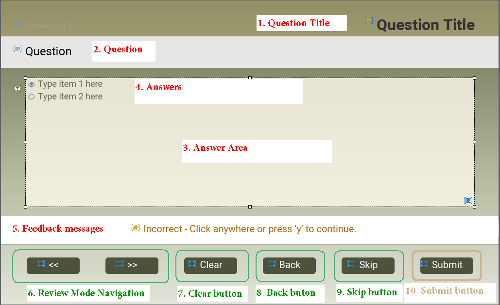
In a first article about Quizzes I introduced some terminology and one of those terms is ‘Embedded Objects’: those objects on the quizzing slides and master slides which have no individual timeline, but have functionality built in. Some of those objects can be turned off, using either Quiz Preferences (for global settings) or Quiz Properties for individual slides. Here is an overview of those objects (for quiz master slide MCQ,T/F….), from top to bottom, using the numbering in this screenshot:

  1. Question title: cannot be deactivated. You can edit that title on the quiz slides, do not delete it.
  2. Question: same, change the style if wanted but never delete.
  3. Answer area: compulsory as well. If you expect long and/or many answers, I recommend to make this area as big as possible on the master slide. If you want custom objects on the quiz slide (like an image), free some space by editing the size of this area. For a Fluid boxes quiz slide, you’ll need to add a fluid box for that purpose. More information in Fluidize your quizzes.
    This area is the container for:
  4. Answers: it is not possible to resize the individual answer size on the master slide, only on the quiz slides. Of course you need this object.
  5. Feedback messages: are stacked in the same location (also in fluid boxes, by using a static fluid box). In the screenshot the Review area is also stacked in the same location. It has almost no meaning anymore since it is only used for skipped questions.
    Quiz Preferences offers no way to activate/deactivate the messages, that has to be done with Quiz Properties for the quiz slides.

    1. Correct message: is checked by default for a normal quiz slide
    2. Incomplete message: is checked by default for a normal quiz slide
    3. Failure message: normally set to 1, with the dropdown list you can choose ‘None’. If you have more than 1 attempt on quiz level, you can add up to  failure messages with that same list.
    4. Retry message: becomes available when the number of attempts is greater than  However if you have more than 1 Failure message it will be dimmed.
    5. Partially correct message will appear instead of the Correct message when Partial scores is turned on and the question is not answered fully correct.
  6. Review Mode Navigation Buttons: if you allow Review (Quiz Preferences), it is wise to activate these buttons in the Quiz Preferences. They will only appear during Review, and make navigation possible since quiz slides normally do not have a Next button (and I also recommend no Back button) except when “Submit All” is turned on (will post a future article about Quiz Preferences). Here is a partial view of Settings in Quiz Preferences:

7. Clear button:  can be turned on/off both globally (see the screenshot above from Quiz Preferences, Settings). In the default setting it is turned off. It is possible also to turn on/off on individual quiz slides using th Quiz Properties (see screenshot top right).

8. Back button:  is a bit confusing. You can turn off ‘Allow Backward movement’ in the Quiz Preferences, which will automatically result in having the Back button disappear on quiz slides. However, when using remediation, where you want to send the learner back to a content slide, you have to turn this option on. Having a Back button on a questions slide is not a good idea, since answers are frozen once the question slide is left. Learners cannot re-enter an answer. One exception: when Submit All is turned on (see future article). Even when ‘Allow Backward movement’ is turned on, you can still check off theBack button on all quiz slides with Quiz Preferences, Settings. You can also do it individually using the Quiz Properties for the question slide.

9. Skip button; is turned off by default, can be turned on both globally and for individual quiz slides.

10. SUBMIT button: is the most important object on this slide. There is no way to turn it off, not globally nor individually. It is that button which is responsible fir the two-step Submit process. Remember: quiz slides have a pausing point by default which cannot be turned off (you can move it only with the mouse).

Two-step Submit Process

When the learner clicks the Submit button:

Step 1

Feedback message appears, playhead is not released but remains paused at the pausing point. If you have added slide audio to the question slide and it is not finished, it will continue playing. The pausing point will not stop the audio. Four possible situation in this first step:

  1. There is no answer or answer is not complete: Incomplete message appears.
  2. The answers were totally or partially correct. The feedback message Correct (or Partially correct) appears.
  3. The answers were not correct (partially correct is considered as correct).
    1. If there is only one Failure message and one attempt Failure message appears
    2. If there are multiple attempts which are not exhausted,  and one failure message: Retry message appears
    3. If there are multiple attempts, not exhausted, and multiple failure message: the appropriate failure message appears. Make sure to indicate that they can retry except for the last failure message.

All messages, except the Retry message and the intermediate failure messages (not the last one) should indicate how to trigger the second step. For all types of quiz slides, except the overlay quiz slides in a VR project, that will be ‘click the slide or press Y’.

The goal of this first step is to offer the learner as much time as necessary to read the feedback messages. Some developers don’t like the present workflow, will post some possible tweaks in a future post. Personally I hope that the new workflow for the overlay quiz slides in VR projects, which is more user friendly, will be extended to the other types of quiz slides.

When the user clicks the slide or presses Y:

Step 2

With this step the playhead will be released, same way as what happens with an action when the option ‘Continue Playing the Project’ is activated. It can only happen in two cases: for a correct answer, or for a Last attempt answer.

  • Correct answer: the action ‘On Success’ specified in the Quiz Properties panel will be done. Beware: default action is set to ‘Continue’.  It means that the released playhead has to travel through the inactive part of the slide (the part after the pausing point).  It it is only the default 1.5secs, that may be OK. However if you added slide audio, and forgot to move the pausing point closer to the end of the slide, that may be a long waiting time for the learner. Alternative could be to replace the action ‘Continue’ by ‘Go to Next slide’. In most cases that works fine, some users could have issues in case of low bandwidth and slow reactions of the LMS due to hardware problems. I had that problem in college when too many students were taking the same assessment, due to outdated switches.
  • Wrong, last attempt: the action ‘Last Attempt’ will be done. Same comments as for the Correct answer concerning the pausing point and audio. Look at the screenshot below: due to the audio clip, if you leave the action to the default command ‘Continue’, the learner will have to wait 4 seconds before getting to the next slide. Better drag the pausing point to almost the end, at 4 seconds. You cannot use the Timing properties panel to do so.

Quiz basics 1: Terminology

Why?

Since 2008 I have been blogging regularly about Captivate. The most visited post is a rather old one date October 2011. It is labeled  ‘Question Question Slides‘ and believe me, still has daily views.  It is the reason why  I consider Quizzes as one of the three main topics for any Newbie in ‘Three Skills to Acquire‘.  Since 2011 quite a lot has changed in Captivate, although the basic design of quizzes is still the same.  Many peers have asked me in the past to publish a book about Quizzes  (could easily fill a book if it included custom questions). From what I feel in the community, a book is not at all the appropriate medium anymore. However I want to publish a sequence of articles about Quizzes, as I did for the Timeline (another stumbling block), with up-to-date information. It is important to understand the terminology, which is a problem when trying to answer questions everywhere: there is no ‘official’ glossary for Captivate and lot of terms are used in a haphazard way. To avoid any misunderstanding in future posts about Quizzes, I want to start with explanation of the different terms concerning quizzes. Some are ‘official’ also to be found in the Help documentation, some are terms I am using as well.

Drag&Drop will not be included in this sequence of articles, it is not following all the rules of the normal question types

Quiz Menu

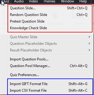
Although you can insert Question slides and Knowledge Check Slides from the big button Slides, the place to be is the Quiz menu:

The red box shows the 4 possible choices:

Question slide

Is based on a dedicated Quizzing Master slide, depending on the type: True/False, Multiple Choice, Fill-in-the-Blank, Short Answer and Sequence have the same master slide, Matching, Hotspot and Likert have each an individual master slide. Beware: Likert type cannot be used in a responsive project, whether Fluid Boxes or Breakpoint workflow is used.

An inserted Question slide will have these settings by default (except Likert which is set to Survey):

  • Graded
  • 10p score, no penalty
  • 1 attempt
  • actions Success/Last Attempt are set to Continue
  • pausing point at 1.5 secs
  • 1 Failure message
  • Reporting turned on
  • Included in Quiz Total

Most settings can be changed. Only one type has the possibility for partial scoring: MCQ with multiple correct answers. MCQ with one correct answer has the functionality of Advanced Answers (message/action). If number of attempts is higher than 1, you can have up to 3 Failure messages.

Question slides have a dedicated  category of system variables, read-only. More information in this post

You can use the On Enter event of a question slide to trigger a custom action, but not the On Exit event. Question slides, like interactive objects have a Success and a Last Attempt event which can be used for actions.

Random Question Slide

Is a placeholder slide, which will be replaced by a random question from a question pool. Pool questions are based on the same quizzing master slides as normal question slides. On Enter event can be used on slides in the pool, not on the placeholder slide. The same quizzing system variables are used for random question slides as for the normal question slides.

You find the option for Random slides also in the dialog box ‘Insert Question’ which you open with Quiz, Question slide.

More details about this type in Random Questions, Do’s and Don’ts

Pretest Question Slide

Slides are based on the same master slides as the normal question slides. They have a special bunch of system variables, will not be included in the variables used for question and random slides. The Pretest slides have only one goal: to have navigation after the pretest based on the results. For that reason you set up a Pretest action. These special slides have limitations:

  • They need to appear in sequence at the start of the course.
  • All free navigation will be disabled: both by playbar and by Table of Contents (reason is that learner cannot go back to the Pretest slides).

Knowledge Check Slide

This new type was introduced with Captivate 9.  Likert questions nor random questions can be used. They are not scored, will not be present in the quizzing system variables nor in Review/Retake. They can be recognized by a special icon in the Filmstrip. This is the default setup:

  • Not graded
  • No score, no penalty, partial scoring in MCQ impossible
  • Infinite attempts
  • action Success is set to Continue
  • pausing point at 1.5 secs
  • No Failure message
  • No Reporting

Some featured can be changed: you can limit the attempts and will then get a Last Attempt action. You can turn on Failure message(s).

A complete comparison with normal quiz slides can be found in Tips for Knowledge Slides

TIPS:

  1. It is possible to copy/paste normal question slides in a question pool  to reuse them as random slides.
  2. It is possible to copy/paste a question slide from a pool as a normal question slide in a project.
  3. It is impossible to convert a normal quiz slide to a Knowledge Check slide nor to a Pretest slide.
  4. It is impossible to convert a Knowledge Check slide to a normal quiz slide nor to a Pretest slide.
  5. It is not possible to convert a Pretest slide to a normal question slide, nor to a KC or random slide.

PS: KC slides can also be used as Overlay slides in an Interactive video. You’ll find more details in Tips for Interactive Video.

Question slides can be used in 360 slides and VR projects. Styling of those slides is limited at this moment, cannot be based on a custom theme.

Import GIFT file

Instead of adding the question/answers in the individual slides, Captivate allows two alternatives, one of them being GIFT import. Moodle developed this ‘language’, you can find the full documentation here. Use a text editor which allows to publish to non-formatted txt files. This file can be used to insert all types of questions in Captivate with the exception of Likert, Hotspot and Sequence types. There are also workflows which start from an Excel file.

Lot of features are supported: for MCQ with multiple correct answers you can set up partial scoring, you can add feedback messages etc.

GIFT import is possible for normal question slides, for slides in a question pool. It is NOT possible for Pretest slides, nor for Knowledge Check Slides.

Especially when dealing with big amounts of question slides, and/or many pools I like to keep the questions ready in a GIFT file as backup and for eventual editing

Import CSV file

New import workflow appeared with CP2019: use of an Excel template which will create a CSV file that can be imported. You’ll need two files which are stored in the GalleryQuiz under the installation folder of Captivate. I published a small article about this workflow. Using the macros in CSVQuestionsCreationMacro file is pretty straightforward and documented in this tutorial by Dr. Pooja Jaisingh.  Same question slides are supported as for GIFT import (T/F, MCQ, Matching, FIB and Short Answer). There are some limitations, reason why I still stick to the GIFT alternative:

  • You cannot indicate partial scoring for MCQ with multiple correct answers
  • CSV file not really suited as backup, since you cannot edit a question once it has been added to the CSV sheet
  • Got some errors when trying CSV editing with importing to an Excel file, and exporting to CSV. File was not accepted by Captivate.

Quizzing Master Slides

All types of question slides described above are using the Quizzing Master slides. Each theme in Captivate needs at least 6 master slides, whether it is a blank (non-responsive) project, a Fluid Boxes (responsive) or a Breakpoint Views (responsive) project. Blank master slide is always required (for PPT import an software simulations), 4 question master slides and one score master slide. The Blank theme used to show this minimum set, but for some reason in CP2019 a Title master slide was added (?) which I deleted in this screenshot.

I will focus on editing those quizzing master slides in a later article. In this introduction I just want to point out some very special aspects of those slides.

Timelines

The timeline of the quizzing master slides, and the result master slide is very simple: you see only the slide timeline. There are no placeholders, no object timelines like you normally find  on content master slides. However when you look at the content of those master slides, you see a lot of objects!

You don’t see any pausing point on the master slides, not for the questions, nor for the score master. However when you insert a question slide (any type) it gets automatically a pausing point at 1.5secs. Same for the Score slide.

When you select an object on the master slide (button, a feedback, Question, Answer area) they still don’t show a timeline. Their properties will appear. I will point to the objects in a question (master) slide or a score (master) slide as:

Embedded Objects

My definition: objects that do not have an individual timeline, not on the master slide nor on the slide itself. Those objects have functionality built in, which control the workflow for the slide. I talk about the Submit process (see future article), the appearance of messages, the inclusion in quizzing system variables etc. Just one tip: be careful when dealing with Embedded objects.

Those objects have absolute priority in the z-order, also known as stacking order. They will always appear on top of extra inserted custom objects.

Puzzling: normally the only interactive object allowed on a master slide is a shape converted to a shape button. However on the quizzing and score master slides the used buttons are all Transparent buttons.

When creating a question slide or a score slide, not all objects will appear. It depends on the setup in Quiz Preferences (see later article), the Quiz Properties of the slide and… on the situation. The Review Navigation buttons (with the double arrows) on quiz slides will only appear during Review. The Retake button on the score slide can only appear if more than one Attempt on Quiz level is allowed.

Next?

So much has to be told about Quizzing, always more than I expected. In future posts I will try to write about:

  • Two-step Submit process
  • Tweaking/customizing that process
  • How to handle Embedded Objects
  • Quiz Preferences
  • Editing the Master slides for quizzing
  • (Setting up the Pretest condition)
  • Audio on Quiz slides
  • Custom objects on quiz/score slide
  • Custom score slide
  • Scoring for KC slides
  • ….

I am sure this list is not complete. If you want to add more ideas, feel free to comment.

Randomizing in Captivate

Intro

Randomizing exists in some limited situations in Captivate:

  • Question pools allow to add randomized quiz slides to a project.
  • Shuffle feature for several question types can be seen as randomizing.

However in all other situations you need to use JavaScript to get a randomized number (or text). This short blog is meant as an answer to a user request in the eLearning community, to be found under this link. In my blog you will find multiple examples of randomizing for games. This is a very simple example since the user only wants to have a random card chosen from a deck on clicking the deck. A second click on the deck needs to flip back to the cover of the cards.

Example file

There is only one slide in this project besides the Title slide. The three (tarot) decks are identical, have 14 cards. Try it out. You may get some ideas how to use this workflow for games. In the future I will post more examples of this workflow in a bigger tutorial project. 

This example can be watched below (fixed size) or you can click this link for a rescalable version.


Step-by-step workflow

The timeline of the tarot slide shows the three decks. Each deck has a Click box on top of the deck, which will trigger an advanced action with embedded JavaScript. I hear you exclamations! Why not use the deck itself (PNG image) as interactive object. It is impossible because JS is used to change the state of the object, and it is impossible in that case to use the image itself as button. Of course that is annoying, because a responsive project with Fluid Boxes will not allow stacking of the click box with the multistate object in the same location. You would need a button in another location. For a non-responsive project (like this example) it is not a problem.

Multistate object (deck)

Decks are multistate objects with 15 states. The Normal state shows the cover. Due to the script the labeling is important for the other custom states. They are all labeled Cardx  where x is a number corresponding with the rank of the card. The three decks in the example are identical, but you can have decks with a different number of cards, just use the same logic for the numbering. Look at the Object state panel for Deck1:

Variables

In Captivate I need only one variable for each deck to follow up the status: is it showing the cover, or a random card? Two possibilities means that I can use a Boolean variable. When the cover is visible, the variable has the value 0, for a random card it has the value 1.

Advanced Actions

Click boxes trigger a conditional advanced action. Here is the action for the first click box (CB_1) over Deck1:

The Boolean variable v_1 is checked. If it has the value 0, a random card needs to be shown which is done by a JS script (see below), and the variable is toggled to 1. If it has the value 1, the cover (which is the Normal state) is shown. 

For the second and third deck, the variable and the name of the deck need to be edited.

Javascript

The used trick is to create the name of the state by concatenation of two strings:

  • First string is always 'Deck1'.
  • Second string is a random number between 1 and 14, converted to string.

I have explained in depth the use of Math.floor(Math.random()*(max-min))+min) in an older blog post:

Playing-with-numbers-part-1

That random number is converted to a string with a JS method. Result of the concatenation is the name of one of the states in the deck multistate object. 

For the second and third deck, the deck name need to be changed in this script. If you do have more or less cards in those decks you need to edit the maximum number (here set at 15).

More ideas?

This basic example may have ignited your creativeness? What about creation of a jackpot game? A funny mathematics exercise for your kids? A board game where you use a dice? 

For this use case it is impossible to create a shared action. One of my long-standing feature requests for actions is the possibility to generate a command using concatenation. A second one: being able to change a state based on a variable.


Comparing Advanced and Shared Actions

Intro

If you have followed me since a while, you know that I am a great fan of Shared actions.  However I am aware that many developers seem to be afraid of those shared actions. In this post I will try to demystify the 'shared action', and answer some questions.

First of all: the biggest advantage of a shared action is its reusability. Whenever you need an action which will be used multiple times in a project, or which you plan to use in more than one project, it is worthwhile to consider the use of a shared action. Here are some other reasons. You can skip this part and come back to it later:

  • When used within one project, you are using instances of the same shared action. If you prefer using duplicated and edited advanced actions the file size will be bigger. It can be compared with the use of multiple instances of the same graphic/audio clip.
  • Shared actions appear in the Project Library with all the functionalities of Library assets: how many times uses, on which events etc..
  • You can transfer an existing advanced action to a new project using copy/paste of the object triggering the action: a button, click box, TEB (success/Last attempt events), slide (Enter/Exit event). If variables are used in the advanced action, they will be created in the new project. However, in many cases, commands in the advanced actions will revert to Continue if what they are referring to is not available in the new project. Example: missing slides for navigation commands, missing states or even multistate objects...  
  • Transferring a shared action to a new project is a breeze: drag the action from the original Library to the Library of the new project. Variables which are not used as parameters will be created (similar to copy/paste for advanced actions). Since the shared action is not connected with any event, you don't have to bother about having everything in place before transferring the shared action.
  • There is no built-in way to document Advanced actions in Captivate. A shared action however allows to add a description to the action and to the parameters if any are used. 

There are some limitations to shared actions:

  • It is not possible to trigger a shared action from a hyperlink.
  • You cannot attribute a shared action to several events at once, as is possible for an advanced action.

Beware: not all advanced actions are suited as shared action. In a recent post about 'Hint after x failed clicks' I explained a use case which was meant as introduction for Captivate users new to variables and advanced actions. You may have a look at that first blog post:  https://blog.lilybiri.com/automatic-hint-after-x-failed-clicks

Conversion to shared action

It is a good idea to create and test the action as advanced action before creating the shared action. This was the advanced action  created in the mentioned blog post, triggered by the Success event of the  'wrong' hotspots (5) in the example:

Two user variables were used: 

  • v_attempts tracks the number of clicks on the button/hotspot
  • v_failure is used in the Failure feedback message and allows to change the content of that message. The default failure message will be replaced by a Hint message after the defined number of clicks.

First version Shared Action

Open the advanced action in the dialog box, use the button Save as Shared action, and this dialog box will appear:

In the screenshot you see that I have filled in the description. It is important to do so, try to explain in short sentences what the action will do exactly. It may seem a loss of time, but if you reuse the action a couple of months later, you'll understand why I emphasize this.

In the main part you see the 'parameters', and in this particular case all of them show the green check mark. This means that you can save the shared action as it is. Result will be that the parameters remain static, cannot be changed when you attach the action to an event.  They will not need a description neither. Comparing with the advanced action:

Pro

  • The description of the action, which is impossible for an advanced action.
  • Its appearance in the Project Library with all the functionality of other assets.
  • For reusability in another project: you can drag the shared action from this library opened as external library to the Project library of the new project. For an advanced action you would need to copy/paste one of the wrong hotspots to the new project.

Con

  • You cannot attach the shared action to all wrong hotspot events at once, you need to do it one by one. The advanced action could be attached in one workflow by selecting all the wrong hotspots.
  • For another hotspot slide in the same project it will be easier to create a duplicate advanced action, and edit the Hint text (value for the variable v_failure).

Second version Shared action

In the first screenshot I marked two parameters with a question mark:

  • Parameter '2': literal indicating the number of required wrong clicks before showing the Hint.
  • Parameter 'Click on the icon 'Responsive project'': the new value (literal) for the variable v_failure to replace the failure text by the Hint text.

You can make the static parameter dynamic by clicking the check box, and entering a description for the parameter. To me the most important candidate is the Hint text. Making that parameter dynamic, means that you can enter a different Hint text for each new attachment of the action to an event. Beware: the correct checkmark will only appear after confirming the description of the active parameter:

This makes the action flexible: you only have to enter the Hint text as parameter whenever you attach the shared action to an event.

Pro

  • Besides the description of the action, the meaning of the parameter will appear whenever you apply the shared action.
  • Its appearance in the Project Library.
  • Reusability in any new project remains.
  • File size will be lower compared with using duplicate advanced actions.
  • You can edit the Hint text for each instance.

Con

  • You cannot attach the shared action to multiple events at once.
  • You need to fill in the text parameter with each attachment (copy/paste is possible)

Third version Shared action

You can make the action even more flexible by declaring the number of wrong clicks to be a dynamic parameter.  Using that shared action you'll be able to change the number of wrong clicks before showing the Hint instead of the Failure message.  Like increasing the number for a more complicated hotspot slide. I don't have to explain this screenshot anymore:


More tips

I may write out a third blog about using this shared action as template for advanced actions, including possible enhancement by adding graphical (audio) assets to the Hint text message.

If you want to learn more about using Shared actions, please have a look at my 'crash course'. 

Shared Actions : intro

Lesson 1 (video)

Lesson 1 (step-by-step)

Lesson 2 (video)

Lesson 2 (step-by-step)

To circumvent the "Con" of shared actions not being able to apply to multiple events at once, remember that you can easily create an advanced action from a shared action. Here is an example:

Using Shared action as template


Automatic Hint after x Failed clicks

Intro 

This short blog post is created to answer a question in the Adobe forum about clicking an interactive object with multiple attempts. After two wrong clicks, the Retry message should be replaced by a Hint message. There are multiple workflows possible, but I tried with this simple solution to use as much of the existing features as possible.  The Hint will be only text. A more elaborate solution could be a Hint where the text is accompanied with a highlight box and/or other graphical elements. If useful, could create such an example as well. This one is meant for relative new users of Captivate, hence the step-by-step workflow.

Example

Watch this published 3 slides project, using this link (for a scalable version).


On the second slide you'll see the results of the workflow: learner is asked to click the correct button. Number of attempts was set to Infinite but could also be lower. First two wrong clicks lead to a Retry message, on the third wrong click the Hint message replaces the Retry message.

Workflow

Slide setup

Have a look at this screenshot, where the slide (2) and its timeline are visible:

The six interactive objects are shape buttons (Alpha and Stroke both set to 0) over the buttons of the image. One of them deserves the correct click and the other ones are wrong choices. All buttons have the default pausing point at 1.5secs. They will all trigger an advanced action, which means the slide will remain paused. You see the Correct feedback message, using the Default Success Shape style (messages are no captions, but shapes).

Variables

The workflow needs setting up two user variables using the Project menu, option Variables:

  • v_attempts will track how many times a click has been done. Its default (start) value is set to 0. Its value will always be numerical.
  • v_failure: will have a text message. In the screenshot of the variables dialog box you see the default value. However it is not really necessary to define that default value if you use the Reset action described below and triggered by the On Enter slide event. 

The first variable is easy to understand. The variable v_failure will be used as placeholder in a default feedback message. That makes the message 'dynamic': by changing the value of the variable, message text will change. This is the only way to achieve such a change, because those default feedback messages do not support multiple states (although the States button is active, you cannot add states). You'll learn which message to use in the next part.

Events and Advanced Actions

As mentioned before, I did set up the 6 shape buttons with Infinite Attempts. This means that they are left with only the Success event, which occurs on clicking the button. Only the Success message will be necessary. That may seem illogical, is linked with the Captivate meaning of Success and Failure. Success means the button has been clicked, Failure means the click happens outside of the button. You understand that clicking outside of a button is useless here.

Setup SBCorrect

Clicking the Correct button should result in navigation to the next slide with the simple action 'Go to Next Slide' (happens to be the default simple action). That navigation will not happen immediately after clicking the button because the option 'Pause for Success/Failure Captions' is activated. Display time for those messages (because they often are not in a caption, but in a shape) is 3 seconds, can be changed in the Timing Properties. See the full setup in this screenshot:

The correct feedback message can be edited on the stage, uses the Default Success Shape style.

Setup 5 SB_Wrongx 

Dynamic Message

Clicking the Wrong buttons will also show the Success feedback message, and you'll get 5 of them. For the learner they should look like Retry (or Hint) messages, so I choose another Shape style for these messages (see screenshot Slide setup). Since they are linked to their buttons and all appear in a different location I also used the Align, Align and Resize to the same size from the right-click menu after selecting the 5 messages.

The trick here is to fill those messages with the same user variable v_failure to replace the normal success text. Do this by using the X-button in the Character part of the Properties panel of the message while in editing mode:

That X-button will show the 'Insert Variable' dialog box. User variable is the default choice, you just need to choose v_failure from the dropdown list. Important: the default 'length' is set to 50 characters, if you expect a longer text increase that amount. In this screenshot I increase it to 100:

Advanced Action FailureAct

This is a screenshot of the Preview window of that action:

You see that this action has two decisions:

Decision 'Tracking' is non conditional. It consist of one Increment action for the variable v_attempts.

Decision 'Message' is conditional, has only the THEN part, not an Else part. When the attempts are greater or equal to 2, the text in the variable v_failure is changed to the Hint text. Of course it is possible to change that amount of attempts if wanted.

EnterSlide Action

If you allow the learner to revisit the slide, and want to have the identical situation of the first visit, it will be necessary to Reset the variables. You'll need this non-conditional advanced action, to be triggered by the On Enter slide event:

Both variables v_attempts and v_failure are reset to their original values. Because an advanced action is not releasing the play head, I added Continue. In this example it is not really necessary, but it would mean that the play head remains in the first frame and is not advancing to the pausing point at 1.5 secs. It is possible with other setups, like having an effect or animation that you need that release of the play head.

Video Demo - Tips

Intro

You will not find in this blog post details about the basics of creating a Video Demo (cpvc-project) in Captivate, just some practical tips which could make the workflow easier. 

Since I rarely use the possibility to capture from webcam along with the screen recording, you'll not find tips about that neither. Many users reported issues with webcams or cameras. Sorry you'll not find a solution for those issues neither.

Tips for Preparation

You'll need a solid 'storyboard', similar to what you need for a software simulation. My preparation always includes:

  1. In Preferences, Recording, Video Demo set the bitrate to 32-bit instead of 16-bit. You could also change the location of the temporary working folder if you don't have enough space in the default folder under AppData. In most cases you will want to keep the default choice for capturing the mouse tracks:

    BTW this setting will also improve the quality of Full Motion Recording slides in software simulations, although it seems to be only for Video Demo.
  2. Recording requires, similar to software sims, to see 1px/px. That can be done by editing the AdobeCaptivate.ini file, DPIAwareness setting as you are invited to:

    However I prefer the alternative: lowering the screen resolution until I can set the Display Resolution to 100% and still be comfortable to manage Captivate. 
    Example: laptop used has a recommended screen resolution of 3840x2160px and a display resolution of 225%. To be able to work comfortable with Captivate at 100% I need to lower to HD (1920x1080)

Tips for Recording

As mentioned at the beginning, I will focus on screen recording, not webcam recording.

  1. Do not try to record a complete video at once, but split it up in manageable chunks. In most cases I record only a couple of minutes in one session. After recording the first part, I will use the editor to clean up, and eventually replace the audio clip (see tips about editing). Goal is to finalize the real duration of that part before adding the next recording. To add the next recording you need to move the play head to the end of the first footage and start the recording using the menu Insert, Video Recording:

    Tip: If you plan to use the recording to create an interactive video later on, you can use planned bookmarks or overlay slides to choose how to split up in chunks. 
  2. It is important to record in an appropriate rhythm. For that reason I always opt to capture video and audio at the same time. In most cases the narration will define the wanted rhythm. That narration can be a 'draft' version which you'll replace later on by a proper recording (see tips about editing). Try to make the mouse movements as swift as possible, and try a narration speed convenient for a one to one talk.

Tips for Editing

The Video Demo editor has a lot of features, and editing is non-destructive. Although it is possible to do some editing in specific editing applications like Premiere Pro and Rush (see later), those applications need a published MP4-file. It is important to do use the editor before switching to those other applications.

  1. When previewing the video you'll often find the mouse paths too boring because they are too slow. In that case I often prefer to hide the path and use only the the marker for the mouse click itself.

  2. Although you can edit the audio narration clips in Audition or in Captivate, it is possible that you want to replace the 'draft' audio by a more professionally recorded version. This is possible using either the Audio menu, Import Video Narration. However, in that case you get the full audio clip. For that reason I prefer to use the Edit options in the Library on the individual audio clips of each part. That way you'll keep even the original WAV files on top of the 'edited' clips which can be new recordings. Look at this example of a video which had 7 parts. Some audio clips have been edited, others have been replaced.
  3. The object styles are available in Video Demo projects. Use them to create proper styles for the static objects you want to insert: highlight boxes, shapes, captions.
  4. If you use text (captions or shapes) you don't have to bother about the used fonts, as in normal cptx projects. ( Fonts in Captivate). It is perfectly possible to use a cool system font.
  5. Careful with transitions which you'll need between the 'chunks' of your video. You can also bridge a gap between clips using a static object which can have transitions (no Effects).

Extra tips

Video Demo Slides in Software sims

Software simulations often need Full Motion Recording slides for mouse movements. Those slides are short videos, which are still based on the original SWF technology (FLV slides). Although they will be converted to MP4 when published, several developers have reported issues with the conversion. You can avoid those problems by replacing the FMR slide by Video Demo slides. The easiest way is during recording:

  • When you expect a FMR slide to appear, stop the recording.
  • Use the Slides button to create a Video Demo slide, the resolution will be set automatically to the chosen resolution at the start.
  • After the creation of the Video Demo slide, continue with the software simulation. 

Final touch with Adobe Premiere Rush 

The Video Demo editor has great features for mouse management, Pan and Zoom, inserting static objects. However if you want to uplevel your video with great intro and outro, you need a real video editor. This can only be used with published MP4 footage. I used Premiere Pro in the past, but always found it rather challenging for the small improvements to the videos. Adobe launched Rush a couple of years ago, available for phones, tablets and desktop. It has exactly the amount of features needed to embellish your Video Demo projects. If you have a license to Creative Cloud, give it a try:

Adobe Premiere Rush

Interactive video

It is no secret that I am not a big fan of passive video, because due to my decades of experience with coaching/training/teaching interactivity is my first goal.  A recorded Video Demo is perfect to use as Interactive Video to enhance its learning efficiency. It is not offering a big amount of interactivity but way better than passive video. Here is an example:
Custom Play/Pause button


Timer Learning Interaction - use case

Intro

That interaction is meant in the first place to show the learner the exact time he spent on a course. In that situation the interaction is often timed for the rest of the project. However it can be used in other situations. This blog is due to a user request on the Adobe forums, have a look at this link. Summarized: the course should be exited automatically when a slide is displayed longer than a certain time, because it means that the learner probably disappeared without closing the course. That caused issues due to the LMS when retaking a new session for that course. 

Example file

I used one of my previous projects to show the result of the proposed workflow. In this case the course will be exited on each slide if it is displayed for more than 3 minutes. Of course it is perfectly possible to edit that duration, or even have a different duration for each slide as you'll see in the described setup workflow. Try to be patient on at least one slide to let the 3 minutes elapse and see the course automatic exit. You can open this course in a scalable version using this link, or you can watch the embedded non-scalable one below.


Setup

Basics Timer interaction

When you insert a Timer interaction, you'll have to define the properties in this dialog box:

You need to define the amount of time (here 3 minutes 0 seconds) for the timer, and whether you want to count down or up. In a normal situation you can have a message popping up after the end of the counting, but in this case it was not needed. I marked three fields in this screenshot:

  • Background: I unchecked this option which would show the image of a clock. Since the timer should not be visible for the present use case I preferred a transparent background. 
  • Variable: is an optional field, but was needed in this case(see below). That variable is a Boolean with only two possible values (0/1). You need to define that variable in Project, Variables. It was labeled v_timer in this use case. Its default value will be 0, and toggled to 1 when Timeout occurs.
  • Jump to Slide on Timeout: which slide is not important, but you can use the On Enter event of that slide to trigger an advanced or shared action. As you'll see in the setup, I used a very short dummy slide in this case.

Even after closing the dialog box, you can always reopen it using the pencil icon in its Properties panel:

Setup workflow

Variable: Although each slide will have an instance of the Timer Interaction, the created user variable v_timer (see screenshot under Basics) can be used for all instances. The value will automatically be reset to 0 on a slide with a new instance of the interaction. It will be toggled to 1 only when the Timeout occurs on a slide, and then the course will exit. Variables do not keep their value when closing a session.

Timing Interaction instances: insert an interaction on the first slide where you want to enable the timeout, and resize it and set up the properties as indicated in the screenshot under Basics. Since its visibility is not wanted, there are two ways to make this possible. Remember that the background already has been made transparent (see screenshot of the dialog box):

  • If the slide background is a solid color, you can use that color for the Text in the interaction:
  • It is not necessary to have the complete interaction on the slide, you can move it partially to the scratch area so that the numbers (text) is not visible on the stage. That will be necessary if the slide background is not a solid color:

You can copy/paste the interaction to the other slides without any problem. All fields  will be the same. Only two possible exceptions which can need editing: the text color field (if using the first method above) and the time duration if you don't like to have the same timeout settings for each slide.

Dummy slide: in this case I used a very short slide at the beginning of the project, duration = 0.1second. It is not really necessary to use such a slide, you can choose any slide of the project. These are the reasons for my choice:

  • The On Enter event of this slide will be used to trigger an advanced action. For most slides in my projects I already have a dedicated On Enter action to reset situations. If you need to add another decision to those actions, it will be different for each project where you want to use this workflow. The Dummy slide can be copied to any project, including its advanced conditional action.
  • The first slide will already be rendered in the project whatever the slide used to navigate back to this slide. That may speed up the navigation process. However: if you have quiz slides, you need to enable Backwards navigation in the Quiz Preferences. 

Advanced action

The On Enter event of the Dummy slide triggers this advanced action:

Since this is the first slide, it has to continue to the next slide on first visit. That is the reason for the conditional action, because on first visit the timer variable v_timer will have its default value (0). Only when the slide is visited from another slide where timeout has occurred, that variable will be set to 1. 

Before exiting the navigation is returned to the "last visited slide" in order not to mess up bookmarking by LMS: last visited slide (bookmarked) will be the slide where timeout occurred. If you don't want bookmarking by LMS, you can delete that command.

Reusing workflow

User insisted on a workflow that was easily to be reproduced in multiple projects, both responsive and non-responsive. 

For another non-responsive project:

  • Copy/paste the dummy slide and use it as first slide.  An extra advantage will be that the used variable v_timer will be created in the new project.
  • Copy/paste the learning interaction. You may need to edit the timeout duration and eventually the text color to adapt to the colors of the new project.
  • Now you can proceed as described: just copy/paste the interaction to all the slides. Do not forget to check Quiz Preferences to allow Backwards movement.

For a fluid boxes project:

  • Copy/paste the dummy slide, do not bother about fluid boxes on that slide.
  • You'll need to create a fluid box for the Timer interaction, it is not possible to copy it from a non-responsive project. Edit the interaction as needed, the user variable has been created from the dummy slide.
  • It is recommended to create the fluid box on the used master slide(s), because you'll need to copy/paste the first instance to the same fluid box on each slide. 

Button states - Basics and Tips

Intro

Recently I answered several questions about button states, which proved that some information is missing. For that reason I checked the official Captivate document, and indeed to me it is not at all complete especially for buttons which are the most used interactive objects. You can have a look:

Work with multi-state objects in Adobe Captivate

Some examples: the InBuilt state 'Visited' is not mentioned at all. I couldn't find any information about the lock of InBuilt states for buttons and how to circumvent it. The recent added button types - SVG and Bitmap images - are not even mentioned. What is the meaning of the blue and red selection rectangles in button state objects? Several years ago I published an extensive blog about the InBuilt states for Drag&Drop objects (Inbuilt D&D states) to fill in gaps in the Help document.  With this blog I will try to summarize tips and workarounds for InBuilt states for buttons. After a short recapitulation of typical features of Button states, you'll get some examples.

Typical features

InBuilt states

Buttons of any type have by default three InBuilt states: Normal, Rollover and Down. Those three states are part of the object styles for text buttons, image buttons, transparent buttons and shapes (because they can always be converted to shape buttons). However no object styles can be created for bitmap images and SVGs used as buttons, the most recent types added in version 11.5. 

Less known is the fourth InBuilt state: Visited, probably because you always need to create that state. It cannot be included in the object style for the four mentioned button types neither which is a pity. Audio can be attached to the Visited state and Normal state, while that is impossible for the Rollover and Down state

InBuilt states will appear in specific situations. Rollover when hovering over the button, Down while button is pressed, Visited after the button has been pressed and released. However the Visited state can also be set using the Change State action which is impossible for any other InBuilt state (for buttons and D&D objects). Like with custom states, you can add Audio to the InBuilt states. Here are two tips based on that knowledge:

Tip 1: The Down state will disappear when you release the button. If you want to keep the down state after release, use the Visited state, looking identical to the Down state. This is valid for both responsive and non-responsive projects.

Lock Size/position

The size and position of the button is the same for all InBuilt states, based on what you designed for the Normal state. That is the reason for the lock symbol which you see on the stage when Rollover, Down or Visited are selected. 
The Normal state defines the clickable area, hence the Lock symbol. For all buttons, except the SVG used as button, this will always be the bounding box of the button. You can always edit or replace the content in a state but that content will be rescaled to the bounding box defined in the Normal state. In the example screenshot that content was a SVG where the clickable area was kept to the bounding box. That vector image type always keeps its height/width ratio. If you want to use another SVG in the Rollover or Down state, which needs more space, be sure to create a bounding box which is bigger than what is needed in the Normal state. Here is an example, the SVG in the Rollover state is wider, so the bounding box in the Normal state has a larger width.
In this example a different SVG was used in all the states. You cannot replace a SVG by a bitmap image, each replacement needs to be of the same type.

Tip 2: (answer to this thread in the eLearning community: Word Search) to create a highlight appearing after a click, use a shape button with 2 (or 4, the Rollover and Down are not important) states, one is the Normal state and the shape has no fill nor outline, the second one is a custom state where the shape has an outline. Use the action 'Go to Next State....' for that button. First click will show the custom state (outline), second click will revert to the Normal state.

Extra objects

Contrary to audio which can only be added to the InBuilt states Normal and Visited, you can add extra objects to all InBuilt states. However this is only possible in non-responsive (Blank) projects and in static fluid boxes. Normal fluid boxes do not allow adding extra objects to a state (due to the stack prohibition). 

This aspect opens a lot of tweaking possibilities. Those extra objects are not locked, nor do they need to be of the same type. Contrary to the locked button states which have a blue outline marker, extra objects will have a red outline marker (see screenshot under Tip 3). There is no real limit to the number of objects you can add. Whereas audio cannot be added to Rollover or Down states, you can add extra objects to those states.

Tip 3: Create a tooltip for a button by adding a text (or other object) to the Rollover state.

Tip 4: Quick Click/Reveal workflow, using a button with a custom state derived from the Normal state but with the Reveal objects added to it. Use 'Go to Next State' for that button, and you have a toggle button, which will hide the revealed objects when clicking again. When using a variable as explained here, you have even more control.

Tip 5: Can you increase the size of a shape button in Rollover state, was another recent question? The forementioned trick with a bigger bounding box in the Normal state is not functional in that case. Here is another possibility:

  • In the Rollover state make the shape button invisible. Depending on its setup this means Alpha for Fill set to 0, border width set to 0 and eventually take out the text.
  • Add a bigger image of the shape button to the Rollover state and align it as wanted.

Of course you can this also apply on the Down state and/or with a smaller version of the button, see screenshot:

Tip 6: Starting with an invisible Normal state for a shape button (Alpha and stroke set to 0) and adding an object to that state within the bounding box of the shape button, allows you to create a rotating button. A full description of the workflow can be found in this blog post. Of course this means the clickable area will be greater than the image itself, but most learners will not detect that incongruity.


Conclusion

You'll for sure know about more examples to use button states in a creative way. Feel free to post your ideas in a comment, always appreciated.

Fractioning (custom) motion paths

Intro

Motion effects can be customized in many ways. Pausing Captivate's timeline will also pause automatically any effect if it is not finished. This feature can be used to make boring slides more engaging. To see what I mean, have a look at this example file. It has three slides using that approach:

  • Business Model: has a simple left to right motion path use on a cover shape to deploy an infographic sequentially.
  • Career Steps: uses a custom polygon path to have an animated avatar and discovering states in a multistate object
  • Captivate Hurdles: has a custom curved path, and uses also multistate objects.

You can watch the example file full screen by clicking this link.

Or have a look at this embedded example:


Workflow

Steps

Each of these three steps will be explained in detail below:

  1. Create the motion path, and edit its duration taking into account the number of wanted fractions.
  2. Create the button and its advanced action, which will have two decisions:
    1. Decision 1 will manage the motion and pausing, and a tracking variable if you want a second decision to be done when all parts have been deployed. This decision is non-conditional
    2. Decision 2 will be done when the path has ended and is conditional
  3. Test the interaction, it will probable need tweaking the path length and fraction times. Moreover if you allow to revisit the slide, you may need an On Enter action to reset the situation.

The detailed explanation will be done using the first example ‘Business Model’ . Explore its timeline:

Slide background is a a shape filled with a gradient. That shape was duplicated to be a cover, which is stacked on top of the Infographic (with the images) and the Next button. Motion effect will be attached to that cover shape. On top of the cover you’ll see the Play button (no pausing point), title and instruction text. The Next button has a pausing point which needs to be after the end of the motion effect.

Step 1: Motion path

The effect applied to the cover is a simple Left-to-Right motion path. It has no easing because easing would be applied to the start and/on end of the complete path, but you’ll use it in fractions. This linear path will be cut in 6 parts. I used a vertical guides grid to visualize the 6 fractions, and make sure that each guide is in between two images. Have a look at this screenshot, showing the guides and their setup (using View, Create Multiple Guides):

Motion path  is visible on the stage with end and start points. Those points are always connected to the center of the bounding box of the shape. The start point is at 1024/2px = 512px because the project width is 1024px. You need to extend the length of the path by moving the end point horizontally (keep SHIFT key pressed) to the X coordinate 512+1024px = 1536px. For that reason I added another vertical guide at 1536px. Turning the snap on for the guides helps to position the end point. See screenshot:

For the duration of the Effect, start from the time to use for each fraction. I found that using a time between 1 and 2 seconds is fine. As you can see in the timeline screenshot above, for this slide a duration of 1.5secs was chosen, leading to the Effect duration of 9secs. If you look closer to the Timeline, you’ll see that the effect duration is slightly shorter, because of step 3: tweaking.

Step 2: Action for Play button

Basic setup

At first sight the needed advanced action for the Play button seems to be rather simple.:

  • Pause the slide On Enter.
  • For the Play button use this sequence:
    • Continue      to release the playhead, the motion effect will start
    • Delay Next Actions by 1.5 secs          for the Business model slide 1.5seconds is 9secs/6
    • Pause      to pause the motion effect waiting for the next step (see guides in the first screenshot )
  • The Next button will be uncovered in the last step.

However, there is no way to prevent the learner to click the Play button after the motion effect ended, and the Continue command would then override the pausing point of the Next button, which you probably want to avoid. To prevent this you need a way to track the end of the motion path. Using a variable v_counter for tracking is an easy way. Although you could use one conditional decision, I like to separate the advanced action in two decisions. Have a look at this screenshot of the basic PlayMotion action:

Supposed here is a starting value of 0 for the variable v_counter. When all 6 parts have been ‘discovered’ the Play button will be hidden. It could be possible to replace that Hide action by a pure Pause action, but it would lead to frustrated learners.

If you try out this basic action for the Business Model slide, you’ll have a flickering problem. That has been a pain since many versions. In the Tweaking section of this blog, I will show you how to solve this. Moreover in the video displayed in the previous post, you’ll see that the first part of the effect is deployed immediately. There is also need for an On Enter action on all the slides, to reset everything in the original situation including the value of the counter variable.

Extended Setup

This simple slide didn’t need to have another action to be done besides part of the motion effect. That is not the case for the Steps nor the Hurdles slides. The extra actions need to be inserted before the Delay command in the Always decision. Look at the versions for the Hurdles slide. Multistate objects were used to show explanations. There are 4 parts. At the end the Play button (is in a group with a Tooltip) needs to be hidden, and the group of extra buttons made visible:

Step 3: Tweaking

Timing

When testing the project with F11, Preview HTML in Browser, you'll see that the timing is not perfect: motion effect. There are two ways to tweak this timing, and often both are needed:

  1. Decrease the total time of the motion effect (Timeline panel or Timing Properties). That will speed up the motion, more will be shown with each part. If you look at the first screenshot, Timeline panel for the Business Model slide, you see that the duration of the effect is now 8.9secs instead of the original 9secs. For the Steps slide, I reduced the original 10secs (5steps of 2sec) to 9.7secs, for the Hurdles slide 5secs was reduced to 4.8secs

  2. Decrease the Delay time in the advanced action for the Play buttons. You could see in the Hurdles action the change to 1.8secs. 

On Enter action

You’ll need such an action to reset the situation if the learner is allowed to revisit the slide, and also to be able to reuse the unique variable v_counter.  Whenever possible, avoid to create multiple variables if you can reuse the same variable. Here is a simple On Enter action for the Steps slide:

As promised, here is the On Enter action for the Business Model slide, which is more complicated because it solves the flicker issue, and will show the first part of the image (Hence the Assign to 1 command for the counter variable):

To avoid the flickering of the InfoGraphic image, it is hidden to start with and shown after 0.3secs.  I also added a Fade in Transition The starting value of the variable is now 1 instead of 0. To deploy the first part of the infographics you’ll see the same actions as in the Play button action. The total delay for this first part is 1.6secs.

More?

It would be wonderful to hear how the described workflow could inspire you for your projects.. 

Creating custom paths - curved or polygonal - comes with some issues:

  • For polygons: you cannot create horizontal nor vertical parts for an obscure reason. I have logged this bug multiple times.
  • For curves: realizing cusp points is normally not possible... 

If you want to learn how to overcome those issues, please let me know.