Available Events in Adobe Captivate

Intro

Over 6 years ago I published a blog post explaining the importance of Events in the application. I also offered for free a table describing all the possible events. Meanwhile new features have been added, the User interface has changes. It is time to update that old post and table. You will be able to download the table at the end. It is a protected document, you can print it at a low resolution, but no permission for editing. You can find workarounds, but please I beg you to show some respect for my work.

When training/helping users to start with advanced or shared actions, I often detect that newbies are not aware of the process needed to trigger an (advanced/shared) action: each action, whether a simple, shared  or advanced has to be linked to an 'Event', and that is the subject of this article. 

Events - out of the box

Lot of events to trigger an action are linked with interactivity, requiring  the user to act. That  is the case for Success/Last Attempt  events for (Shape) Buttons, Click Boxes, Text Entry boxes, interactive Learning interactions, Drag&Drop but also for Question/Knowledge Check slides. 

Less known are the actions that can be triggered when a Quiz is completed (Passed/Failed).

In that older blog post I mentioned the  Rollover slidelet which had  two events: on Rollover, and on Click. Since that object is no longer supported for HTML5 output, I took it out of the table. 

Object actions can be triggered by each drag event in a Drag&Drop slide and offer a lot of possibilities. Have a look at all the posts I published about Drag&Drop

Ignored by most users are the Hyperlink events. Such an event is not limited to 'hyperlink', but can trigger all sorts of actions, including Advanced actions. Find a example here.

Events that are not linked with interactivity are the slide events: when entering or when exiting a slide, you can have a simple, advanced or shared action to be executed. Have a look at the table to see possible limitations.

Often I get the question if an action can be triggered by time or by a frame. Not possible out of the box, but with micro-navigation, eventually the Delay Next actions command and/or the Timer/Hourglass interaction this limitation can be overridden. 

Overlay slides in Interactive Video, both the content and KC slides have similare events to those in a normal project. However the events for the hotspots in a VR project or 360 image/video are more limited as are the overlay Quiz slides in a VR project.

Widget to extend events

InfoSemantics developed a HTML5 widget that is one of my favourites: the CpExtra Widget. Adding events to objects is only one of its multiple features. It is not free but if you are plunging really into advanced/shared  actions, please try it out because it can add as many events as you want to any object. A trial version is available.

InfoSemantics used to have a SWF widget (EventHandler), worked great, but with the EOL of Flash player for all browsers, not so useful anymore.

List

You can download the list from this link

First column (Event) identifies the event, second column (Assign action) shows in which Properties panel (PI) you can indicate the action to be triggered, third column is A Description. When necessary you’ll find some comment/use cases in the last column, which also mentions the possible limitations for the event. 

There are two  tables. First table shows events able to  trigger only one simple, shared or advanced action/ The second smaller table summarizes the events which can trigger one out of two possible actions based on a condition: validated TEB, question slides, scored Drag&Drop slides  and Quiz.

I would appreciate if you left some comment in case you find this list useful. If you find this list useful, I could offer some other tables as well.

Answer key for Survey

Intro

Once in a while a question like in this thread pops up:

“….students will need to answer short answer questions.  They will not be right or wrong, they will be their thoughts.  Is there a way to have all their answers compile into a final screen at the end?”

It seems logical to use short answer quiz slides, in Survey mode, for this use case. However I prefer to use one of the Learning Interactions, ‘Scolling Text’ for reasons I want to explain in this article, by describing both workflows with their specificities. It is up to you to decide which you’ll use. In both workflows variables will be important, hope you are familiar with them.

Short Answer quiz slides, Survey mode

Setup quiz slides

No right/wrong answer means that scoring has no sense, change the stqtus of the quiz slide to ‘Survey’. Nevertheless a score slide will be inserted but you can hide it easily.

Answers to quiz slides are stored in a reusable variable, cpQuizInfoAnswerChoice.After a short answer question the variable will contain the text typed in by the learner in the short answer field. Reusable means that the value will change after each short answer slide. Since we need to store each answer safely (for reusing on the slide at the end), you will need:

  • to create a user variable for each short answer question; I will label them v_First, v_Second, v_Third for the example you’ll see in the demo movie;
  • the default answer area is pretty small (one line), if you expect longer answers, make sure to increase the height of the answer area. It is not possible to edit the used master slide because it applies to multiple types of quiz slides;
  • the content of the system variable cpQuizInfoAnswerChoice is updated when the Submit button is clicked; it has to be transferred to the appropriate user variable, using the After Survey event; for that purpose I created a shared action with two commands:
    Assign v_First with cpQuizInfoAnswerChoice
    Go to Next Slide
    only parameter is the user variable (here v_First)
  • apply this shared action to each of the question slides, with the appropriate parameter.

Setup Answer Review slide

In the example movie I created one text container (shape or caption) and inserted the three user variables in it. Be careful to increase the number of characters to be shown when inserting the variables. You’ll also have to leave enough space for each variable. Of course you could create multiple text containers and/or have the answers distributed over multiple slides.

Using Scrolling Text interactions

A limitation of Short Answer quiz slide is that you can have only one answer per slide. When using a Scrolling Text interaction you can have several question on a slide as you can see in the example movie.

Setup interaction

Setup of the first answer box can be seen in this screenshot:

Two important items are indicated  in the screenshot:

  1. You have to type in the name of the variable to be used. There is no way to use a dropdown list. Beware: you have to create the variable, it is not created uatomatically.
  2. To allow text to be typed in by the user, the checkbox ‘ReadOnly’ has to be unchecked. By default it is checked.

It would have been possible to enter the question in the interaction, instead of having it in a separate text container. I preferred not to do it. Reason: if the user adds the answer, instead of overwriting the question, the variable will contain html tags, like <br>.

The Submit button, which you’ll see on the slide, triggers  the (default) action ‘Go to Next Slide’.

Since I reused the three user variables in this part of the example, I have created an advanced action triggered on Enter to empty the user variables with the technique described in this article.:

Setup Answer Review slide

Very easy: duplicate the slide with the interactions, and take out the On Enter action to reset the variables. The interactions are now populated with the given answers. Moreover the learner can still edit those answers, because of the option ‘ReadOnly’ being unchecked. If you don’t want it, check the option ‘ReadOnly’ on this duplicate slide.

It is also possible to use a similar slide for the first workflow with short answer quiz slides. That will be useful if you want indeed to allow editing the answers.

Example movie


Force First View (micro-navigation)

Intro

This question appears often: how can I force the user to view the slide completely before the Next button appears; but when revisiting the slide the Next button should appear immediately. From a pedagogical point of view, I don't think this will improve the efficiency of the learning, but that is off topic. 

Watch this movie: forcing view is used on the slide with the animated dices. The workflows for the audio slides will be explained in a future blog post.


I will explain my analysis and how to create the needed variables and advanced action.

Analysis

Look at the timeline of the animated dices slide from the movie.

This particular slide is just an example. You see that the Next button (a shape button) appears after the last animation has finished, the learner is forced to watch everything that happens on this slide before the Next button becomes available and learner can proceed. We don't want to put him/her throught the same ordeal when revisiting the slide. Here are three possible workflows:

  1. Create two Next buttons: the one at the end (visible at first visit) and another hidden button, with a timeline that starts from the start of the slide. That second button has to be made visible on second and later visits, whereas the first button will be hidden. Advantage: learner can watch the animations if he wants to, but also skip them by clicking the Next button.
    Problem: this will not be possible in responsive projects with Fluid boxes if you want the two buttons in exactly the same location. Even though they are not timed to appear at the same time, a normal fluid box doesn't allow this.

  2. One Next button, timed from the start of the slide, to be shown/hidden. Use the On Enter event to check tf it is a first visit. If that is the case, hide the Next button, use the command 'Delay Next Actions by....' and enter the time that you want to keep the Next button invisible, then Show the Next button. This looks a good workflow but you have to avoid to offer the possibility to the learner to pause the slide. The Delay command takes not into account any pausing. If  you cannot figure out how to script this solution, send me a note.

  3. Use what you learned about Micro-navigation:  except for the first slide visit, jump directly to the start frame of the Next button's timeline. That means that everything will be in place, animations are finished in this case. Check to have all objects timed for the rest of the slide (CTRL-E).  Since there is no stacking in this workflow, this workflow is also functional for responsive projects developed with Fluid Boxes. Focus of this article  is on this last workflow. Check the Timeline screenshot: the jump should be equivalent with 10secs , start of the Next Button timeline.

All workflows need to track if the learner visits the slide for the first time or not. That can be done by a user variable. We could use a Boolean, or a variable that is incremented with each visit. It is the increment approach that will be used here.

Advanced Action + Variables

The variable that will track the visits got the name v_visit, and a default value of 0. It will be incremented by 1 on each visit. Eventually you can show the number of visits by inserting that variable in a text container:

We have to jump 10secs ahead, which has to be converted to frames.You can use the system variable cpInfoFPS. We'll use another variable v_skip to store the number of frames (that variable could be reused on several slides):

v_skip = cpInfoFPS * 10

The advanced action will have two decisions, as you can see in this Preview:

In the first decision 'Always' which is not conditional, the number of frames is calculated and the tracking variable v_visit is incremented. The second decision 'JumpFrames' is conditional: if it is not the first visit, the playhead will jump as many frames ahead as calculated in v_skip. Since this action is triggered On Enter of the slide, the system variable cpInfoCurrentFrame corresponds with the first frame of the slide.

Afterthoughts

How will you manage if you have a lot of slides that need to get this 'Forced view' action?  What can be reused? Will you duplicate and edit the actions? What has to be edited? Try to find an answer to those questions. Look out for my reflections in two future posts: next one will show that a similar advanced action can be used for another use case, and in a third post I'll explain why this perfect to be converted to a Shared action, how to convert the present advanced to a Shared action to make it as flexible as possible.


Micro-navigation (introduction)

Intro

Recently I presented two sessions about the Timeline at the Adobe eLearning Conference in DC (25th of April 2018). Maybe you did read a previous post, where I offered some easy Timeline Tweaks, taken from the first presentation 'Demystifying Captivate's Timeline' which was aimed at clarifying basic features of the timeline, including the different ways of pausing the timeline. The second presentation 'Mastering Captivate's Timeline' plunged deeper into exploring advanced workflows, including use of variables, advanced/shared actions and.... micro-navigation. I created that term in this (old) article. The word has been adopted by many Captivate users. Time to upgrade this article to integrate the changes within newer versions (system variable names) and the switch from SWF to HTML output. If you have a look at that article, please use a Flash Player enabled browser to watch the embedded interactive movie (SWF).  The present post can be considered as an introduction to 'micro-navigation'. We will start with a comparison between navigation between Slides (macro-navigation) and navigation between Frames.

Navigation

Between Slides

You, Captivate user,  are aware of slides and master slides. Slides appear in the Filmstrip and each slide is based on a master slide Master slides have a dedicated panel, which looks very similar to the Filmstrip. In the Newbie UI when activating the Master Slide panel it will replace the Filmstrip in the left docking station. The Timeline panel can be used both for slides and master slides. Timing (horizontal scale) itself has no real meaning for master slides,  panel is used to change the stack order (or z-order) of objects. If you insert a shape button having a pausing point on a master slide,  pause will be visible at the end of the timeline. 
For sure you have used navigation commands for slides. In the dropdown list of the Actions tab for any event (slide event, interactive object event) or hyperlink navigation commands are available. They allow you to override the default navigation. 'Default navigation' means when the playhead reaches the end of a slide it will automatically move to the next slide.
The slide navigation commands are:
  • Go to the next slide

  • Go to the previous slide

  • Jump to slide ...

  • Go to last slide visited

Maybe you are not aware of the availability of dedicated Shape buttons in the Shape thumbnail dialog box, that have an advanced action to go to the Last slide or the First slide of a project?
Also less known are the system variables from the category 'Movie Control'  related to slide navigation. They be used in actions:
  • cpCmndGotoSlide  can be used to replace the simple command 'Jump to Slide'; beware: index starts with 0, whereas the index of cpInfoCurrentSlide starts with 1 (exceptional to make it possible to use in a progress indicator). If you want to restart a slide without re-entering the slide, you can use "Expression cpCmndGotoSlide = cpInfoCurrentSlide - 1"  

  • cpCmndNextSlide  is a Boolean variable with a default value of 0. With 'Assign cpCmndNextSlide with 1" has the same result as Go to the next slide     
  • cpCmndPrevious is a Boolean variable with a default value of 0. With 'Assign cpCmndPrevious with 1" has the same result as Go to the previous slide

Between Frames

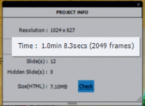
A published cptx-file (to HTML or SWF) is an interactive movie. Each movie '(and animation' plays at a certain speed, the 'professional' name for that speed is 'Frames per Second' rate, or FPS. The quality of a movie depends on the resolution but also on that FPS number. The default FPS for a published cptx-file is 30FPS. You can see this rate in the Project Info panel.
 

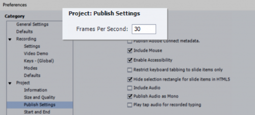
It is possible to change FPS rate in Preferences, Project Publish settings.

 
With the default rate (30), each second on the timeline has 30 frames, the smallest unit on the timeline  (0,1sec) 3 frames.  I use the word micro-navigation for navigation between frames. Contrary to the navigation to slides, there are no commands available for micro-navigation. It is only possible using advanced or shared actions which allow you to manipulate the system variables available for frames. The relevant frame system variables are:
    
From the category 'Movie Information'
  • cpInfoCurrentFrame: your best friend when exploring Captivate's timeline, debugging projects with advanced actions, micro-navigation etc. You'll find that variable inserted in a text container quite often in my tutorials. You can watch an example in this interactive movie   
              
  • cpInfoFPS: returns the FPS rate, by default set to 30 as explained above. This variable can be used in calculations (with Expression) to convert from seconds to frames.

  • cpInfoFrameCount: similar to cpInfoSlideCount (total number of slides in project) it returns the total number of frames in the project. It can be used in combination with the previous variales to calculate to the total duration of the project (as shown in the TOC).
    From the category 'Movie Control'
  • cpCmndGotoFrame can be used to jump to a frame using its frame number (similar to cpCmndGotoSlide); playhead will not be released, project remains paused.
  • cpCmndGotoFrameAndResume can be used to jump to a frame using its frame number and to release the playhead at the same time, project will continue.

Testing? 

It is just a proposal: test out what you learned by creating a one-slide project, similar to the one visible at the start of this post and as thumbnail.  Design is up to you, but this is required for the 'exercise':

  1. Replace 'No action' for the On Enter event of the slide by 'Pause'; the slide shouldn't start playing automatically.
  2. Insert the system variable cpInfoCurrentFrame in a text container (example has it bottom right); that will allow you to track the location of the playhead. When starting the slide it will pause immediately, it will show 1 (although the system variable starts with 0, there is a small delay).
  3. You need two buttons: one for navigation forward, and one for navigation backwards. I used two shape buttons from the category Buttons, but replaced the action (see below). In the example they are at bottom center.
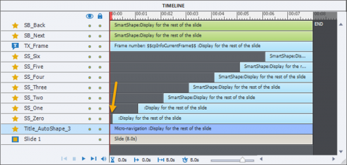
  4. A number of objects staggered on the timeline. In the example I have 7 shapes aligned in a row. They appear 1 second later than the previous one. All objects are timed for the Rest of the Slide. Result will be that the slide itself will have a duration that is longer (8secs in my case). To move an object on the timeline one second to the right: select the timeline of that object and use shortcut key CTRL-right (see Colors and Keys for Timeline). Here is a screenshot of the Timeline in my example:

    You see a small gap (0,1 sec) before the first object. Reason is the delay I mentioned before: playhead is stopped at frame 1, I don' want that shape to appear immediately. Because this is a one slide project, I didn't need to pause the slide at all, not even at the end. Both buttons have no pausing point as you can see in the Timeline.

Three events are used on this slide for actions:

  1. I already mentioned the On Enter event of the slide, which is set to 'Pause'.
  2. The button SB_Next triggers a one-line advanced action that should look like this:
  3. The button SB_Back triggers a one-line advanced action similar to the previous one, but with the math operator for subtracting instead of adding.

Test now, either after publishing and uploading to a webserver, or with Preview HTML in Browser! 
Everything is working as exptected? Great, you are ready for more advanced workflows with micronavigation. Watch out for the next article about micro-navigation: a shared action that can be used in different situations: forcing full view of a slide on first visit, but not on later visits is one of the use cases.


Where is Null in CP2017?

Intro

One of my most visited blog posts published 7 years ago (Captivate 5, 5.5)  is Where is Null?

Beware: the embedded movie is a SWF, you need a browser with enabled Flash Player to watch that movie. Everything worked fine for SWF output also in later versions. However it is now partially broken for HTML output in CP9 and CP2017. Several users contacted me to ask for a solution, hence the reason for this new post.

Use Case

The use case can be split up in two phases:

  1. Checking the entry in the Text Entry Boxes): user has to enter something, but it is not to be validated, cannot be empty. Because the way Captivate is treating the value of variables, you need to create an empty variable, which I use to label 'v_null'. If the TEB field(s) is (are) empty, a warning should appear for the user.
    That part described in the old blog post is still valid!  For that reason I will restrict the explanation in this post to one TEB on the slide.
  2. Reactivating the Text Entry Boxes) to allow a new attempt for the learner. Once the Submit button is clicked the TEB is deactivated by default. It is this second part that is no longer functional in recent versions for HTML output.  Focus will be on this second part.

Example Movie

You can watch the example movie by clicking this link

CheckTEB

Workarounds for Reactivating TEB

I propose two workarounds: the first workaround uses the dummy slide as described for another use case in a recent post as Tip 2 (Reset Slide). Since you will re-enter the slide, you can use the On Enter event to restore the initial settings. The second workaround uses micronavigation, which was also used in the original setup. But in this case micronavigation will be not be used to move the playhead before the pausing point of the TEB, but to re-enter the slide.

Solution 1: Using Dummy slide

In the movie this solution is on slide 3, the dummy slide (duration 0,1sec) is slide 2. You see the slide numbers at the bottom in the movie. That is the biggest drawback of this solution, you will have extra slide(s). Three events are used on slide 3:

  • On Enter event triggers the advanced action EnterEmpty which resets the situation when re-entering the slide: clears the TEB associated variable v_MyName, hides a Group Gr_Retry (message + button) which will be shown when the TEB is empty and hides another group Gr_OK (message + Next button) which will be made visible when the TEB has an entry.

  • Success event of the TEB triggers the shared action Check_TEB which is also used in the second workflow. It has 3 parameters: the variable associated with the TEB, what (group or object) has to be shown when the TEB is empty, and what (group or object) has to be shown when the TEB variable has a value. In this case the two last parameters are groups: Gr_Retry and Gr_OK.
  • Success event of the Retry button has the simple action 'Go to Previous Slide'.

Solution 2: Using micronavigation

You see this solution on slide 4. This solution needs one more user variable v_start to store the first frame number of the slide, using the On Enter event of the slide. The Retry button will use this number in combination with the system variable cpCmndGotoFrameAndResume to navigate the playhead to one of the last frames in the previous slide. This will avoid the creation of extra slides as with the first solution But the workflow is a little bit more complicated.  The used events and actions are now:

  • On Enter event triggers the advanced action EnterEmptyBis which resets the situation when re-entering the slide: clears the TEB associated variable v_myName, hides a Group Gr_RetryBis (message + button) which will be shown when the TEB is empty and hides a message  Tx_Welcome_20 (kept the generic name) which will be made visible when the TEB has an entry. It also defines the value of v_start with the current frame number, which will be the first frame of the slide. 

  • Success event of the TEB triggers the shared action Check_TEB  used in the first workflow. It has 3 parameters: the variable associated with the TEB, what (group or object) has to be shown when the TEB is empty, and what (group or object) has to be shown when the TEB variable has a value. In this case third parameter is not a group but the message Tx_Welcome_20.

  • Success event of the Retry button triggers an advanced action RetryAct with two commands: clears the variable v_myName, and calculates the frame number that is 2 frames less than the start frame of the slide. I prefer 2 instead of 1 frame because there could be a small delay which makes v_start equal to the second frame number of the slide.

Roundup

Drawback of both proposed workarounds, compared with the original solution (broken now) is possible flickering when the slide is re-entered. I have tried a lot of ideas to avoid that flickering which is an annoying issue since many versions (if my memory is correct since version 6): transitions (not slide transition which is unsupported for HTML output), Delay command, delay on timeline etc.. 

Drawback of the first workaround is that the total number of slides (cpInfoSlideCount) and the current slide number (cpInfoCurrentSlide) cannot be used directly to indicate slide progress due to the inserted dummy slides.

For the second workaround: if you want to apply this to multiple slides, it is possible to reuse the variable v_start which stores the first frame of each slide. If you use the shared action, the variable v_null is not defined as parameter. That means it will be automatically created when import or drag this action to the Library of a new project. As you probably know I am a big fan of shared actions. Maybe I will post some of my tricks to save time with shared actions. in a future post.


Drag&Drop Actions

Intro

In the webinar which I presented on 2018/3/15 about Shared Actions, I showed several workflows with shared actions. If you want to have a look at the presentation used during the webinar, look at my previous blog post. You'll find a link to the published interactive movie

One of those examples, was a Drag&Drop slide where both advanced and shared actions were used as Object Actions. It can help you with the tough task to choose between the two types of actions. A similar example appears in the presentation, where only a shared actions was used. It had 7 drag sources and two drop targets:

Example movie

You can watch this movie to understand the goal of the D&D slide. It has 6 drag sources and only one drop target. You will be asked to drag only the correct new features in CP2017 to the drop target. Only when the answer is correct will you see the Next button. There is a Reset button for the D&D, which is not the default reset (because of the states used on the drop target) but uses an approach which I have explained already multiple times.


Setup D&D slide

Auto Submit Correct Answers is activated, and the Submit button has been dragged to the scratch area. The drop target accepts all drag sources, which will disappear behind the target but the count is limited to 3 (because there are 3 correct answers). Due to the Auto Submit which only will happen for the correct answer, the Next button will only appear when the answer is completely correct (Action 'On Success'). 

The drop target is a multistate object. I didn't add InBuilt states in this case but three custom states, using a gradient edited for each state with 'Edit Gradient'.

On the slide, not overlapping with any object, there is a multistate shape, labeled 'Comments',  acting as feedback container. The normal state is blank and you see the other states in this screenshot:

Advanced Action DD_CorrectAct

I imported the shared action used in the presentation to the project Library and used is as a template for this Advanced action DD_CorrectAct. I added the Play Audio command. First I tried to add the audio to the state 'Correct' of the multistate shape 'Comments', but that proved not to work in this case, probably due to the Drag&Drop limitations. After the duration of the audio clip (4secs) the shape reverts back to the Normal state, which is invisible to the user (Alpha and Stroke set to 0).

Sorry for the generic label on he drop target. You probably know from my previous blog posts that renaming an object used in a D&D interaction, will kill the set up. 

Since this action is used with exactly the same feedback text and same audio clip for 3 drag actions it is much better to use an advanced action in the situation. 

Shared Action DD_IncorrectAct

The previously described Advanced action DD_CorrectAct is used as source to create a shared action. Since there is no state change needed for the drop target, the fifth command can be deleted. Five parameters are needed (due to the fact that audio couldn't be embedded in states). Four of them are compulsory parameters, one candidate was turned into a parameter: the literal for the delay time. That delaty time has to be at least as long as the audio clip to be played.

You just need to apply the advanced action and the shared action to the proper object actions: 

Want more?

Goal of this simple example was to show when to use a shared action instead of an advanced action? It could have been done with 3 duplicate advanced actions, which is what I see most clients doing. Start to appreciate the advantages of shared actions over duplicate advanced actions:

  • Ease of transfer to other projects
  • Management in the Library
  • Possibiity to use as template

Give it a try. If you want to learn more, give me some feedback, please.


Shared or Advanced actions?

Why?

Shared actions were a new feature in Captivate 7 and were improved in Captivate 8. Nevertheless I rarely see examples of shared actions, and there is also lot of misunderstanding.  Some users think they can only be reused in other projects. I did see experts claiming that they are totally useless, that it is much easier to duplicate advanced actions. I don't agree with that opinion, about 90% of all the project I have developed do include shared actions. They are especially useful for responsive projects as well. In a recent article you can find links to tutorials about shared actions.

 A problem that still remains is that you cannot edit an existing shared action, had hoped that would have been solved in 9 in a recent version but it didn't happen. The reason is probably that since they are not much used, this improvement doesn't get on the priority list. If you want to learn more about how to create shared actions and see some examples, have a look at this recent article in which I summarized several older posts. This post is a showcase, where I'll try to explain when to use a shared action, and when you cannot use them. The origin of this showcase is due to this question in the forums. The answer I gave there is working, but has a serious drawback, I will explain both this first simple answer, followed by a second version that will work in all situations. I hope you learn from that workflow: test out all possible situations, even though they seem to be improbable. As a trainer/coach never underestimate how trainees will explore courses.

Problem

User did look for a solution to apply to this use case:

  • Drag&Drop slide with two drag sources and two drop targets
  • Each drag target should accept only one drag source
  • Depending on the sequence of the dragged items, one out of two texts should appear.
  • Learner can switch the drag sources
  • Auto submit for the answer.
  • Slide needs a reset button

Example movie

Watch this embedded movie (rescalable HTML), where you'll see the two solutions after publishing. As an alternative you can also watch it directly using this link. You can test the problem with the first solution as well. Everything works fine if you switch only once, like first dragging the First text to the Top target, than drag the Second text to the Top target. However if you switch a third time, First text to the Top target, you'll see that the functionality is lost. This will not happen with the second solution.


Setup Drag&Drop slide

The setup is the same for both solutions. Drag sources are shapes and labeled SS_DragOne and SS_DragTwo. The shapes acting as drop targets are labeled SS_DropTop and SS_DropBottom. The feedback will appear in another shape SS_Feedback, which has 3 states: Normal, OneTop (first scenario with SS_DragOne in SS_DropTop) and TwoTop (second scenario (SS_DragTwo in SS_DropTop). 

Since Auto Submit is turned on in the Actions tab of the Drag&Drop panel, I dragged the Submit button out of the way to the scratch area. 

That means that both possible answers have to be defined as Correct answers. This can be done with the button 'Correct Answers' on the Options tab of the Drag&Drop panel.

Each drop target should accept only one drag source, but the learner can switch them if wanted, as long as no correct answer has been defined. For that reason editing the dialog box 'Accepted Resources' is necessary, because the default setup is that each Drop target accepts all drag sources. This dialog box can be opened from the Format tab of the Drag&Drop panel, when a drop target is selected. It has to be repeated for both targets. Rest of the setup like snapping behavior is not important for the rest of the workflow, do what you like.

First solution

This solution is using two variables: v_first and v_second. They are related to the first scenario (SS_DragOne in SS_DropTop and SS_DragTwo in SS_DropBottom) and the second reverse scenario. Default value of the variables is 0. 

I used the same shared action for all object actions, for both targets. It is pretty simple, conditional with one decision. It has three parameters:

  1. First parameter is the variable associated with the scenario, v_first or v_second. 
  2. The multistate feedback object is the second parameter
  3. The state to be shown, which fits the scenario is the third parameter.

This was the original idea:

  • When the first drag action occurs, it fits into either scenario 1 or scenario 2; the appropriate variable is set to 1.
  • If the drag source is replaced on that same target nothing happens.
  • When the second drop target is filled with the other drag source, it has to be in the same scenario. Checking if that associated variable has a value=1, means that both targets are filled, and the feedback is shown, depending on the scenario variable.

What is the problem with this action? It works fine until the user changes the object twice on the first target: in that case the feedback will be shown to early. That was the reason for the second solution which does avoid this problem.

Second solution

Besides the two scenario variables, a third variable to track the number of drag actions was created: v_counter. It started also with a default value of 0. The shared action now has 3 decisions as you can see in this Preview:

The first decision 'Always' is a mimicked standard action. The increment command for both v_counter and the associated scenario variable (v_first or v_second, depending on the object action) will always be done.

The second decision 'Complete' checks if both targets are filled, which is the case when both v_counter and the associated scenario variable have the value = 2. In that case the correct feedback is shown (similar to first solution).

The third decision 'Incomplete' is the one that solves the problem with solution 2. If there has been 2 drag actions (v_counter is equal to 2) but the associated variable for the active object action is still set to 1, that means that the user has switched the drag sources on one target two times. In that case the variable for the other scenario (which probably has already a variable different from 0) is reset to 0. 

It is not necessary to define v_counter as parameter, since it will be used as counter whatever the scenario. This action needs 4 parameters, because both v_first and v_second are used in the action; whereas in solution 1 only one of them was used..

Reset 

This is not the default Reset from Drag&Drop, because it will not reset the variables nor the state of the feedback container. I used the usual workaround (micronavigation as explained in 'Replay Slide' is not possible yet due to a HTML5 bug in CPwhere the On Enter action is not executed) to reset the variables and that feedback container. Two dummy slides with a duration of 0,1sec are inserted: one before each D&D slide. The reset button triggers the command 'Go to Previous Slide', thus forcing the playhead to re-enter the D&D slide.

The On Enter action 'EnterDD' is also a shared action and looks like this:

I used that action for both D&D slides, even though v_counter is not used in the the first solution. 

I hear you! Why a shared action, you only need it twice, and the only edit to make to a duplicate advanced action is the label of the feedback container. If you were one of my college students, you would know that 'Weymeis never acts without a reason....'. I will try to explain why I preferred a shared action with two parameters, instead of two advanced actions.

When you import this shared action in a new project by dragging it to the Library from this project opened as External Library (see Libraries) the variables v_counter, v_first and v_second are created automatically in that new project, with their definition and default value. That is a time saver, something to take into consideration when creating shared actions. This happens only for variables that are not defined as parameters.

Offer

Do you want to try out those actions? Send me a mail (info@lilybiri.com) and tell me if you use shared actions, or will use them in the future?  As a 2018 offerI will send you a project that you can use as external library with the two shared actions (EnterDD and DragSequence) described in this blog post, and instructions how to use them.


Custom Review

Goal

This question recently appeared on the forum (thread):

"I'd like to customize the results page at the end of a quiz to display the numbers 1 to 20 (representing the 20 questions in the quiz) and indicate if each question was answered correctly or incorrectly."

Although I posted an answer, the user never returned to check it. Since I have spent some time to work out that solution, I also discovered that it could be very useful in two situations that are often mentioned as failing in the normal Captivate design:

  • To show the user an overview of answers on a test with Knowledge Check slides: which anwsers were  correct/incorrect? If you are not sure about the differences between KC slides and normal quiz slides, have a look at this article.

  • To create a Review slide, where the learner would see the same information for normal quiz slides. Captivate has a great Review feature for quiz slides (not for KC slides) but it has some shortcomings. It will not only show the answers by the learner but also the correct answers. Moreover, clicking the Review button will cancel all remaining attempts on Quiz level for apparent reasons. With the solution I propose the user would not see the correct answers, only which questions were answered correctly or incorrectly, and the Retake attempts would still be available. 

The work flow is based on a couple of simple shared actions, use of multistate objects (for the feedback checkmarks) and some advanced actions.

Example movie

Watch this embedded movie or use any device to open this link (it is a rescalable, non-responsive HTML5 project). 

You will first see a test with two Knowledge Check slides, followed by a 'Review' slide. You will be able to retake this test, or to continue.

Second part is a realy quiz, with 5 question slides. Question slides are followed by a Review slide. In Quiz Preferences I provided 3 attempts. When the attempts are exhausted or you succeeded passing the test, the Next button (was formerly a Retake button) will take you to the official Score slide.

.

Set up

Checkmark - multistate object

The checkmarks, both on the Review slide for the KC question and for the real quiz, are shapes with 3 custom states:

  1. Normal state: shape is invisible because Alpha for Fill and Stroke for Width are both set to 0.
  2. Correct state: shape is filled with a PNG representing a green tick symbol. This can of course be all you want: text, text + image, text + image + audio. I kept it simple. 
  3. Wrong state: shape is filled with a PNG that is the Cross symbol.

Here is a screenshot of the Object styles for the checkmark:

The checkmarks are labeled: Check_KC1 - Check_KC2 for the KC slides, and Check_1, Check_2.... Check_5 for the Quiz slides. The numbers make it easier to select them by filtering in the Parameters dialog box, because they are used in the shared actions.

Retake button Quiz Review - multistate object

That button on the Review slide for the Quiz, is used to start a new attempt because the user will not see the Score slide. I had to reproduce he functionality of that Score slide, where the Retake button automatically disappears in two situations: either the learner has passed the quiz, or the Quiz attempts are exhausted. I solved that by adding a custom state to the Retake button, where the label changes to 'Next'. To have a non-confusing Rollover and Down state, which would be valid for both the Retake and Next button, I used the text '>>'. This is the Object state panel of this button, type Transparent button like the Quiz buttons and buttons on the Score slide: The advanced action (see below) EnterReview will take care of switchnng beteen the Normal and Passed state.

The Review slide for the KC questions doesn't need that type of button. It has two buttons: Retake for those who want to retry the KC test (answers are always reset for KC slides when leaving them) and a Continue button.

KC/Question Slides - variable v_KC

I changed the default setup to only one attempt for the KC-slides (default =  Infinite attempts). That change made the Last Attempt event availalbe. Contrary to Quiz slides the results of the KC-slides are not stored in exposed system variable. I wanted to show a 'trophy' on the Review slide to learners who correctly anwered all KC-questions. To track the correct answers, I created a user variable, labeled v_KC  which starts with a default value of 0 and is incremented for each correct answer. For the same reason, the shared action triggered by the Success event is different from the one used for normal quiz slides. If you import the shared action to another project, the variable will automatically be created. 

Quiz slides kept the default setup: only one attempt allowed.

Events for Actions

On KC-slides Success event (Quiz Properties) is used for Shared Action 'CorrectAnswerKC'

On KC-slides Last Attempt  event (Quiz Properties) is used for Shared Action 'WrongAnswer'

ReviewKC slide On Enter event triggers Advanced Action 'EnterReviewKC'

Continue button Success event (on ReviewKC slide) is set to simple action 'Go to Next Slide'

Retake button Success event (on ReviewKC slide) is set to simple action 'Jump to slide  KC1' (first KC slide)

On Question slides Success event (Quiz Properties) is used for Shared Action 'CorrectAnswer'

On Question slides Last Attempt  event (Quiz Properties) is used for Shared Action 'WrongAnswer'

Review slide On Enter event triggers Advanced Action 'EnterReview'

Retake button Success event (on Review slide) is set to simple action 'Go to Next Slide'

Score Slide On Enter event triggers Advanced Action 'EnterScore'


Shared actions

WrongAnswer triggered by Last Attempt event (KC slides and Quiz slides)

It is a very simple action with two commands: changing the state of the associated checkmark to the Wrong state and going to the next slide. There are two parameters: the checkmark (which is different for each slides) and the state. Although the state always has the same name (Wrong), there is no way to turn it into a 'fixed' parameter (one of my feature requesnts). Here is the action with filled in parameters

I like the way it is possible to track shared actions in the Library, look at the Usage panel for this action/ You see that this shared action is used both for the two KC slides and for the 5 Quiz slides.

CorrectAnswer triggered by Success event Quiz slides

It is a similar action, now showing the state Correct in the first command:

CorrectAnswerKC triggered by Success event KC slides

I used the CorrectAnswer from Quiz slides as template to add an extra command that will increment the variable v_KC.

Advanced Actions

EnterReviewKC triggered by the On Enter event of the ReviewKC slide

This is a simple conditional action, to decide if the trophy will show up or not.

EnterReview triggered by the On Enter event of the Review slide

This conditional action has two decisions. The first decision will change the state of the Retake button to have a Next button if the quiz has been passed or the Quiz attempts are exhausted. The second decision is about showing an image if the quiz has been passed. It also shows or hides the text mentioning the number of the present attempt.

EnterScore triggered by the On Enter event of the Score slide

This is the 'trick'. To have the functionality of a Retake button on the previous slide, which is the Review slide, the playhead visits to the score slide, but will immediately jump back to the first question slide. All quizzing system variables are reset in that case. Only when all attempts are exhausted or the learner passed the quiz, will the score slide become visible to the learner.

More is possible...

Several enhancements are possible based on this approach:

  • You can have multiple review slides, if there is not enough space on one slide

  • You can have a review side after a chapter which has some question slides or KC slides; in that case you'll have to tweak the advanced actions; if you want to track different bunches of KC slides you can either reuse the variable v_KC or use several variables. In the last scenario you'll have to turn the variable in the shared action into a real parameter.

  • I used a simple checkmark to indicate correct/wrong answers. It is not limited to that: in custom states you can also have audio, text etc...

More ideas? Suggestions?


:


Power of Shared Actions in Captivate

Intro

Shared actions were a new feature in Captivate 7 several years ago. They were improved with Captivate 8.  I never understood why almost no one talks about them, even self-labeled experts seem never to use them. This is a real pity because their power is much underestimated. In most projects I open an external library (have a look at Internal and External Libraries) which has frequently used shared actions. It saves me a lot of time in each project. I will try to summarize in this blog post the results of my almost 5 years of experience with Shared actions. As usual my goal is to get more CP-users to understand when and how to use them.   More users could mean getting enhancement feature requests on the priority list of the developers :)

Example movie (CP2017)

Please watch this movie, one of the examples I will explain at the Adobe Learning Summit, session 202 'Make the most of Captivate's Timeline for Advanced Workflows'. You will see in this movie how one shared action can be used both to skip slide audio on revisiting a slide, or to force to view the entire slide on first visit. This is a use within one project. That action certainly has its place in a common external Library. To have an explanation of the shared action, you'll have to be patient, because I want to give 'First View' to the participants of the session in Las Vegas, 24 October.

Published Tutorials Shared Actions

These posts were published 4 years ago (yes, have over 4 years experience with SA :-)). If you are on CP2017, the screenshots may be a little bit different because of the change to the Advanced Actions dialog box (see AA Dialog in 2017). However the work flow and terminology for Shared actions is still the same.

Use cases

Following on those tutorials I explained a bunch of use cases where shared actions were used. Examples are the way to explore new features, and you'll find a list with links here:

1 (shared) Action  = 5 Toggle Buttons

This blog post has a unique shared action that you'll be ablefor several toggle button in all your projects. The post was written  for Captivate 8. If you are using Fluid Boxes work flow (responsive projects) in CP2017, you can have the toggle buttons in a fluid box on master slides, not timed for the rest of the project (unless in a static fluid box):


Dashboard, using shared actions

The advantage of shared actions when setting up a menu or dashboard

Drag&Drop Tips

When using object actions for Drag&Drop slides, shared actions can be an excellent choice over duplicate advanced actions


Custom Hotspot Questions

Using shared actions to create a custom controlled hotspot question which has lot of advantages over the default type of Hotspot question.


Forcing First View

This is an older version of the Example that you watched above. It did already use Shared actions.

Matchstick Game

Games often need repetitive actions and that means that shared actons are the way to go.


Playing with Captivate 9

Another version of a dashboard created with shared actions, to celebrate the arrival of CP9.

Myths and tips

Strange myths exist about Shared actions. Lot of users believe they are only useful  between projects, not in the same  project. Personally, with the exception of the external library mentioned at the beginning, I always give priority on shared actions within one project over advanced actions if appropriate. If an action is used at least twice in a project, and it is possible to use a shared action, I will not use duplicate advanced actions.

Half-myth is that you cannot edit a shared action. That is partially true. You cannot edit a shared action which is already assigned to events and have it changed automatically. However you can use the original shared action as template to create a new shared action. You will have to assign it to all events after completing the new shared action. At that moment you will appreciate the fact that the shared action appears in the Library and has a Usage button  -  like any other asset. Contrary to advanced actions you can even reuse the same name for a shared action, provided the older action is no longer present in the file. That is one of those annoying things, that you can never reuse a name for an advanced action, even if it has been deleted. Keeping track of Usage of advanced actions is also very cumbersome.

Shared actions cannot replace advanced actions in all circumstances, and they need a different set of mind when preparing the actions. You have to be very careful with the candidate parameters: variables and literals.  I could tell a lot about spectacular results when replacing advanced by shared actions that are set up in an efficient way: courses that couldn't be published anymore because of the number of variables and advanced actions that now run very smoothly, decrease of file size and loading time when using shared instead of advanced actions. Once lot of Captivate users gave me the title 'Queen of Advanced Actions'. At this moment I feel more like the defender of Shared Actions, not the first ignored and underestimated stepchild of Captivate.  Too often I hear comments like: 'I cannot see any advantage in using shared over advanced actions'.  Sorry, but that means you never tried them out. This article proves that I have explored them.... and they are on my top feature list of Adobe Captivate.

Conclusion

I would love to organize an online training with focus on use of shared actions. If you would consider such a course a valuable add-on to your skillset, please send me a message using info@lilybiri.com.


Fluid Boxes and Master slides

Intro


A while ago I published a post explaining the setup of the Quizzing Master slides, compulsory parts of each theme, even the almost empty Blank theme. In this article I will try to explain my experiences using Fluid Boxes on Content Master slides. Most themes shipped with Captivate have several content master slides (exception = Blank theme). Let us first start with the master slides that are not behaving like the content or quiz master slides

Main master slide, Blank and Title master slides

Main Master slide

It is not possible to insert Fluid boxes on the main master slide: the button seems active but both options (Vertical and Horizontal) are dimmed. Objects placed on that Main master slide, and inherited by the daughter master slides, are to be set up using the Position Properties panel. Example: the text container with my name and copyright in the example movie.
However after some more testing on iOS devices, the Position properties set up for those objects are not correctly displayed in portrait mode. 
TIP: at this moment avoid putting objects on the Main master slide, since they don't display at the correct location on some mobile devices.

As you probably know, it is not possible to have shape buttons timed for the rest of the project when you use Fluid boxes. You could put a shape button on the main or one of the other master slides but you cannot control it because it has no ID. In the example movie I preferred to have a Next button on the individual slides, because ton most slides it is hidden until the learner has visited everything. However a toggle shape button for Audio, for CC, for the TOC could be on the Main Master slide. They will not behave like objects in a Fluid box however, but act as defined on the Position Properties panel for size and location.

Blank Master slide 

This master slide has no Fluid boxes by default but you could add them. As I have explained in previous articles, you should prefer to duplicate the master slide for editing, don't edit the original slide because it is used for Powerpoint import and for software simulations.

Title Master slide

That master slide has one Fluid box (parent fluid box) but no child fluid boxes. It is set up as 'Squeeze in a Column', and vertically and horizontally centered. Because the title placeholder is inserted directly in that parent fluid box, you are not able to insert child fluid boxes.  Because each new project, using the default theme White will start automatically with a Title slide, this has caused already many frustrations when starting with the use of Fluid boxes. If you want to use fluid boxes on the first slide, you have to change the master slide from Title to Blank (exception Blank theme which starts with a Blank slide).

TIP: if you want to add objects on the Title master slide, first take out the Title Placeholder, to be able to insert child fluid boxes. Then put back the Title Placeholder in one of the child fluid boxes.

Content master slides

It can be a time saver to use a content slide that has already Fluid boxes. In a future next article I'll explain how to create a custom content master slide with the help of Guides, but for now let us focus on an existing master slide, and see how we can tweak it.
In the example movie, the second slide is based on the Content04 master slide from the Theme 'OldPaper'. I didn't customize the theme, just applied the correction explained in my last post

Look at the setup of the Fluid boxes on the master slide: the parent fluid box (FB_15) has two vertcial child FB's (FB_16 and FB_17). The top one is meant for the Title placeholder: 

The bottom Fluid Box has 4 child FB's, (FB_19,FB_20, FB_21, FB_22), which are set up to wrap Symmetrically (when width is too small, two FB's will move to the next row), and have a padding both vertically and horizontally to have some spacing between the FB's. Each of them has a placeholder for an image.

Example movie

Play with this responsive movie (will open in a new window) which has only 3 slides: Title slide (with inserted Next button, and taking over my name from the main master slide), a slide based on Content04 master slide, with a lot of tweaking, and an End slide. The Next button on the second slide will only appear when you have clicked all available shape buttons and seen all the content. 

Refining slide based on Content master slide

The FB setup on the master slides can be tweaked on a slide based on that master slide. You can remove all fluid boxes, but that is has not much sense. To demonstrate I did a lot of tweaking for the second slide of the movie which you just watched:
  • I deleted the image placeholders


  • I decreased the height of the top fluid box (FB_MS2_16) to 10%, originally it was 15% (edited font style as well)

  • I added a third vertical child FB under the parent FB_MS2_15, it is labeled FB_9
    TIP: this will not affect the master slide, if you use Reset Master Slide button in the Properties panel of the slide, you'll get the original layout


  • That last FB_9 got two horizontal FB's, FB_37 (70% of the width) and FB_38 (30% of the width); the last one will be used for the navigation buttons (Back/Next)

  • The setup for FB_38 is visible in this screenshot
  • Each of the four FB's in the center (FB_19,FB_20, FB_21, FB_22) has no longer any object (see 1) and can be divided in two new vertical child FB's


  • As you can see on the screenshot, the top FB will have the button and explanation text (originally hidden, but cannot be grouped in FB's), the bottom one has an example of the style (also initially hidden).

  • Setup for the top FB's here is visible in this screenshot; for the Shape button ('Normal') the option Maintain Aspect Ratio is kept, but not for the Text container, so that it can change for smaller screen sizes (especially in portrait mode).

More questions?

You will have seen that I always had Rulers and Guides activated. My next blog post will focus on the use of that great tool, which almost no one seems to use?

Sure, I have several advanced actions in that movie, but that was not the goal of this post. No explanations here about those actions.